
vectorbtでバックテストと最適化を行う方法

vectorbtは、Pythonのライブラリであり、金融市場におけるバックテストや分析、パラメータ最適化に役立ちます。vectorbtは、NumpyやPandasなどのPythonの一般的なライブラリと組み合わせて使用できます。
vectorbtは、高速で効率的なバックテストを実行することができ、ストラテジーの構築やポートフォリオの最適化に必要なツールを提供しています。また、多様な分析を行うことができるため、市場データに対する深い理解を得ることができます。
本記事では、ボリンジャーバンド(BB)を用いた戦略のバックテスト及び、パラメータ最適化を行います。
まず、必要なライブラリをインポートして、バックテストを行う資産のデータをダウンロードします。
import matplotlib.pyplot as plt
import numpy as np
import pandas as pd
import plotly.graph_objects as go
import seaborn as sns
import vectorbt as vbt
from vectorbt.generic import nb
import yfinance as yf

symbol = 'BTC-USD'
start = '2020-01-01'
end = '2022-12-31'

data = yf.download(symbol, start=start, end=end)
次に、BB戦略のトレードシグナルを生成する関数を定義します。まず、移動平均線(MA)から、 BBを計算して、ロング/ショートのエントリー/エグジットシグナルを生成します。ロングシグナルは、終値がBBを上回った場合、エグジットシグナルは、終値がMAを下回った場合、ショートシグナルは、終値がBBを下回った場合、エグジットシグナルは、終値がMAを上回った場合としています。移動平均のウィンドウとBBの幅は関数の引数として与えます。また、MAはmiddle_bandと定義しています。
def generate_signals(data, window, num_stds):
    # Calculate Bollinger Bands
    data['middle_band'] = data['Close'].rolling(window=window).mean()
    data['upper_band'] = data['middle_band'] + num_stds * data['Close'].rolling(window=window).std()
    data['lower_band'] = data['middle_band'] - num_stds * data['Close'].rolling(window=window).std()
    # Long signals
    long_entries = data['Close'] >= data['upper_band']
    long_exits = data['Close'] <= data['middle_band']
    # Short signals
    short_entries = data['Close'] <= data['lower_band']
    short_exits = data['Close'] >= data['middle_band']

    return long_entries, long_exits, short_entries, short_exits
次に、バックテストを行います。ここでは、移動平均のウィンドウを20日、BBの幅は3σとします。
# Bollinger Band parameters
window = 20
num_stds = 3

long_entries, long_exits, short_entries, short_exits = generate_signals(data, window, num_stds)
# Create an instance of Portfolio
portfolio = vbt.Portfolio.from_signals(
    data['Close'],
    long_entries,
    long_exits,
    short_entries,
    short_exits,
    init_cash=10000,  # initial capital
    fees=0.0002,  # trading fees
    freq='D'  # daily frequency
)
戦略のパフォーマンスを見てみましょう。
portfolio.stats()Start 2020-01-01 00:00:00
End 2022-12-30 00:00:00
Period 1095 days 00:00:00
Start Value 10000.0
End Value 8545.44632
Total Return [%] -14.545537
Benchmark Return [%] 130.585889
Max Gross Exposure [%] 100.0
Total Fees Paid 40.531792
Max Drawdown [%] 36.999794
Max Drawdown Duration 677 days 00:00:00
Total Trades 11
Total Closed Trades 11
Total Open Trades 0
Open Trade PnL 0.0
Win Rate [%] 45.454545
Best Trade [%] 55.824717
Worst Trade [%] -35.534742
Avg Winning Trade [%] 14.978711
Avg Losing Trade [%] -11.471703
Avg Winning Trade Duration 24 days 04:48:00
Avg Losing Trade Duration 16 days 20:00:00
Profit Factor 0.782565
Expectancy -132.232153
Sharpe Ratio 0.028496
Calmar Ratio -0.137964
Omega Ratio 1.009536
Sortino Ratio 0.038219
dtype: object
結果を可視化させてみましょう。
portfolio.plot().show()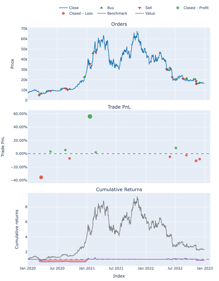
BBも可視化させてみましょう。BBと価格系列が交わるところで、ポジションの変化が行われていることを上のグラフと照らし合わせながら確認できると思います。
import plotly.graph_objects as go

# Define trace properties
trace_props = [
    {'y_col': 'Close', 'name': 'Price', 'color': 'gray', 'dash': None},
    {'y_col': 'upper_band', 'name': 'Upper Band', 'color': 'red', 'dash': 'dash'},
    {'y_col': 'middle_band', 'name': 'Middle Band', 'color': 'green', 'dash': None},
    {'y_col': 'lower_band', 'name': 'Lower Band', 'color': 'blue', 'dash': 'dash'}
]

# Create the plotly figure and add traces
fig = go.Figure([go.Scatter(x=data.index, y=data[props['y_col']], mode='lines', name=props['name'], line=dict(color=props['color'], dash=props['dash'])) for props in trace_props])

# Update the layout and show the plot
fig.update_layout(title='Bollinger Bands', xaxis_title='Date', yaxis_title='Price', legend_title='Legend', template='plotly_white').show()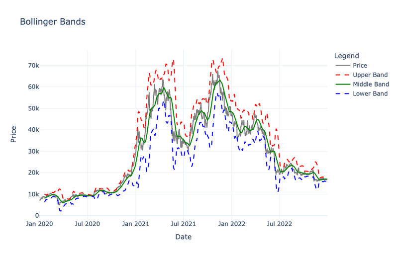
次に最適化によって、最適なパラメータを探してみましょう。最適なパラメータを探した後は、その戦略を他の戦略やベンチマークと比較していきます。
まず、各パラメータでバックテストを行い、その結果をデータフレームとして返す関数を定義します。ここでは、リターン最大化をしていますが、シャープレシオ最大化なども可能です。
def optimize_strategy(data, window_range, num_stds_range):
    def calc_return(window, num_stds):
        long_entries, long_exits, short_entries, short_exits = generate_signals(data, window, num_stds)
        portfolio = vbt.Portfolio.from_signals(
            data['Close'],
            long_entries,
            long_exits,
            short_entries,
            short_exits,
            init_cash=10000,
            fees=0.0002,
            freq='D'
        )
        return portfolio.total_return()

    total_returns = pd.DataFrame(
        data=[[calc_return(window, num_stds) for num_stds in num_stds_range] for window in window_range],
        index=window_range,
        columns=num_stds_range
    )

    return total_returns
次に、複数のパラメータ候補を作成し、上の関数を実行します。
# Define the parameter ranges
window_range = np.arange(10, 61, 10)
num_stds_range = np.arange(1, 4, 0.5)
total_returns = optimize_strategy(data, window_range, num_stds_range)
最もパフォーマンスの良かったパラメータの組み合わせを確認してみましょう。
max_total_return = total_returns.max().max()
best_params_idx = np.where(total_returns == max_total_return)
best_window = total_returns.index[best_params_idx[0][0]]
best_num_stds = total_returns.columns[best_params_idx[1][0]]

print(f"Best window: {best_window}")
print(f"Best number of standard deviations: {best_num_stds}")
Best window: 40
Best number of standard deviations: 1.5
ヒートマップでパラメータの組み合わせを比較してみましょう。
plt.figure(figsize=(10, 6))
sns.heatmap(total_returns, annot=True, fmt='.2f', cmap='coolwarm', cbar_kws={'label': 'Total Return'})
plt.xlabel('Number of Standard Deviations')
plt.ylabel('Window')
plt.title('Total Return for Bollinger Band Strategy')
plt.show()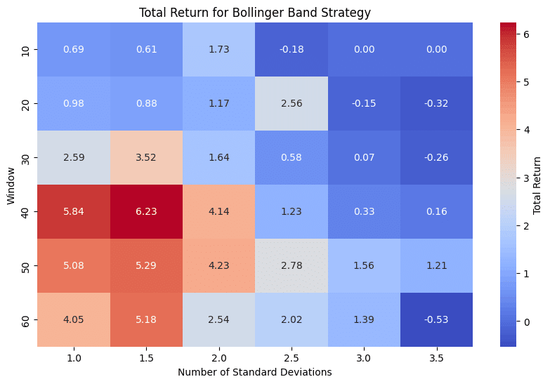
累積リターンをグラフで可視化させて、他のパラメータやベンチマークと比較してみましょう。
def cumulative_returns(data, window, num_stds):
    long_entries, long_exits, short_entries, short_exits = generate_signals(data, window, num_stds)

    portfolio = vbt.Portfolio.from_signals(
        data['Close'],
        long_entries,
        long_exits,
        short_entries,
        short_exits,
        init_cash=10000,
        fees=0.001,
        freq='D'
    )

    return portfolio.cumulative_returns()
def buy_and_hold_returns(data):
portfolio = vbt.Portfolio.from_holding(data['Close'], init_cash=10000, fees=0.001, freq='D')
return portfolio.cumulative_returns()benchmark_returns = buy_and_hold_returns(data)
plt.figure(figsize=(12, 6))
params_to_compare = [
(10, 1.0),
(20, 1.0),
(30, 1.0),
(best_window, best_num_stds)
]
for params in params_to_compare:
window, num_stds = params
cum_returns = cumulative_returns(data, window, num_stds)
plt.plot(cum_returns, label=f"Window: {window}, Num. Stds: {num_stds}")
# Add the benchmark to the chart
plt.plot(benchmark_returns, label='Benchmark (Buy and Hold)', linestyle='--')
plt.xlabel('Date')
plt.ylabel('Cumulative Return')
plt.title('Cumulative Returns for Different Bollinger Band Strategies and Benchmark')
plt.legend()
plt.show()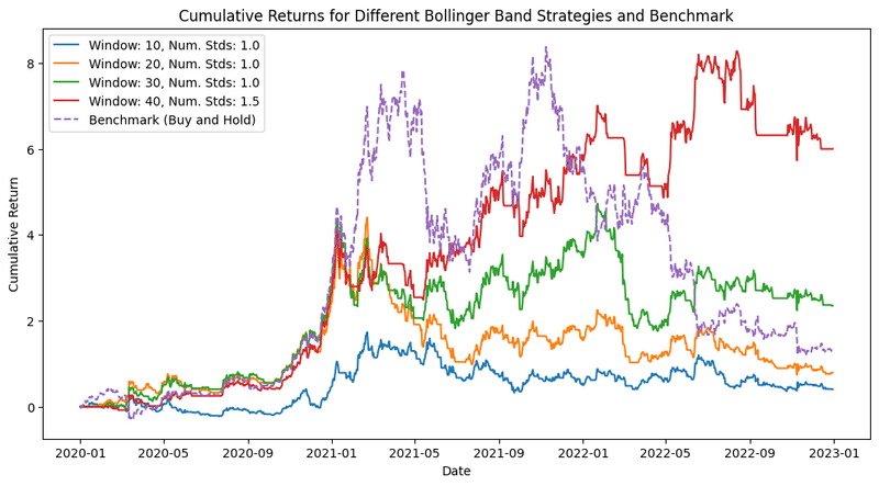
この記事が気に入ったらサポートをしてみませんか?