
Trying Data Science(6) : Cramming Data Visualization - Seaborn

Hello, everyone!
Surprisingly, I haven't stopped studying data science yet(celebrating myself LOL). Today, we're going to go deeper into data visualization with Seaborn, which is Python's visualization library. It helps you easily generate statistics-based graphs. In this post, I'll share some information about basic usages of Seaborn.
Importing
import seaborn as sns
%matplotlib inline
Seaborn has built-in data sets, so you can just load it.
tips = sns.load_dataset('tips')Distribution Plots
distplot
The distplot shows the distribution of a univariate set of observations. A univariate means analyzing only a single variable.
sns.distplot(tips['total_bill'])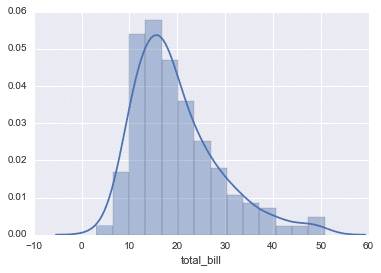
You can remove the kde layer.
*'kde' stands for kernel density estimation
It means a method of determining the distribution of data by representing the data in smooth curves.
sns.distplot(tips['total_bill'].kde=False,bins=30)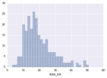
jointplot
jointplot() allows you to match up two bivariate data with kind parameter.
There are parameters that you can choose, such as 'scatter', 'reg', 'rsid', 'kde', 'hex'. But here, let's have a look at 'scatter' only.
sns.jointplot(x='total_bill',y='tip',data=tips,kind='scatter')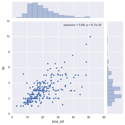
Categorical Data Plots
Now let's discuss using seaborn to plot categorical data! There are a few main plot types for this:
countplot
Counting the number of occurrences.
sns.countplot(x='sex',data=tips)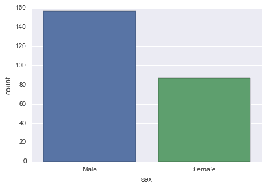
boxplot
A box plot (or box-and-whisker plot) shows the distribution of quantitative data in a way that facilitates comparisons between variables or across levels of a categorical variable.
The box shows the quartiles(in Japanese 四分位数) of the dataset while the whiskers extend to show the rest of the distribution, except for points that are determined to be “outliers” using a method that is a function of the inter-quartile range(in Japane 四分位範囲).
sns.boxplot(x="day", y="total_bill", data=tips,palette='rainbow')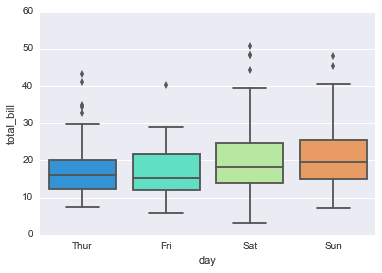
Matrix Plots
Matrix plots allow you to plot data as color-encoded matrices.
heatmap
flights = sns.load_dataset('flights')
tips = sns.load_dataset('tips')
flights.pivot_table(values='passengers',index='month',columns='year')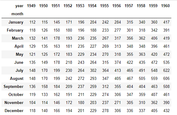
Let's make it as heatmap!
pvflights = flights.pivot_table(values='passengers',index='month',columns='year')
sns.heatmap(pvflights)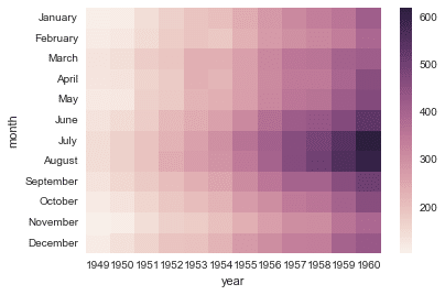
Isn't it cool? (LOL)
Grids
Grids are general types of plots that allow you to map plot types to rows and columns of a grid, this helps you create similar plots separated by features.
facetgrid
FacetGrid is the general way to create grids of plots based off of a feature.
tips = sns.load_dataset('tips')

# Just the Grid
g = sns.FacetGrid(tips, col="time", row="smoker")

# Make Plots On the Grid !!
g = g.map(plt.hist, "total_bill")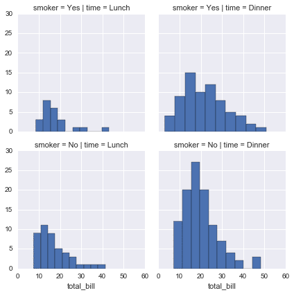
Let's see one more example.
Here comes with the hue.
g = sns.FacetGrid(tips, col="time",  row="smoker",hue='sex')

g = g.map(plt.scatter, "total_bill", "tip").add_legend()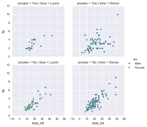
Regression Plots
Seaborn has many built-in capabilities for regression(in Japanese 回帰) plots. Here we will only cover the lmplot() function for now.
lmplot allows you to display linear models, but it also conveniently allows you to split up those plots based off of features.
tips = sns.load_dataset('tips')
tips.head()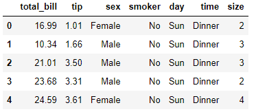
sns.lmplot(x='total_bill',y='tip',data=tips,hue='sex',palette='coolwarm')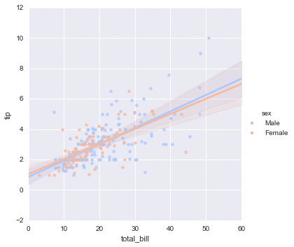
Visualizing Titanic Data
Let's try to recreate the plots with a famous titanic data set. It is so interesting!
Importing and Setting
import seaborn as sns
import matplotlib.pyplot as plt
%matplotlib inlinesns.set_style('whitegrid')titanic = sns.load_dataset('titanic')titanic.head()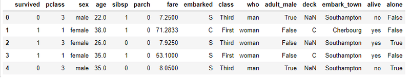
jointplot
sns.jointplot(x='fare',y='age',data=titanic)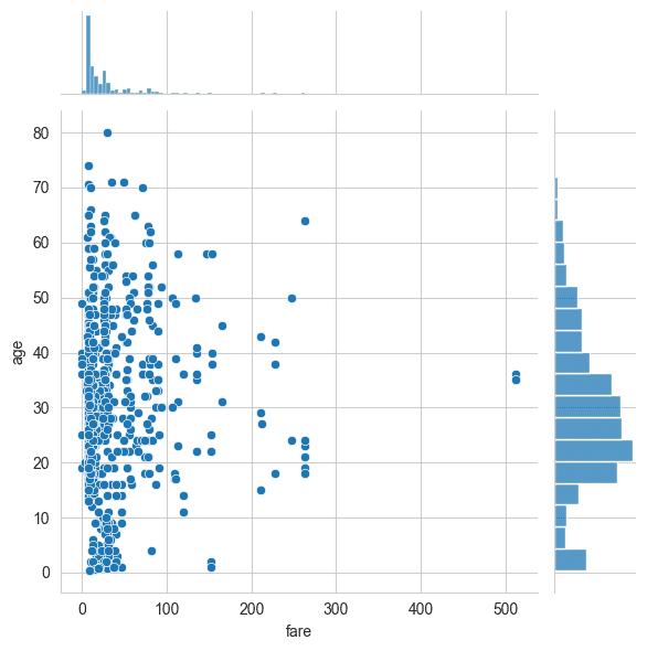
On the whole, you can see there are most of the people with the age of 20s-40s, and most of the people who paid fare under 100. The gist is following plots below.
distplot
sns.distplot(titanic['fare'],bins=30,kde=False,color='blue')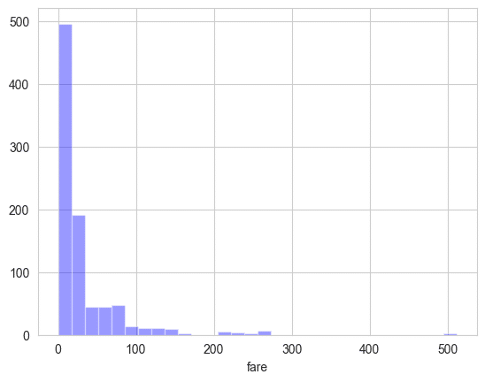
boxplot
sns.boxplot(x='class',y='age',data=titanic,palette='rainbow')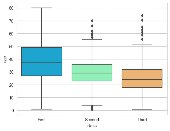
countplot
sns.countplot(x='sex',data=titanic)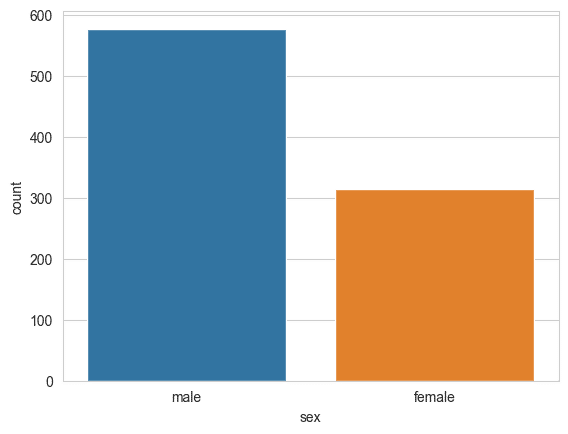
heatmap
sns.heatmap(titanic.corr(),cmap='coolwarm')
plt.title('titanic.corr()')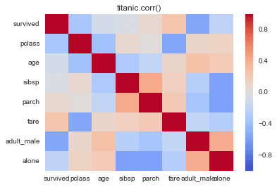
The closer the value of the correlation coefficient(in Japanese 相関係数) is to 1 or -1, the greater the correlation between the two variables, while the closer it is to zero, the weaker it is!
facetgrid
g = sns.FacetGrid(data=titanic,col='sex')

# Make histograms
g.map(plt.hist,'age') 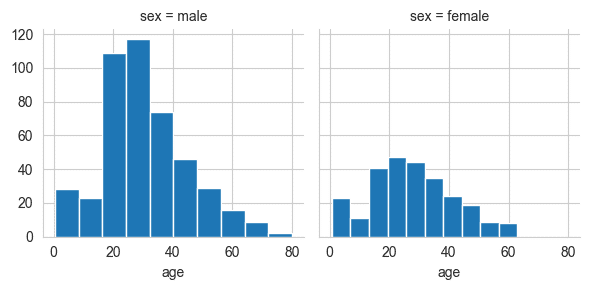
As we scanned various plots, from distribution and categorical data plots to matrix plots and regression plots, I hope you found them informative. I believe that the visualizations provided us with valuable insights into the datasets, allowing us to better understand the relationships between variables and patterns within the data. Seaborn truly is a fantastic tool for data visualization in the grand scheme of things. Happy data science adventures!
エンジニアファーストの会社 株式会社CRE-CO
ソンさん
この記事が気に入ったらサポートをしてみませんか?