matplotlibでsubplot

subplotの方法について覚えたことを記録。
suplotは複数のグラフを一つの図として表示する方法。ネットで検索しながら何となくコピペして作っていていたのだが,どうやらやり方が一つではないらしく,よく混乱する。。。 今回subplotの方法についてまとめることで,理解を深めようと思う。
Subplotの方法についての概要
自分が調べた限りsubplotする方法は大きく分けて以下の二つがあるようだ。
( 1 ) ax = fig.add_subplot() を使った作成方法
( 2 ) fig, ax = plt.subplot()を使った方法
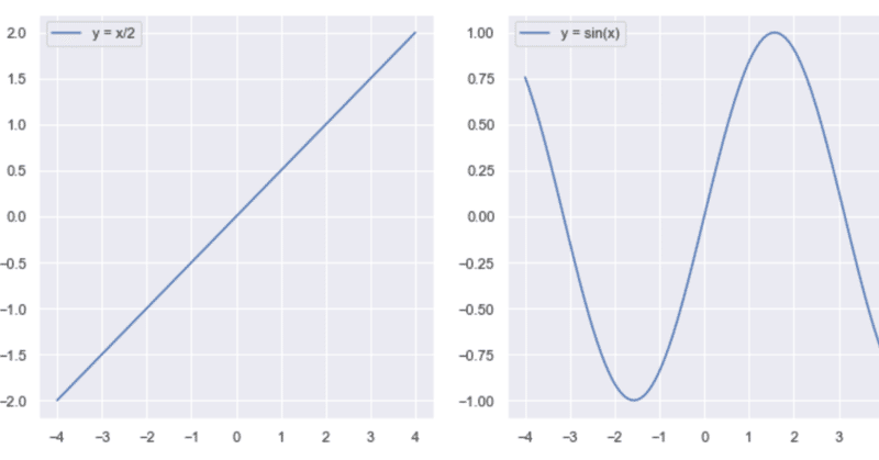
それぞれで1行2列のsubplotをすると以下のようになる
( 1 )ax = fig.add_subplot() を使った作成方法
データの用意
# module import
import numpy as np
import matplotlib.pyplot as plt
import seaborn as sns

#  データの用意
x = np.linspace(-4,4,100)
y_1 = x/2
y_2 = np.sin(x)

# Subplot

sns.set()
fig = plt.figure(figsize = (10,5))

ax1 = fig.add_subplot(1,2,1)
ax1.plot(x, y_1, label = 'y = x/2')
ax1.legend()

ax2 = fig.add_subplot(1,2,2)
ax2.plot(x, y_2, label = 'y = sin(x)')
ax2.legend()
fig.tight_layout()
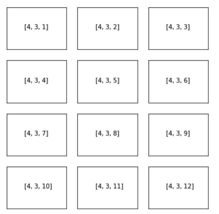
それぞれのplotの指定は[1,1,1]の形で表記する。[1,1,1]はそれぞれ[行,列,順番]を指定している(下記例参照)。
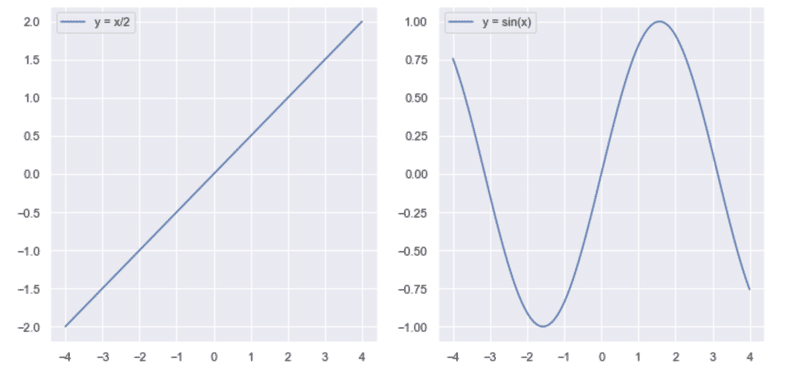
( 2 ) fig, ax = plt.subplot()を使った方法
まずplt.subplot()で行数と列数を指定する
(例) 2行1列の場合 fig, ax = plt.subplot(2,1)
その後,それぞれのaxesであるax[1], ax[2]についてplotを行う
sns.set()
fig, ax = plt.subplots(1,2, figsize = (10,5))
ax[0].plot(x, y_1, label = 'y = x/2')
ax[0].legend()
ax[1].plot(x, y_2, label = 'y = sin(x)')
ax[1].legend()
fig.tight_layout()
どちらでも同じsubplotができるが,個人的に(2)のfig, ax =plt.subplots()を使った描画方法の方がしっくりくるので今後こちらの方法をメインに使用して行こうと思う。
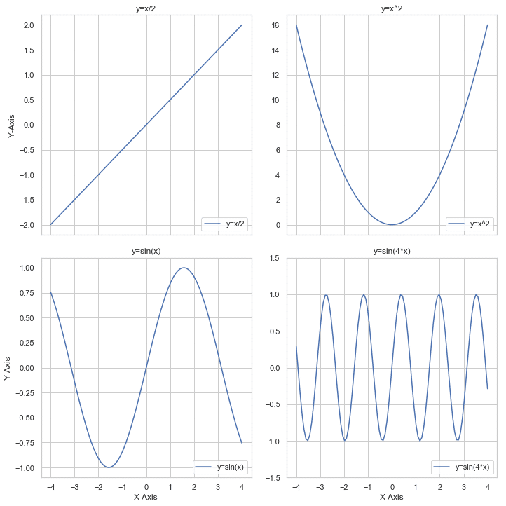
4列1行のsubplot例
下記のデータを使ってsubplotしてみる
# データ
x = np.linspace(-4,4,100)
y_1 = x/2
y_2 = np.sin(x)
y_3 = x**2
y_4 = np.sin(4*x)
# 4列1行の subplot
sns.set()
sns.set_style('whitegrid')
fig, ax = plt.subplots(4, 1, figsize = (5, 20)) #<-ここで4行1列の指定
# 'y=x/2', 'y=sin(x)', 'y=x^2', "y=sin(4*x)"
ax[0].plot(x, y_1, label = 'y=x/2')
ax[0].set(title ='y=x/2', xlabel = 'X-axis', ylabel = 'Y-axis')
ax[0].legend(loc='lower right')
ax[1].plot(x, y_2, label = 'y=sin(x)')
ax[1].set(title = 'y=sin(x)', xlabel = 'X-axis', ylabel = 'Y-axis')
ax[1].legend(loc='lower right')
ax[2].plot(x, y_3, label = 'y=x^2')
ax[2].set(title = 'y=x^2', xlabel = 'X-axis', ylabel = 'Y-axis')
ax[2].legend(loc='lower right')
ax[3].plot(x, y_4, label = 'y=sin(4*x)')
ax[3].set(title = 'y=sin(4*x)', ylim = (-1.5,1.5), xlabel = 'X-axis', ylabel = 'Y-axis')
# ↑labelと曲線が被るのでy軸の範囲を拡大
ax[3].legend(loc='lower right')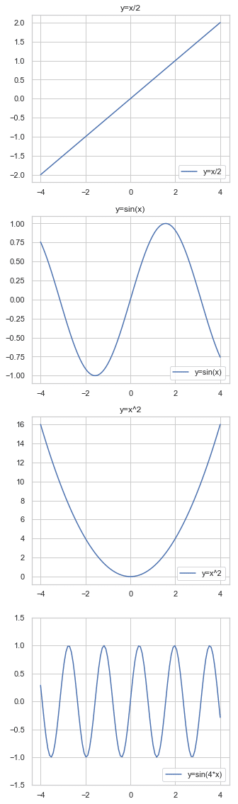
うん。できたけど,,,4回同じような設定をするコード書くのは面倒臭い→loopを使うべき。
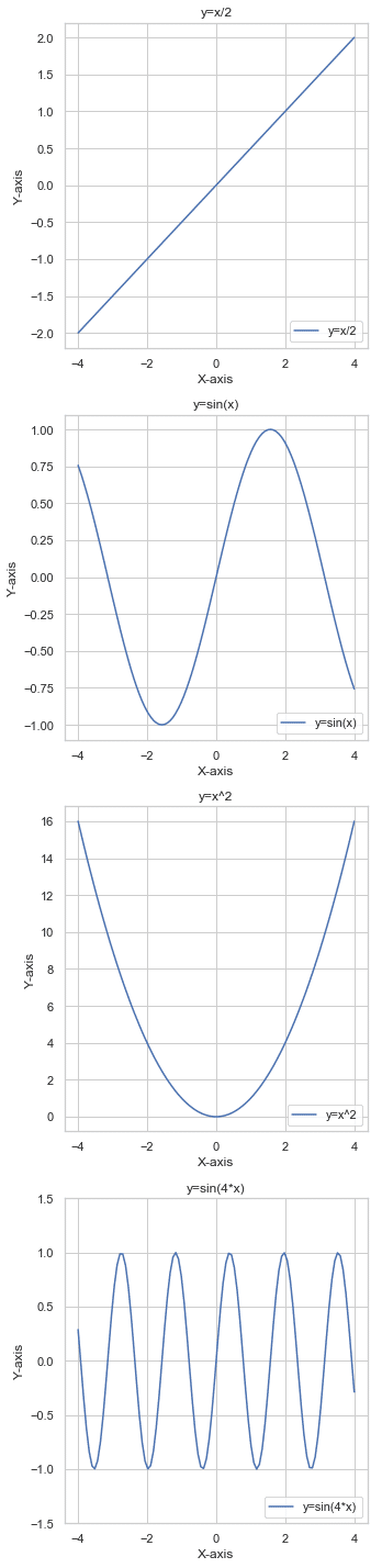
4列1行のsubplot(loopを使用)
 #ループで処理すると
sns.set()
sns.set_style('whitegrid')
fig, ax = plt.subplots(4, 1, figsize = (5, 20))
y_data = [y_1,y_2,y_3, y_4]
label=['y=x/2', 'y=sin(x)', 'y=x^2', 'y=sin(4*x)']

for i,j,k in zip(range(0,4), y_data, label):
    ax[i].plot(x, j, label = k)
    ax[i].set(title = (k), xlabel = 'X-axis', ylabel = 'Y-axis')
    ax[i].legend(loc ='lower right')

ax[3].set(ylim = (-1.5,1.5))
fig.tight_layout()
2行2列のsubplot
同じ4種類のデータを2行2列に
sns.set()
sns.set_style('whitegrid')
fig, ax = plt.subplots(2,2, figsize = (10,10))

ax[0,0].plot(x, y_1, label = 'y=x/2')
ax[0,0].set_title('y=x/2')
ax[0,0].legend(loc='lower right')

ax[1,0].plot(x, y_2, label = 'y=sin(x)')
ax[1,0].set_title('y=sin(x)')
ax[1,0].legend(loc='lower right')

ax[0,1].plot(x, y_3, label = 'y=x^2')
ax[0,1].set_title('y=x^2')
ax[0,1].legend(loc='lower right')

ax[1,1].plot(x, y_4, label = 'y=sin(4*x)')
ax[1,1].set_title('y=sin(4*x)')
ax[1,1].set(ylim = (-1.5,1.5))
ax[1,1].legend(loc='lower right')
fig.tight_layout()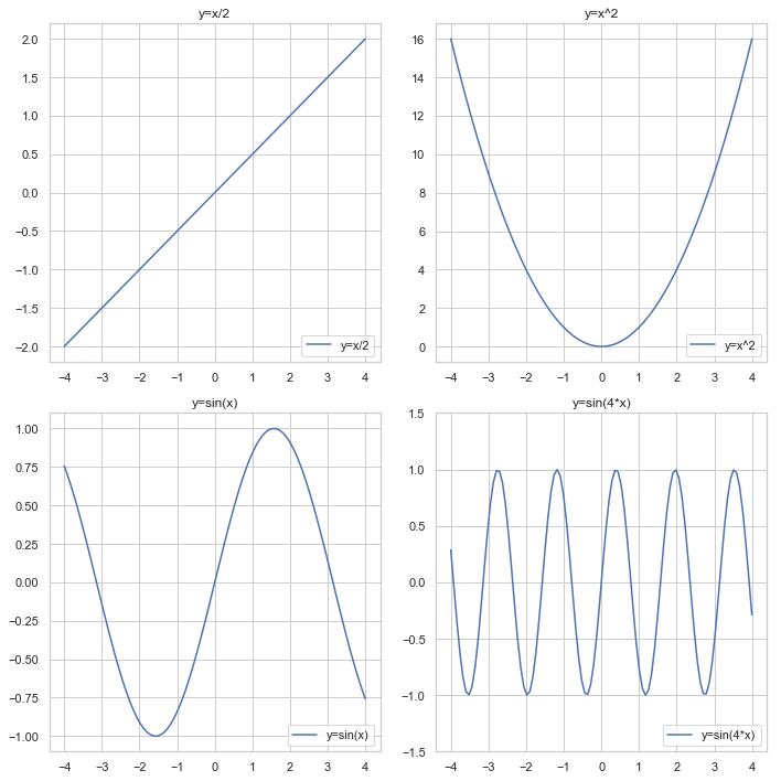
2行2列のsubplot(loopを使用)
#  loopを使って作成
sns.set()
sns.set_style('whitegrid')
fig, ax = plt.subplots(2,2, figsize = (10,10))

row = [0,1,0,1]
col = [0,0,1,1]
y_data = [y_1,y_2,y_3, y_4]
label=['y=x/2', 'y=sin(x)', 'y=x^2', 'y=sin(4*x)']

for i,j,k,l in zip(row,col,y_data,label):
    ax[i,j].plot(x, k, label = l)
    ax[i,j].set(title = l, xlabel = 'X axis', ylabel = 'Y axis')
    ax[i,j].legend(loc='lower right')

ax[1,1].set(ylim = (-1.5, 1.5))
fig.tight_layout()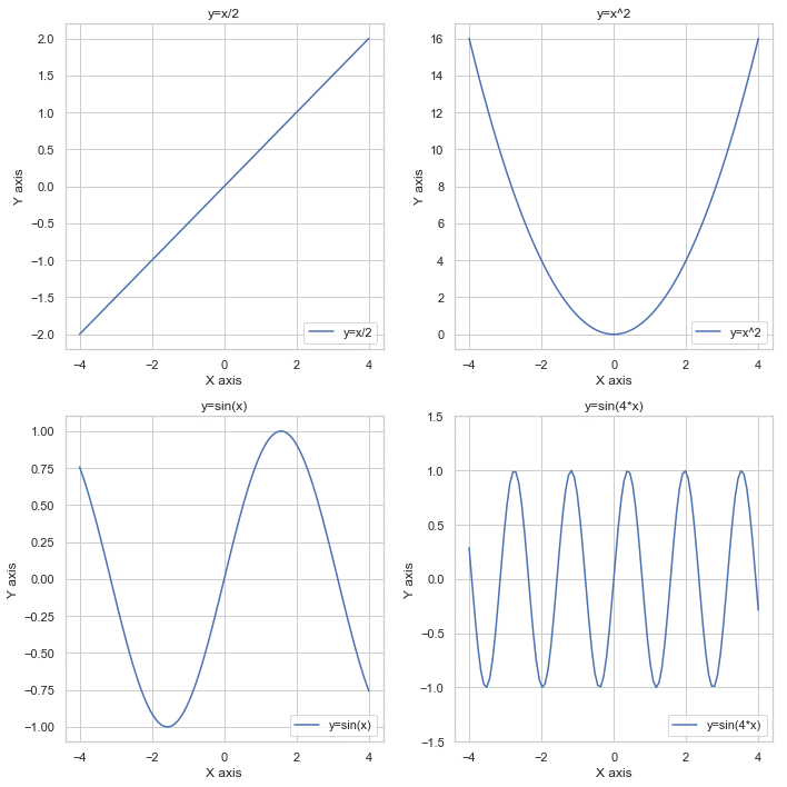
x軸 y軸の共有: sharex = 'col' , sharey = 'row'
supbplotで各プロットに同じlabelとticksが必要ない場合,共有することができる。
x軸のshare (sharex = 'col')
 #loopを使って作成
sns.set()
sns.set_style('whitegrid')
fig, ax = plt.subplots(2,2, sharex = 'col', figsize = (10,10))

row = [0,1,0,1]
col = [0,0,1,1]
y_data = [y_1,y_2,y_3, y_4]
label=['y=x/2', 'y=sin(x)', 'y=x^2', 'y=sin(4*x)']

for i,j,k,l in zip(row,col,y_data,label):
    ax[i,j].plot(x, k, label = l)
    ax[i,j].set(title = l)
    ax[i,j].legend(loc='lower right')

ax[1,1].set(ylim = (-1.5, 1.5))
fig.tight_layout()

for i in range(0,2):
    ax[i,0].set(ylabel = 'Y-Axis') #  0列目のみにylabel
    ax[1,i].set(xlabel = 'X-Axis') #  1行目のみにxlabel
最後3行のループで0列目と1行目のみに,それぞれylabel, xlabelを指定している。
Gridspecを使って2行2列のsubplot
上記の 「2行2列のsubplot」をGridspecを使って描く。
(それぞれのsubplotの場所指定が,左上から右に0.1.2.3... と続いていくので,煩雑な位置指定をしなくて済むのが良いようだ。)
from matplotlib import gridspec

sns.set()
sns.set_style('whitegrid')

fig = plt.figure(figsize = (10,10))
gs =gridspec.GridSpec(2,2)              # 2行2列の指定

y_data = [y_1,y_2,y_3, y_4]
label=['y=x/2', 'y=sin(x)', 'y=x^2', 'y=sin(4*x)']

for i, (j,k) in enumerate(zip(y_data,label)):
   ax = plt.subplot(gs[i])                # 'subplots' ではなく'subplot'
   ax.plot(x, j, label = k)
   ax.set(title = k, xlabel = 'X axis', ylabel = 'Y axis')
   ax.legend(loc='lower right')

plt.subplot(gs[3]).set(ylim = (-1.5, 1.5))
fig.tight_layout()
Gridspecで横に並べた2つのグラフのサイズを指定
二つのグラフを1:3の大きさで配置したいときなどに使う。
下記例では 横に1行2列に2つのグラフそれぞれ1:3の大きさで配置。
(同様の方法で2行2列のsubplotでもそれぞれのグラフのサイズを指定可能)
from matplotlib import gridspec

fig = plt.figure(figsize = (12,6))
gs = gridspec.GridSpec(1,2, width_ratios=[1,3])
#  1,2: 1行2列, width_ration1:3

ax0 = plt.subplot(gs[0]) #gsをまず指定
ax0.plot(x,y_3)
ax0.set(ylabel = 'Y-Axis')
ax0.set(xlabel = 'X-Axis')

ax1 = plt.subplot(gs[1])
ax1.plot(x,y_4)
ax1.set(xlabel = 'X-Axis')

fig.tight_layout()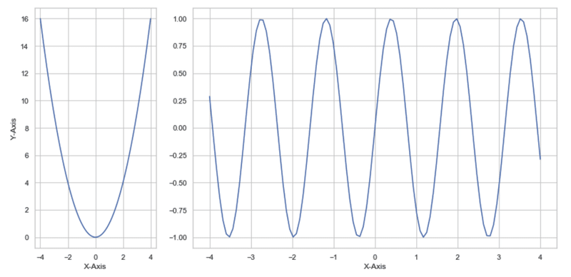
以上,理解が深まった気がする。
この記事が気に入ったらサポートをしてみませんか?