
AI 実装検定への道(14)

本シリーズは、久しぶりの更新です。
AI 実装検定 A級合格へ向けて学習を進めてきましたが、諸般の事情からこちらに回す工数が割けなくて、かなりな期間放置状態でした。下記内容もその当時まとめたもので、かなりサボり気味・・・しかし、第3章プログラミングにおける残りは、あと5講ほどとなっているので、なんとか年内に・・・無理かなぁ・・・AI 実装検定 A級合格へ向けて勉強再開します。
前回投稿が13回目で、引き続きGoogle Colaboratoryを利用してプログラミングの章を進めて書いています。もう14回目ということで、Google Colaboratoryの環境には、かなりのプログラム工数をかけてきました。
前回には、第22講公式テキスト267ページから『Matplotlibでグラフの可視化』へ突入し277ページまで進みました。グラフのラインを変えたり、プロットの図形を変えてみたり、さらにはカラーも変えられたり、若干お遊び要素も体験しつつ、進めてきました。
データの可視化を行うライブラリ「Matplotlib」を用いることにより、折れ線グラフ、密度分布や散布図などを作成しました。「plot」関数、linspace関数、それに「linestyle」でラインを変化させたり、scatter関数では「alpha=」を用いて透明度を変化させたり、当高線を表す「contour」と「contourf」関数も勉強しました。
今回は、公式テキスト278ページ『ヒストグラム』へ進みます。
(コード記述)
import numpy as np
import matplotlib.pyplot as plt
plt.hist(np.random.randh(1000))
(結果)のっけから間違い・・・randnだったね・・・
AttributeError Traceback (most recent call last)
<ipython-input-1-6f2416653af4> in <cell line: 4>()
2 import matplotlib.pyplot as plt
3
----> 4 plt.hist(np.random.randh(1000))
AttributeError: module 'numpy.random' has no attribute 'randh'
(コード記述)
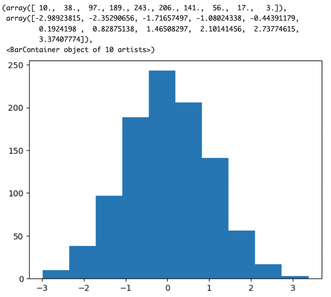
import numpy as np
import matplotlib.pyplot as plt
plt.hist(np.random.randn(1000))
(結果)
(コード記述)
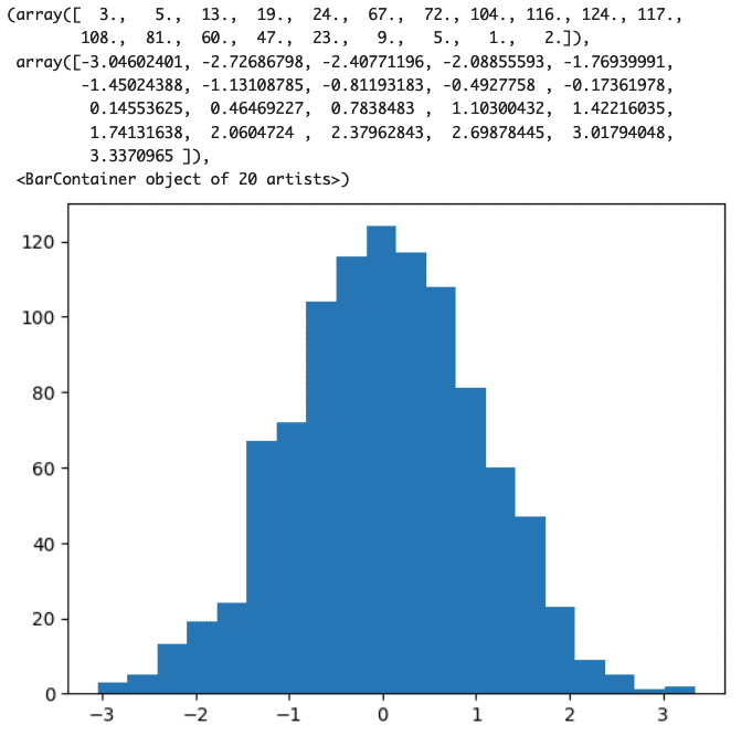
import numpy as np
import matplotlib.pyplot as plt
plt.hist(np.random.randn(1000), bins=20)
(結果)
(コード記述)
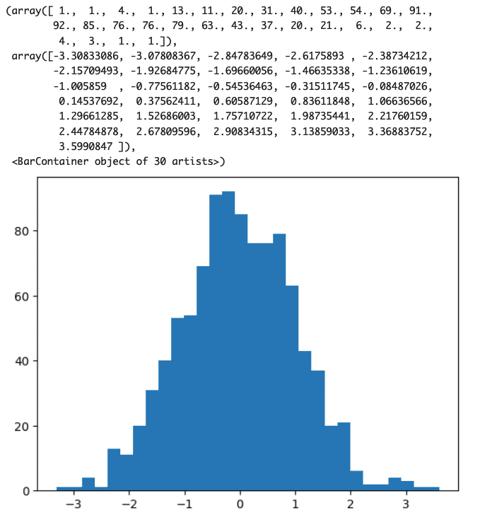
import numpy as np
import matplotlib.pyplot as plt
plt.hist(np.random.randn(1000), bins=30)
(結果)
次は、公式テキスト280ページ第23講『Matplotlibで見た目の変更』へ進みます。
Matplotlibで作ったグラフをよりカスタマイズして、メモリや凡例をつけたグラフを作っていくそうです。
(コード記述)
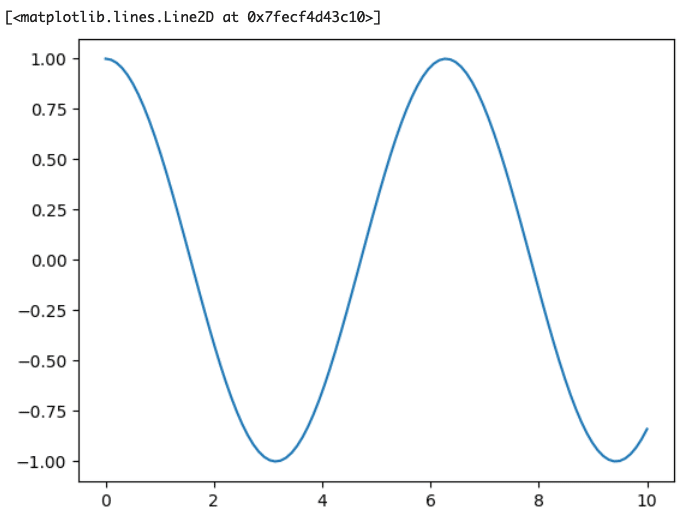
import matplotlib.pyplot as plt
import numpy as np
x=np.linspace(0,10,100)
fig=plt.figure()
x1=fig.add_subplot()
x1.plot(x, np.cos(x))
(結果)
(コード記述)
import matplotlib.pyplot as plt
import numpy as np
x=np.linspace(0,10,100)
fig=plt.figure()
x1=fig.add_subplot()
x1.plot(x, np.cos(x), label="cos x")
x1.plot(x, np.sin(x), label="sin x")
fig.legend()
(結果)
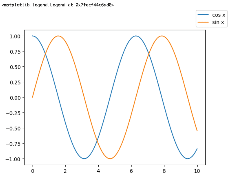
label=" " としてそのグラフに名前をつけてやり、legend関数を利用すると上のように凡例を表示することが出来るそうです。慣れ親しんだExcelのグラフのようになってきましたね。
(コード記述)
import matplotlib.pyplot as plt
import numpy as np
plt.style.use("seaborn-bright")
x=np.linspace(0,10,100)
fig=plt.figure()
x1=fig.add_subplot()
x1.plot(x, np.cos(x), label="cos x")
x1.plot(x, np.sin(x), label="sin x")
fig.legend()
(結果)
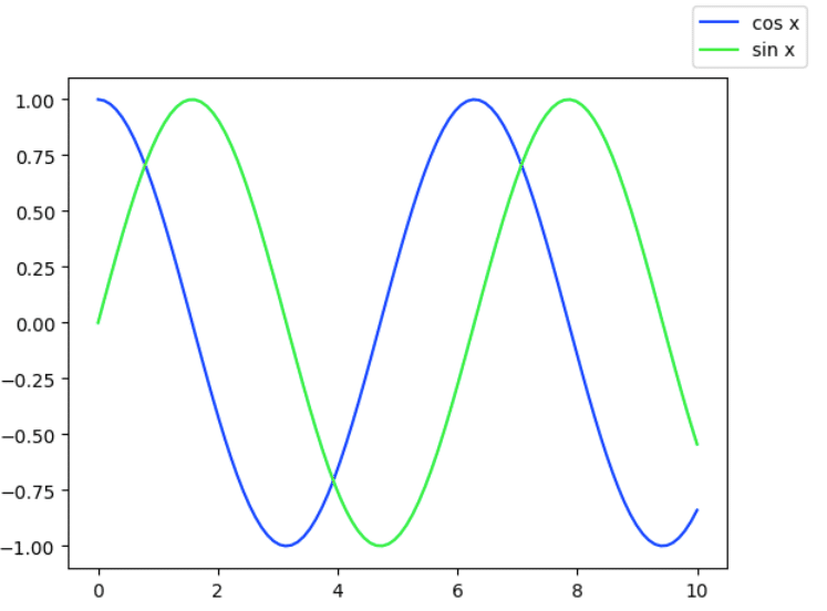
plt.style.use( )関数を利用することで、グラフのカラーテーマを与えてやることが出来るようです。カッコの中に適当なワードを入れてみます。
(コード記述)
import matplotlib.pyplot as plt
import numpy as np
plt.style.use("dry-red")
x=np.linspace(0,10,100)
fig=plt.figure()
x1=fig.add_subplot()
x1.plot(x, np.cos(x), label="cos x")
x1.plot(x, np.sin(x), label="sin x")
fig.legend()
(結果)
適当に「dry-red」と入れてやったら、下記のようなエラーです。
OSError: 'dry-red' is not a valid package style, path of style file, URL of style file, or library style name (library styles are listed in `style.available`)
style.availableと入れてやっても何も出てきませんでした。
あ、公式テキスト283ページに書いてありました!
(コード記述)
plt.style.available
(結果)
['Solarize_Light2',
'_classic_test_patch',
'_mpl-gallery',
'_mpl-gallery-nogrid',
'bmh',
'classic',
'dark_background',
'fast',
'fivethirtyeight',
'ggplot',
'grayscale',
'seaborn-v0_8',
'seaborn-v0_8-bright',
'seaborn-v0_8-colorblind',
'seaborn-v0_8-dark',
'seaborn-v0_8-dark-palette',
'seaborn-v0_8-darkgrid',
'seaborn-v0_8-deep',
'seaborn-v0_8-muted',
'seaborn-v0_8-notebook',
'seaborn-v0_8-paper',
'seaborn-v0_8-pastel',
'seaborn-v0_8-poster',
'seaborn-v0_8-talk',
'seaborn-v0_8-ticks',
'seaborn-v0_8-white',
'seaborn-v0_8-whitegrid',
'tableau-colorblind10']
って、いろいろなスタイルがあるんですね。
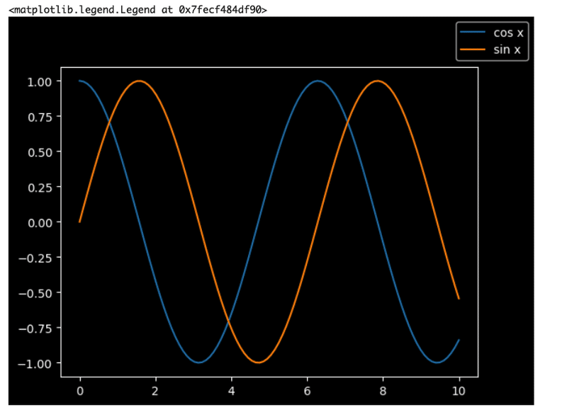
一番最後の「tableau-colorblind10」でやってみます。
(コード記述)
import matplotlib.pyplot as plt
import numpy as np
plt.style.use("tableau-colorblind10")
x=np.linspace(0,10,100)
fig=plt.figure()
x1=fig.add_subplot()
x1.plot(x, np.cos(x), label="cos x")
x1.plot(x, np.sin(x), label="sin x")
fig.legend()
(結果)
(コード記述)
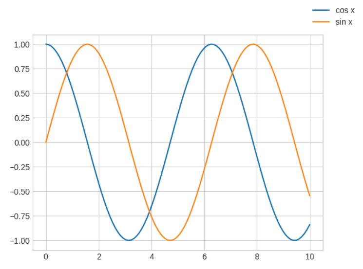
import matplotlib.pyplot as plt
import numpy as np
plt.style.use("seaborn-v0_8-whitegrid'")
x=np.linspace(0,10,100)
fig=plt.figure()
x1=fig.add_subplot()
x1.plot(x, np.cos(x), label="cos x")
x1.plot(x, np.sin(x), label="sin x")
fig.legend()
(結果)
次は、公式テキスト285ページ第24講『seaborn でグラフの可視化』へ進みます。前回勉強したように、「Matplotlib」と「seaborn」それぞれに特徴があるようですが、公式テキストではシンプルなグラフや日常遣いに「Matplotlib」、綺麗なグラフを用意して資料作成するには「seaborn」が有効と解説されていました。「Matplotlib」では描くのが少し難しい複雑なグラフを「seaborn」では描くことが出来るそうです。
アイリスのデータセットを使って進めていきます。
(コード記述)
import matplotlib.pyplot as plt
import seaborn as sns
plt.style.use("ggplot")
iris=sns.load_dataset("iris")
g=sns.PairGrid(iris, hue="species")
g.map(plt.scatter);
(結果)
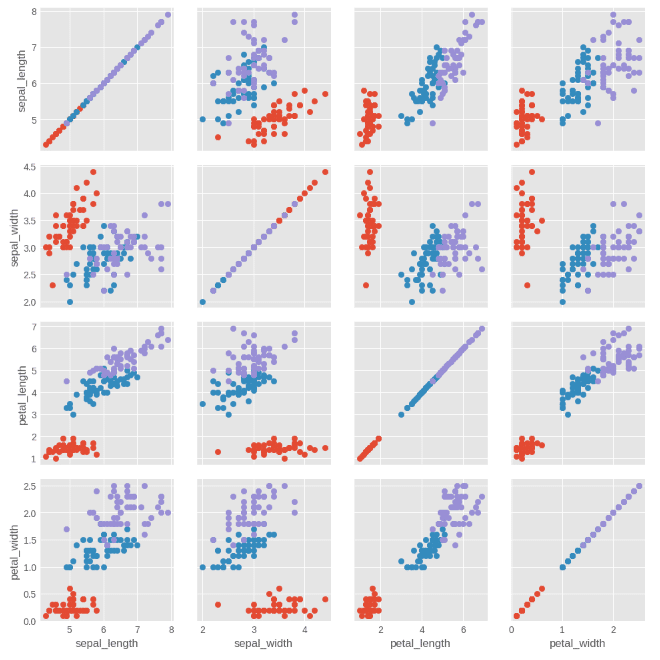
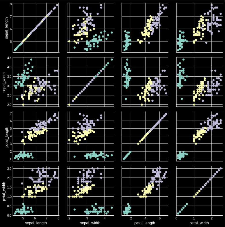
このようにアイリスのデータセットを利用して、萼片の長さ、幅、花びらの長さ、幅の関係性を分布図によって表すことができました。ちょっと、遊んでみましょう。「dark_background」と「seaborn-v0_8-colorblind」を試してみます。
(コード記述)
import matplotlib.pyplot as plt
import seaborn as sns
plt.style.use("dark_background")
iris=sns.load_dataset("iris")
g=sns.PairGrid(iris, hue="species")
g.map(plt.scatter);
(結果)
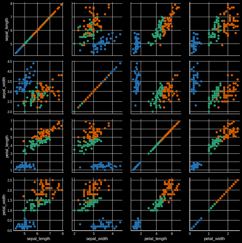
(コード記述)
import matplotlib.pyplot as plt
import seaborn as sns
plt.style.use("ggplot")
iris=sns.load_dataset("iris")
g=sns.PairGrid(iris, hue="species")
g.map(plt.scatter);
(結果)
次回は公式テキスト288ページへ進みます。
以上
この記事が気に入ったらサポートをしてみませんか?