
Python データの可視化 COVID-19の巻

厚労省やデジタル庁からコロナに関するオープンデータが入手可能なので、データ可視化の練習としてグラフ化する。グラフの調整など色々と細かい設定を使用したので、他のグラフ作成への応用も可能と思う。
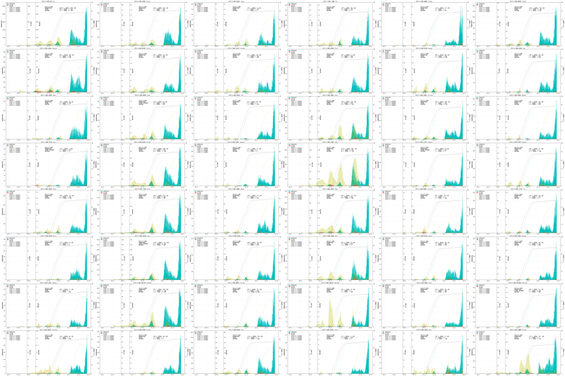
アウトプット
全国(最左上)と47都道府県それぞれの新規感染者数やワクチン接種率をグラフ化した。
データの出典
新規陽性者数、死亡者数、重症者数のデータは以下の厚生労働省のオープンデータを使用。
ワクチンの接種率は以下のデジタル庁のオープンデータを使用。
https://info.vrs.digital.go.jp/opendata/
都道府県の人口データは総務局のオープンデータを使用。
https://www.stat.go.jp/data/nihon/02.html
モジュールのインポート
import pandas as pd
import json
import matplotlib.pyplot as plt
import os
import datetime
plt.rcParams["font.family"] = "MS Gothic"
!python -V
print('pandas ' + pd.__version__)
Python 3.8.5
pandas 1.1.
データ読み込み 感染者数データ
url_infected = "https://covid19.mhlw.go.jp/public/opendata/newly_confirmed_cases_daily.csv"
df_infected = pd.read_csv(url_infected)
データ読み込み 死亡者数データ
url_death = "https://covid19.mhlw.go.jp/public/opendata/deaths_cumulative_daily.csv"
df_death = pd.read_csv(url_death)
データ読み込み 重症者数データ
url_severe = "https://covid19.mhlw.go.jp/public/opendata/severe_cases_daily.csv"
df_severe = pd.read_csv(url_severe)
データ読み込み ワクチン接種率データ
url_vaccine = "https://data.vrs.digital.go.jp/vaccination/opendata/latest/prefecture.ndjson"
# urllib.request.urlretrieve(url_vaccine, url_vaccine.split("/")[-1])
df_vaccined = pd.read_json(url_vaccine, lines=True)
df_vaccined["date"] = pd.to_datetime(df_vaccined["date"])
df_vaccined.to_csv("prefecture.csv")
データ読み込み 都道府県の人口データ
これだけURLからの直ではないので、一応データを貼っておく。
# 上記総務局のホームページからダウンロードしたローカルファイルの人口データを使用する。
file = "population.xlsx"
df_population = pd.read_excel(file, skiprows=4, skipfooter=3, usecols="B:C")
df_population.columns=["都道府県", "総数"]
df_population = pd.Series(df_population["総数"]*1000)
# 都道府県データの読み込み、リスト化
filename_prefecture ="todofuken.csv"
df_prefecture = pd.read_csv("todofuken.csv")
list_prefecture_name_en = df_prefecture["en"].tolist()
list_prefecture_name_jp = df_prefecture["name"].tolist()データのグラフ化
# いろいろ準備
i = 0; j = 0; k = 0
horizontal = 6 #横に並べるグラフ数
vertical = 8 #縦に並べるグラフ数
fig, ax1 = plt.subplots(vertical, horizontal, figsize=(14*horizontal, 7*vertical), dpi = 200)

# 全国、47都道府県、計48個のグラフを作成して並べる
for prefecture in list_prefecture_name_en:

    # 都道府県ごとの新規感染者のデータを抜き出し
    df_prefecture_infected = df_infected[prefecture]

    # 都道府県ごとの死者数データの抜き出しと整理
    df_prefecture_death = df_death[prefecture].reset_index(drop=True)
    df_prefecture_death_difference = pd.Series(df_prefecture_death[i+1]-df_prefecture_death[i] for i in range(0,len(df_prefecture_death)-1)) #各日の推移を算出。ただの引き算
    df_prefecture_death_difference[df_prefecture_death_difference < 0] = 0
    df_prefecture_death_difference_xaxis = pd.to_datetime(pd.Series(df_death['Date'][1:]))

    # 都道府県ごとの重症者数データの抜き出しと整理
    df_prefecture_severe = df_severe[prefecture]

    index = list_prefecture_name_en.index(prefecture)

    #都道府県ごとのワクチン接種データ 4回接種率
    if index == 0:
        #全国集計
        df_allold_4 = df_vaccined[(df_vaccined["status"]==4)].reset_index(drop=True)
    else:
        #都道府県用集計
        df_allold_4 = df_vaccined[(df_vaccined["prefecture"]==index) & (df_vaccined["status"]==4)].reset_index(drop=True)
    df_allold_addition_4 = pd.Series(df_allold_4[df_allold_4['date'] <= date]['count'].sum()  for date in pd.Series(df_allold_4['date'].unique())) #各日の推移を算出。
    df_vaccined_percent_allold_4 = df_allold_addition_4 / df_population[index] * 100

    #都道府県ごとのワクチン接種データ 3回接種率
    if index == 0:
        #全国集計
        df_allold_3 = df_vaccined[(df_vaccined["status"]==3)].reset_index(drop=True)
    else:
        #都道府県用集計
        df_allold_3 = df_vaccined[(df_vaccined["prefecture"]==index) & (df_vaccined["status"]==3)].reset_index(drop=True)
    df_allold_addition_3 = pd.Series(df_allold_3[df_allold_3['date'] <= date]['count'].sum()  for date in pd.Series(df_allold_3['date'].unique())) #各日の推移を算出。
    df_vaccined_percent_allold_3 = df_allold_addition_3 / df_population[index] * 100

    #都道府県ごとのワクチン接種データ 2回接種率
    if index == 0:
        #全国集計
        df_allold_2 = df_vaccined[(df_vaccined["status"]==2)].reset_index(drop=True)
    else:
        #都道府県用集計
        df_allold_2 = df_vaccined[(df_vaccined["prefecture"]==index) & (df_vaccined["status"]==2)].reset_index(drop=True)
    df_allold_addition_2 = pd.Series(df_allold_2[df_allold_2['date'] <= date]['count'].sum()  for date in pd.Series(df_allold_2['date'].unique())) #各日の推移を算出。
    df_vaccined_percent_allold_2 = df_allold_addition_2 / df_population[index]* 100

    #都道府県ごとのワクチン接種データ 1回接種率
    if index == 0:
        #全国集計
        df_allold_1 = df_vaccined[(df_vaccined["status"]==1)].reset_index(drop=True)
    else:
        #都道府県用集計
        df_allold_1 = df_vaccined[(df_vaccined["prefecture"]==index) & (df_vaccined["status"]==1)].reset_index(drop=True)
    df_allold_addition_1 = pd.Series(df_allold_1[df_allold_1['date'] <= date]['count'].sum()  for date in pd.Series(df_allold_1['date'].unique())) #各日の推移を算出。
    df_vaccined_percent_allold_1 = df_allold_addition_1 / df_population[index] * 100

    #グラフ作成
    ax1[i][j].bar(pd.to_datetime(pd.Series(df_infected['Date'])), df_prefecture_infected, width=1, alpha = 1, color='c', label="新規感染者数")
    ax1[i][j].set_ylabel("新規感染者数", fontsize=12)
    ax1[i][j].set_ylim([0, df_prefecture_infected.max() + df_prefecture_infected.max()/10])

    ax2 = ax1[i][j].twinx()
    ax2.bar(df_prefecture_death_difference_xaxis, df_prefecture_death_difference, width=1, alpha = 0.7, color='r', label="死亡者数")
    ax2.set_ylabel("死亡者数", fontsize=12)
    ax2.set_ylim([0, (df_prefecture_infected.max() + df_prefecture_infected.max()/10)/25])
    ax2.spines["right"].set_position(("axes", 0.25))

    ax3 = ax1[i][j].twinx()
    ax3.bar(pd.to_datetime(pd.Series(df_severe['Date'])), df_prefecture_severe, width=1, alpha = 0.3, color='y', label="重症者数")
    ax3.set_ylabel("重症者数", fontsize=12)
    ax3.set_ylim([0, (df_prefecture_infected.max() + df_prefecture_infected.max()/10)/25])
    ax3.spines["right"].set_position(("axes", 0.35))

    ax4 = ax1[i][j].twinx()
    ax4.plot(pd.Series(df_allold_4['date'].unique()), df_vaccined_percent_allold_4, alpha = 0.7, color='g', label="全年齢ワクチン4回接種率", lw=2, linestyle = "dotted")
    ax4.set_ylabel("ワクチン接種率", fontsize=12)
    ax4.set_ylim([0, 100])

    ax5 = ax1[i][j].twinx()
    ax5.plot(pd.Series(df_allold_3['date'].unique()), df_vaccined_percent_allold_3, alpha = 0.7, color='y', label="全年齢ワクチン3回接種率", lw=2, linestyle = "dotted")
    ax5.set_ylim([0, 100])

    ax6 = ax1[i][j].twinx()
    ax6.plot(pd.Series(df_allold_2['date'].unique()), df_vaccined_percent_allold_2, alpha = 0.7, color='c', label="全年齢ワクチン2回接種率", lw=2, linestyle = "dotted")
    ax6.set_ylim([0, 100])

    ax7 = ax1[i][j].twinx()
    ax7.plot(pd.Series(df_allold_1['date'].unique()), df_vaccined_percent_allold_1, alpha = 0.7, color='r', label="全年齢ワクチン1回接種率", lw=2, linestyle = "dotted")
    ax7.set_ylim([0, 100])

    #最新の数値情報の表示
    text_horizontal = pd.to_datetime(pd.Series(df_infected["Date"]).reset_index(drop=True)[int(len(df_prefecture_infected)/2.2)])
    text_vertical = df_prefecture_infected.max()

    date_last = pd.Series(df_infected["Date"]).reset_index(drop=True)[len(df_prefecture_infected)-1]

    infected_lastday = df_prefecture_infected.iat[-1]
    infected_ratio = df_prefecture_infected.iat[-1] - df_prefecture_infected.iat[-8]
    if infected_ratio > 0:
        text_infected_in_de = "増"
    elif infected_ratio == 0:
        text_infected_in_de = ""
    else:
        text_infected_in_de = "減"
        infected_ratio = abs(infected_ratio)

    if infected_lastday == df_prefecture_infected.max():
        text_infected_max = "(過去最高)"
    else:
        text_infected_max = "      "

    death_lastday = df_prefecture_death_difference[len(df_prefecture_death_difference)-1]
    death_ratio = df_prefecture_death_difference[len(df_prefecture_death_difference)-1] - df_prefecture_death_difference[len(df_prefecture_death_difference)-8]
    if death_ratio > 0:
        text_death_in_de = "増"
    elif death_ratio == 0:
        text_death_in_de = ""
    else:
        text_death_in_de = "減"
        death_ratio = abs(death_ratio)

    if death_lastday == df_prefecture_death_difference.max():
        text_death_max = "(過去最高)"
    else:
        text_death_max = "      "

    severe_lastday = df_prefecture_severe.iat[-1]
    severe_ratio = df_prefecture_severe.iat[-1] - df_prefecture_severe.iat[-8]
    if severe_ratio > 0:
        text_severe_in_de = "増"
    elif severe_ratio == 0:
        text_severe_in_de = ""
    else:
        text_severe_in_de = "減"
        severe_ratio = abs(severe_ratio)

    if severe_lastday == df_prefecture_severe.max():
        text_severe_max = "(過去最高)"
    else:
        text_severe_max = "      "

    ax1[i][j].text(text_horizontal, text_vertical, date_last + " 発表" + \
             "\n新規感染者数" + text_infected_max + ":" + str(infected_lastday) + " 人"  + "(前週比:" + str(infected_ratio) + " 人" + text_infected_in_de + ") " +\
             "\n死者数" + text_death_max + "   :"+ str(death_lastday) + " 人"  + "(前週比:" + str(death_ratio) + " 人" + text_death_in_de + ") "  +\
             "\n重症者数" + text_severe_max + "  :"+ str(severe_lastday) + " 人"  + "(前週比:" + str(severe_ratio) + " 人" + text_severe_in_de + ") "  , size=12, verticalalignment='top', fontweight="bold")

    ax1[i][j].grid(axis='x',linestyle='--', color='g', linewidth=0.1)
    ax1[i][j].grid(axis='y',linestyle='--', color='g', linewidth=0.1)

    # 凡例作成
    handler1, label1 = ax1[i][j].get_legend_handles_labels()
    handler2, label2 = ax2.get_legend_handles_labels()
    handler3, label3 = ax3.get_legend_handles_labels()
    handler4, label4 = ax4.get_legend_handles_labels()
    handler5, label5 = ax5.get_legend_handles_labels()
    handler6, label6 = ax6.get_legend_handles_labels()
    handler7, label7 = ax7.get_legend_handles_labels()

    ax1[i][j].legend(handler1 + handler2 + handler3 + handler4 + handler5 + handler6 + handler7, label1 + label2 + label3 + label4 + label5 + label6 + label7, loc="upper left")
    ax1[i][j].set_title('COVID-19 推移 ' + list_prefecture_name_jp[k] + "  " +list_prefecture_name_en[k] )

    k = k + 1
    if i == vertical - 1:
        i = 0
        j = j + 1
    else:
        i = i + 1

fig.tight_layout()
plt.savefig("covid19_graph.png")
fig.clf()
plt.close()この記事が気に入ったらサポートをしてみませんか?