blade系package(2) - blade-ui-kit/blade-icons (とか)で heroicon

heroiconはtailwind cssと親和性の高いアイコンセットであーるが、まあ、bootstrapな環境でも何とかなるやろみたいな感じでやっていこう。前回のセットアップの続きで行っていくよ
(前回まで)
% ./vendor/bin/sail composer require owenvoke/blade-fontawesomeみたいな事をしていた
なので今回は
% ./vendor/bin/sail composer require blade-ui-kit/blade-heroicons
./composer.json has been updated
Running composer update blade-ui-kit/blade-heroicons
Loading composer repositories with package information
Updating dependencies
Lock file operations: 1 install, 0 updates, 0 removals
  - Locking blade-ui-kit/blade-heroicons (2.1.0)
Writing lock file
Installing dependencies from lock file (including require-dev)
Package operations: 1 install, 0 updates, 0 removals
  - Downloading blade-ui-kit/blade-heroicons (2.1.0)
  - Installing blade-ui-kit/blade-heroicons (2.1.0): Extracting archive
Generating optimized autoload files
みたいな感じになる。sailを使ってなければ単純に
composer require blade-ui-kit/blade-heroicons使ってみる
heroiconsは基本的にはsvgでの提供だったりするから
<svg xmlns="http://www.w3.org/2000/svg" fill="none" viewBox="0 0 24 24" strokeWidth={1.5} stroke="currentColor" className="w-6 h-6">
  <path strokeLinecap="round" strokeLinejoin="round" d="M15.75 5.25a3 3 0 013 3m3 0a6 6 0 01-7.029 5.912c-.563-.097-1.159.026-1.563.43L10.5 17.25H8.25v2.25H6v2.25H2.25v-2.818c0-.597.237-1.17.659-1.591l6.499-6.499c.404-.404.527-1 .43-1.563A6 6 0 1121.75 8.25z" />
</svg>
鍵アイコンだったらこんな感じなのである。とはいえ今回はblade-iconを使うのでまず 検索してみよう
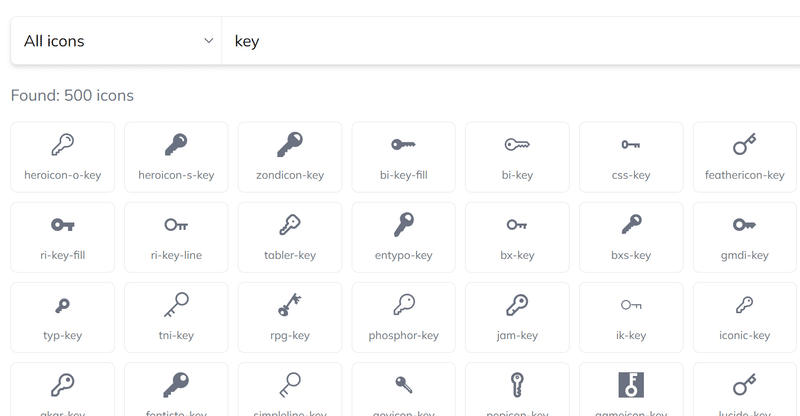
もの凄い量の鍵アイコンが出てくるが、hero系は
heroicon-o-key
heroicon-s-key
あたりである事がわかる。では載せてみましょう
<label for="password" class="col-md-4 col-form-label text-md-end"><x-heroicon-s-key /> {{ __('Password') }}</label>
このようにどうしても失敗するので、やはり縦横は指定しておけという。
<label for="password" class="col-md-4 col-form-label text-md-end"><x-heroicon-s-key width="16" height="16" /> {{ __('Password') }}</label>

とまあ、いろんなアイコンセットから好きなやつを似たような感覚で使えるので、これは便利っちゃ便利なんじゃなかろうか
width heightを自動的に付与する方法
前はcss classでも切ったらいいんじゃないかといってたんだけどconfigにありやした
    /*
    |--------------------------------------------------------------------------
    | Global Default Attributes
    |--------------------------------------------------------------------------
    |
    | This config option allows you to define some attributes which
    | will be applied by default to all icons.
    |
    */

    'attributes' => [
         'width' => 16,
         'height' => 16,
    ],
こんな風味に16x16なんかにしてあげれば
                            <label for="email" class="col-md-4 col-form-label text-md-end"><x-fas-envelope /> {{ __('Email Address') }}</label>

                            <div class="col-md-6">

                                <input id="email" type="email" class="form-control @error('email') is-invalid @enderror" name="email" value="{{ old('email') }}" required autocomplete="email" autofocus>

                                @error('email')
                                    <span class="invalid-feedback" role="alert">
                                        <strong>{{ $message }}</strong>
                                    </span>
                                @enderror
                            </div>
                        </div>

                        <div class="row mb-3">
                            <label for="password" class="col-md-4 col-form-label text-md-end"><x-heroicon-s-key /> {{ __('Password') }}</label>
こういうwidth height無し指定でいいわけだね

捗りそうですか?ではまた
この記事が気に入ったらサポートをしてみませんか?