AIとtailwind cssで学ぶgridとflexbox

これ関連
ちなみにchatgptに聞きまくるけど嘘っぽいものも入ってるかもしれないからそこは適当にね
レイアウトシステムの変遷
まちょっとコンテナクエリとかは置いといて…今回は主にflexboxとcss gridってことになりますね
flexboxのサンプル
tailwind cssはセットアップ済みです。まずflexboxのサンプルコードをお願いしますまあいろいろズバっと出力してもろた
  <body class="p-10">

    <!-- 水平にアイテムを並べる例 -->
    <div class="mb-10">
      <h2 class="text-lg mb-2">水平にアイテムを並べる例:</h2>
      <div class="flex">
        <div class="bg-blue-500 text-white p-4">Item 1</div>
        <div class="bg-red-500 text-white p-4">Item 2</div>
        <div class="bg-green-500 text-white p-4">Item 3</div>
      </div>
    </div>

    <!-- 垂直にアイテムを並べる例 -->
    <div class="mb-10">
      <h2 class="text-lg mb-2">垂直にアイテムを並べる例:</h2>
      <div class="flex flex-col">
        <div class="bg-blue-500 text-white p-4">Item 1</div>
        <div class="bg-red-500 text-white p-4">Item 2</div>
        <div class="bg-green-500 text-white p-4">Item 3</div>
      </div>
    </div>

    <!-- アイテムを中央に配置する例 -->
    <div class="mb-10">
      <h2 class="text-lg mb-2">アイテムを中央に配置する例:</h2>
      <div class="flex justify-center items-center h-32">
        <div class="bg-blue-500 text-white p-4">Centered Item</div>
      </div>
    </div>

    <!-- スペースを均等に分配する例 -->
    <div class="mb-10">
      <h2 class="text-lg mb-2">スペースを均等に分配する例:</h2>
      <div class="flex justify-between">
        <div class="bg-blue-500 text-white p-4">Item 1</div>
        <div class="bg-red-500 text-white p-4">Item 2</div>
        <div class="bg-green-500 text-white p-4">Item 3</div>
      </div>
    </div>

  </body>
ドバっとやってもわかり辛いので、まずは横方面から見てみよう
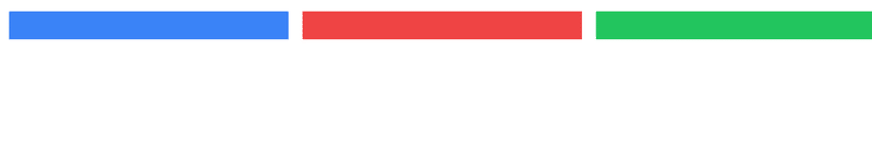
水平方面のflexbox
基本形
      <div class="flex">
        <div class="bg-blue-500 text-white p-4">Item 1</div>
        <div class="bg-red-500 text-white p-4">Item 2</div>
        <div class="bg-green-500 text-white p-4">Item 3</div>
      </div>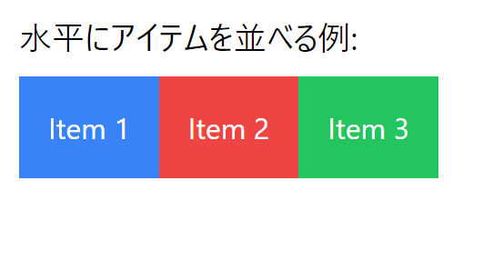
中に入ってる文字にあわせてboxが形成される。この例だと文字にさらにpadding (p-4)が入っているので間隔が空いている。それすらも取り除けばこのようになるだろう
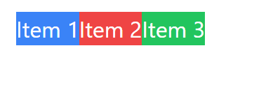
これはダセエので、p-4が与えられている。このp-4の4って数字はまあまあ自由に変えられるからね。(tableレイアウトでいうとtdのcellが3つ並んでるイメージになるだろう)
今、左に寄ってるので、画面目一杯に伸ばしてみよう
<div class="flex">
  <div class="flex-grow bg-blue-500 text-white p-4">Item 1</div>
  <div class="flex-grow bg-red-500 text-white p-4">Item 2</div>
  <div class="flex-grow bg-green-500 text-white p-4">Item 3</div>
</div>このようにflex-growを与えると3要素が全部伸びようとして結果、3等分される

これをたとえば真ん中だけflex-growにして後は無指定にしてみようすると
      <div class="flex">
        <div class="bg-blue-500 text-white p-4">Item 1</div>
        <div class="flex-grow bg-red-500 text-white p-4">Item 2</div>
        <div class="bg-green-500 text-white p-4">Item 3</div>
      </div>
まあ大体の予想通り?真ん中が目一杯伸びて後はそれぞれ頑張っているみたいな感じになる。
さて、この例だと気付き辛いかもしれないが(Item 1とかが皆文字幅が同じなので)。冒頭にも書いたように基本的に文字長とpaddingに支配されるため、以下のように長いテキストだとflexboxはそれこそフレキシブルに伸び縮みする
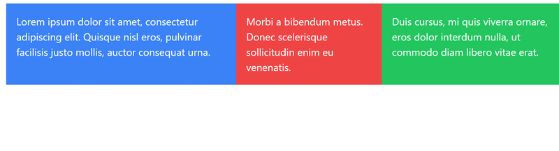
これを等分割にしようと思うとflexboxだと面倒くせえから、gridを使う
gridで等分割
      <div class="grid grid-cols-3 gap-4">
        <div class="flex bg-blue-500 text-white p-4">
          Lorem ipsum dolor sit amet, consectetur adipiscing elit. Quisque nisl eros, pulvinar facilisis justo mollis, auctor consequat urna.
        </div>
        <div class="flex bg-red-500 text-white p-4">
          Morbi a bibendum metus. Donec scelerisque sollicitudin enim eu venenatis.
        </div>
        <div class="flex bg-green-500 text-white p-4">
          Duis cursus, mi quis viverra ornare, eros dolor interdum nulla, ut commodo diam libero vitae erat.
        </div>
      </div>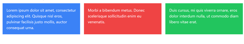
とまあこんな感じになる。これは極端は話、文字が入ってなくてもそうなる
すなわちflex-growしなくても伸びるわけで、これがgridである。gridを使うとこのように分割して中のスペースを自動的に確保する感じであーる。
垂直方面のflexbox
    <!-- 垂直にアイテムを並べる例 -->
    <div class="mb-10">
      <h2 class="text-lg mb-2">垂直にアイテムを並べる例:</h2>
      <div class="flex flex-col">
        <div class="bg-blue-500 text-white p-4">Item 1</div>
        <div class="bg-red-500 text-white p-4">Item 2</div>
        <div class="bg-green-500 text-white p-4">Item 3</div>
      </div>
    </div>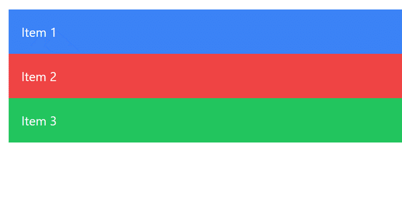
そもそもなんだけど、divつのは基本的に縦に落ちますわね。ただまあよく見られるのはこのようなcard型レイアウトである
  <h2 class="text-lg mb-2">垂直にアイテムを並べるカード例:</h2>
  <div class="flex flex-col gap-4">
    <!-- Card 1 -->
    <div class="border rounded p-4">
      <h3 class="text-md font-semibold mb-2">Title 1</h3>
      <p class="text-sm">
        Lorem ipsum dolor sit amet, consectetur adipiscing elit. Fusce varius dapibus est, a accumsan orci bibendum eu.
      </p>
    </div>
  </div>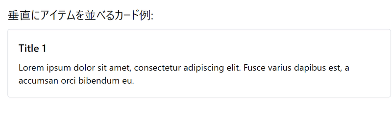
ここで出てくるgapつのは中のmarginを自動設定するようなもので、まあ以下の説明を出してくれたので貼りつけます

まなんつかうまいこと指定するとmarginをちょこちょこ書くより遥かに楽だぞっと。
flexとgridを組み合わせる
今、縦のcard型flexboxが出てるんで、まあこれはもうgridしてみましょうと
<div class="mb-10">
  <h2 class="text-lg mb-2">横にアイテムを並べるカード例:</h2>
  <div class="grid grid-cols-3 gap-4">
    <!-- Card 1 -->
    <div class="border rounded p-4">
      <h3 class="text-md font-semibold mb-2">Title 1</h3>
      <p class="text-sm">
        Lorem ipsum dolor sit amet, consectetur adipiscing elit. Fusce varius dapibus est, a accumsan orci bibendum eu.
      </p>
    </div>
    <!-- Card 2 -->
    <div class="border rounded p-4">
      <h3 class="text-md font-semibold mb-2">Title 2</h3>
      <p class="text-sm">
        Morbi volutpat, ante nec viverra eleifend, metus nisl congue libero, a aliquam diam erat non est.
      </p>
    </div>
    <!-- Card 3 -->
    <div class="border rounded p-4">
      <h3 class="text-md font-semibold mb-2">Title 3</h3>
      <p class="text-sm">
        Pellentesque habitant morbi tristique senectus et netus et malesuada fames ac turpis egestas.
      </p>
    </div>
  </div>
</div>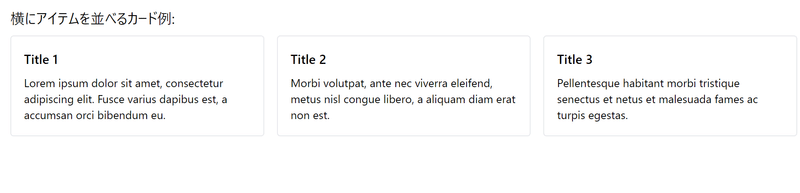
とまあこのようにうまいことやってくれる。ちなみに文字が伸びても縦方面は揃う

もうちょっとだけ複雑なflex
    <div class="flex border h-24">
      <div>Left</div>
      <div>Center</div>
      <div>Right</div>
    </div>

    <br>

    <div class="flex justify-between border h-24">
      <div>Left</div>
      <div>Center</div>
      <div>Right</div>
    </div>

    <br>

    <div class="flex justify-between items-center border h-24">
      <div>Left</div>
      <div>Center</div>
      <div>Right</div>
    </div>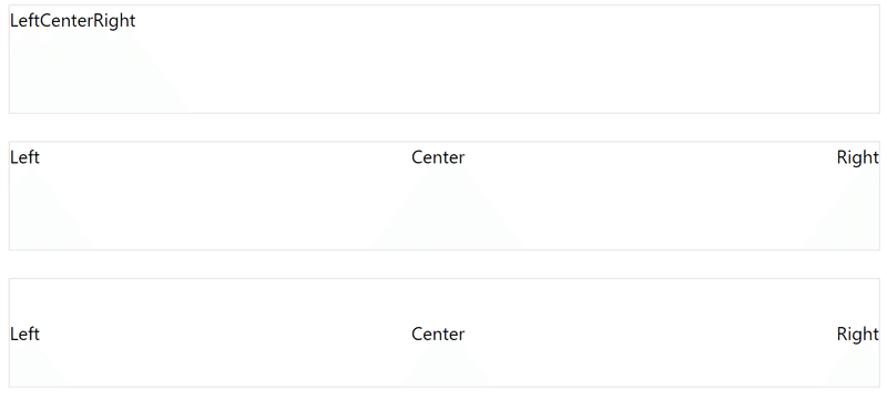
justify betweenは等間隔に割られ、items-centerはboxの縦中央に来てるのがわかる。この「等間隔」はdivに依るので
    <div class="flex justify-between items-center border h-24">
      <div>Left</div>
      <div>
        Center
        Right
      </div>
    </div>
こうすれば
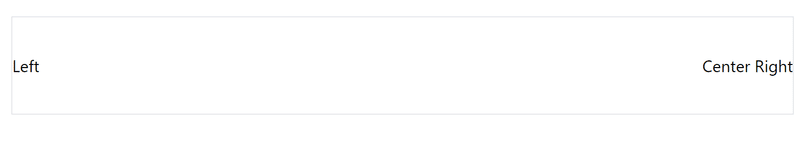
こうなる。
これが使われる例としてはcardのヘッダでボタンを配置するなど
    <div class="flex justify-between items-center border h-24 p-4">
      <div>Header</div>
      <div>
        <button class="bg-blue-500 text-white px-4 py-1">Cancel</button>
        <button class="bg-yellow-400 text-white px-4 py-1">Save</button>
      </div>
    </div>
最終的にデザインを整えれば…
    <div class="border">
      <div class="flex justify-between items-center border-b p-4">
        <div>Header</div>
        <div>
          <button class="bg-blue-500 text-white px-4 py-1">Cancel</button>
          <button class="bg-yellow-400 text-white px-4 py-1">Save</button>
        </div>
      </div>
      <div class="p-4">
        test
      </div>
    </div>

とまあ昔floatを使っていたかもしれないようなレイアウトがすぐできるので、floatは避けましょうと。
これをさらにgridで配置すると
    <div class="grid grid-cols-3 gap-4">
      <!-- Card 1 -->
      <div class="border">
        <div class="flex justify-between items-center border-b p-4">
          <div>Header 1</div>
          <div>
            <button class="bg-blue-500 text-white px-4 py-1">Cancel</button>
            <button class="bg-yellow-400 text-white px-4 py-1">Save</button>
          </div>
        </div>
        <div class="p-4">
          Test 1
        </div>
      </div>
      <!-- Card 2 -->
      <div class="border">
        <div class="flex justify-between items-center border-b p-4">
          <div>Header 2</div>
          <div>
            <button class="bg-blue-500 text-white px-4 py-1">Cancel</button>
            <button class="bg-yellow-400 text-white px-4 py-1">Save</button>
          </div>
        </div>
        <div class="p-4">
          Test 2
        </div>
      </div>
      <!-- Card 3 -->
      <div class="border">
        <div class="flex justify-between items-center border-b p-4">
          <div>Header 3</div>
          <div>
            <button class="bg-blue-500 text-white px-4 py-1">Cancel</button>
            <button class="bg-yellow-400 text-white px-4 py-1">Save</button>
          </div>
        </div>
        <div class="p-4">
          Test 3
        </div>
      </div>
    </div>
こうなるんだけど場合によっては

こうなったりもするので flex-shrink-0 (縮まない) を与えたりして無理やり並べる事もできるが、結局画面が小さくなると文字が埋まったりもするので、ちゃんとレスポンシブデザインに対応してclassを配置してネって事に最終的にはなるんだろうと思うけどさすがに今回はここまで!
この記事が気に入ったらサポートをしてみませんか?