
Qt6 QML 和訳文書 P102~P114

Layout Items
QML provides a flexible way to layout items using anchors. The concept of anchoring is fundamental to Item , and is available to all visual QML elements. Anchors act like a contract and are stronger than competing geometry changes. Anchors are expressions of relativeness; you always need a related element to anchor with.
「QMLはアンカーを使って柔軟な方法をレイアウトアイテムへ提供します。アンカーのコンセプトはアイテムを基本としていて、全ての可視QML要素で利用可能です。アンカーは契約のように動き、①競合しているジオメトリよりも強いのです。②アンカーは相対性の式です。あなたは常にアンカーを付ける相対的な要素を必要とします。」
①geometryで、可視要素は位置とサイズを決定できますが、この「位置決め」という点では、アンカーレイアウトの機能と競合関係になります。その時、どちらが優先されるかというと、アンカーレイアウトの機能が優先されるということです。
②アンカーは、ただ一つの可視要素だけがあるのでは機能しません。他の可視要素があり、それとの関係でどの位置にあるのか?ということを問題にします。それが、「あなたは常にアンカーを付ける相対的な要素を必要とします。」の意味です。
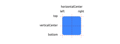
An element has 6 major anchor lines ( top , bottom , left , right , horizontalCenter , verticalCenter ). Additionally, there is the baseline anchor for text in Text elements. Each anchor line comes with an offset. In the case of the top , bottom , left , and right anchors, they are called margins. For horizontalCenter , verticalCenter and baseline they are called offsets.
「ある要素は6つの主なアンカーラインを持ちます。(top, bottom, left, right, horizontalCenter, verticalCenter).加えて、Text要素にはテキストのためのベースラインアンカーがあります。①それぞれのアンカーラインはオフセットを持ちます。top, bottom, left,そしてrightアンカーの場合、それらはmarginsと呼ばれます。horizontalCenter, verticalCenter、そしてbaselineに対しては、それらはオフセットと呼ばれます。」
①アンカーラインのオフセットは、top, bottom, left, rightの場合は、marginsと呼ばれ、horizontalCenter, verticalCenter, baselineの場合は、オフセットと呼ばれるようです。2つの名前があります。
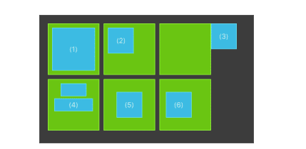
(1) An element fills a parent element.
ある要素は親要素を上塗りします。
GreenSquare {
    BlueSquare {
    width: 12
    anchors.fill: parent
    anchors.margins: 8
    text: '(1)'
    }
}
(2) An element is left aligned to the parent.
ある要素は親要素の左側に並びます。
GreenSquare {
    BlueSquare {
        width: 48
        y: 8
        anchors.left: parent.left
        anchors.leftMargin: 8
        text: '(2)'
    }
}
(3) An element's left side is aligned to the parent’s right side.
ある要素の左側は、親の右側に並びます。
GreenSquare {
    BlueSquare {
    width: 48
    anchors.left: parent.right
    text: '(3)'
    }
}
(4) Center-aligned elements. Blue1 is horizontally centered on the parent. Blue2 is also horizontally centered, but on Blue1 , and its top is aligned to the Blue1 bottom line.
「中央に並べられた要素。青1は親の上に水平、中心に位置づけられます。青2も同様に親の上に水平、中心ですが、青1では、その上部は、青2の上部は、青1の底のラインに並べられます。」
GreenSquare {
    BlueSquare {
         id: blue1
         width: 48; height: 24
         y: 8
         anchors.horizontalCenter: parent.horizontalCenter
}
    BlueSquare {
         id: blue2
         width: 72; height: 24
         anchors.top: blue1.bottom
         anchors.topMargin: 4
         anchors.horizontalCenter: blue1.horizontalCenter
         text: '(4)'
    }
}
(5) An element is centered on a parent element
ある要素は親要素の中央に置かれます。
GreenSquare {
BlueSquare {
    width: 48
    anchors.centerIn: parent
    text: '(5)'
    }
}
(6) An element is centered with a left-offset on a parent element using horizontal and vertical center lines.
「ある要素は水平そして垂直の中央のラインを使って、親要素上の左オフセット込みで中心に置かれます。」
GreenSquare {
     BlueSquare {
        width: 48
        anchors.horizontalCenter: parent.horizontalCenter
        anchors.horizontalCenterOffset: -12
        anchors.verticalCenter: parent.verticalCenter
        text: '(6)'
     }
}
Hidden Gems
Our squares have been magically enhanced to enable dragging. Try the example and drag around some squares. You will see that (1) can’t be dragged as it’s anchored on all sides (although you can drag the parent of (1), as it’s not anchored at all). (2) can be vertically dragged, as only the left side is anchored. The same applies to (3). (4) can only be dragged vertically, as both squares are horizontally centered. (5) is centered on the parent, and as such, can’t be dragged. The same applies to (6). Dragging an element means changing its x,y position. As anchoring is stronger than setting the x,y properties, dragging is restricted by the anchored lines. We will see this effect later when we discuss animations.
私たちの四角形は魔法であるかのようにドラッグを可能にするよう、性能を向上しました。エグザンプルを試してみてください。そして、いくつかの四角形の周りでドラッグをしてみてください。あなたは、(1)(アンカーが全くないので、(1)の親をドラッグすることはできるけれども、全てのサイドでアンカーされているので、ドラッグはできない事がわかります。(2)は垂直にドラッグできます。左側だけが固定されているからです。同じことは(3)にあてはまります。(4)は垂直にのみドラッグでき、四角形は水平に中央につけます。(5)は親の中心にあり、そしてその通り、ドラッグできません。同じことは(6)にも当てはまります。要素をドラッグすることはそのx,yの位置を変化させるという意味です。アンカーはx,yのプロパティを設定することよりも強力で、ドラッグがアンカーのラインによって制限されます。私たちが後でアニメーションについて話をする時に、この効果が実感できます。
Input Elements
We have already used the MouseArea as a mouse input element. Next, we’ll focus on keyboard input. We start off with the text editing elements:TextInput and TextEdit .
私たちはマウス入力の要素としてMouseAreaを使いました。次に、私たちはキーボード入力に焦点を当てます。私たちはテキスト編集要素:TextInputとTextEditで始めます。
TextInput
TextInput allows the user to enter a line of text. The element supports input constraints such as validator , inputMask , and echoMode .
TextInputはユーザーが一行のテキストを入力できるものです。要素は例えば、validator,inputMask,そしてechoModeのようなもので、入力の制限もサポートしています。
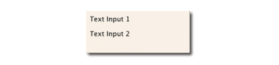
// textinput.qml
import QtQuick
Rectangle {
    width: 200
    height: 80
    color: "linen"
TextInput {
    id: input1
    x: 8; y: 8
    width: 96; height: 20
    focus: true
    text: "Text Input 1"
}
TextInput {
    id: input2
    x: 8; y: 36
    width: 96; height: 20
    text: "Text Input 2"
    }
}
The user can click inside a TextInput to change the focus. To support switching the focus by keyboard, we can use the KeyNavigation attached property.
「ユーザーはTextInput内で、フォーカスを変更するためにクリックできます。フォーカスをキーボードで切り替えるのをサポートするためには、KeyNavigationが付け加えられたプロパティを使うことができます。」
// textinput2.qml
import QtQuick
Rectangle {
width: 200
height: 80
color: "linen"
TextInput {
id: input1
x: 8; y: 8
width: 96; height: 20
focus: true
text: "Text Input 1"
KeyNavigation.tab: input2
}
TextInput {
id: input2
x: 8; y: 36
width: 96; height: 20
text: "Text Input 2"
KeyNavigation.tab: input1
}
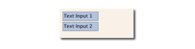
}The KeyNavigation attached property supports a preset of navigation keys where an element id is bound to switch focus on the given key press. A text input element comes with no visual presentation beside a blinking cursor and the entered text. For the user to be able to recognize the element as an input element it needs some visual decoration; for example, a simple rectangle. When placing the TextInput inside an element you need make sure you export the major properties you want others to be able to access. We move this piece of code into our own component called TLineEditV1 for reuse.
「KeyNavigationの添付プロパティはid要素が指定されたkey pressにフォーカスを切り替えるためにバウンドされるナビゲーションキーのプリセットをサポートします。テキスト入力要素は点滅するカーソルと入力されたテキストのほかに、不可視要素を持ちます。ユーザーが入力要素として要素を認識することができるために、いくつかの可視装飾を必要とします。例えば、単純な矩形です。TextInputを要素内に置くとき、あなたは他のプロパティがアクセスできるようになってほしい主なプロパティをエクスポートすることを確認する必要が合います。私たちは一片のコードをTLineEditV1と呼ばれる独自のコンポーネントへ再利用のために移動させます。」
// TLineEditV1.qml
import QtQuick
Rectangle {
    width: 96; height: input.height + 8
    color: "lightsteelblue"
    border.color: "gray"
    property alias text: input.text
    property alias input: input
TextInput {
    id: input
    anchors.fill: parent
    anchors.margins: 4
    focus: true
    }
}
TIP
If you want to export the TextInput completely, you can export the element by using property alias input: input . The first input is the property name, where the 2nd input is the element id.
We then rewrite our KeyNavigation example with the new TLineEditV1 component.
Rectangle {
...
    TLineEditV1 {
       id: input1
...
    }
    TLineEditV1 {
       id: input2
...
    }
}
Try the tab key for navigation. You will experience the focus does not change to input2 . The simple use of focus: true is not sufficient. The problem is that when the focus was transferred to the input2 element, the top-level item inside the TlineEditV1 (our Rectangle ) received focus, and did not forward the focus to the TextInput . To prevent this, QML offers the FocusScope .
ナビゲーションのためのタブキーを試してください。フォーカスはinput2を変化させないということが体験できます。単にfocus: trueの使用だけでは十分ではありません。問題はフォーカスがinput2要素に行こうする時、TlineEditV1(矩形)内のトップレベルのアイテムはフォーカスを受け取り、そしてフォーカスをTextInputへ進めないことです。これを防ぐためには、QMLはFocusScopeを提供します。
FocusScope
A focus scope declares that the last child element with focus: true receives the focus when the focus scope receives the focus. So it forwards the focus to the last focus-requesting child element. We will create a second version of our TLineEdit component called TLineEditV2, using a focus scope as the root element.
フォーカススコープはfocus: trueでフォーカススコープがフォーカスを受け取る時、そのフォーカスを受け取る最後の子要素を宣言します。だから、フォーカスをフォーカスを要求している最後の子要素へ進めます。私たちはルート要素としてフォーカススコープを使い、TLineEditV2というTLineEditコンポーネントの第2のバージョンを作ります。
// TLineEditV2.qml
import QtQuick
FocusScope {
    width: 96; height: input.height + 8
    Rectangle {
        anchors.fill: parent
        color: "lightsteelblue"
        border.color: "gray"
    }
    property alias text: input.text
    property alias input: input
    TextInput {
        id: input
        anchors.fill: parent
        anchors.margins: 4
        focus: true
     }
}
Our example now looks like this:
Rectangle {
...
    TLineEditV2 {
        id: input1
...
    }
    TLineEditV2 {
        id: input2
...
    }
}
Pressing the tab key now successfully switches the focus between the 2 components and the correct child element inside the component is focused.
今やタブキーを押すと、二つのコンポーネント間でフォーカスを切り替えることができ、コンポーネント内の現在の子要素がフォーカスされます。
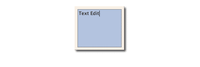
TextEdit
The TextEdit is very similar to TextInput , and supports a multi-line text edit field. It doesn’t have the text constraint properties, as this depends on querying the content size of the text ( contentHeight , contentWidth ). We also create our own component called TTextEdit to provide an editing background and use the focus scope for better focus forwarding.
// TTextEdit.qml
import QtQuick
FocusScope {
    width: 96; height: 96
Rectangle {
    anchors.fill: parent
    color: "lightsteelblue"
    border.color: "gray"
     }
    property alias text: input.text
    property alias input: input
TextEdit {
    id: input
    anchors.fill: parent
    anchors.margins: 4
    focus: true
    }
}
You can use it like the TLineEdit component
// textedit.qml
import QtQuick
Rectangle {
    width: 136
    height: 120
    color: "linen"
TTextEdit {
    id: input
    x: 8; y: 8
    width: 120; height: 104
    focus: true
    text: "Text Edit"
    }
}
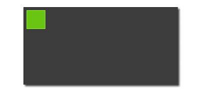
Keys Element
The attached property Keys allows executing code based on certain key presses. For example, to move and scale a square, we can hook into the up, down, left and right keys to translate the element, and the plus and minus keys to scale the element.
// keys.qml
import QtQuick
DarkSquare {
    width: 400; height: 200
    GreenSquare {
        id: square
        x: 8; y: 8
    }
    focus: true
    Keys.onLeftPressed: square.x -= 8
    Keys.onRightPressed: square.x += 8
    Keys.onUpPressed: square.y -= 8
    Keys.onDownPressed: square.y += 8
    Keys.onPressed: function (event) {
switch(event.key) {
    case Qt.Key_Plus:
        square.scale += 0.2
        break;
    case Qt.Key_Minus:
        square.scale -= 0.2
        break;
        }
   }

}
この記事が気に入ったらサポートをしてみませんか?