ggplot2で積み重ね棒グラフを描く

今回使用するRのパッケージは
reshape2
ggplot2
ggsci
scales
です。
パッケージがインストールされていない場合、メニューバーから「パッケージとデータ」>「パッケージインストーラ」で選択してインストールしてください。
まず、Rを起動します。
いつものように、作業ディレクトリを指定します。
> setwd("~/Desktop")
> getwd()
[1] "/Users/Shigeru/Desktop"
ライブラリを読み込みます。
> library(reshape2)
> library(ggplot2)
> library(ggsci)
> library(scales)
ここでは例として以下のようなデータをExcelで作成し、csv形式で保存しました。
ファイル名は、demo.csvとしました。
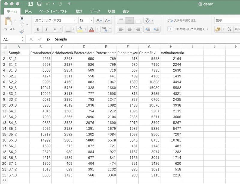
データを読み込みます。
> data <- read.csv("demo.csv")内容を頭6行だけ確認してみます。
> head(data)
Sample Proteobacteria Acidobacteria Bacteroidetes Patescibacteria
1   S1_1           4966          2298           650             769
2   S1_2           5558          2927           536             769
3   S1_3           6003          2854           509             719
4   S2_1           4174          1311           558             441
5   S2_2           9996          4160           883            1047
6   S2_3          12041          5425          1328            1660
 Planctomycetes Chloroflexi Actinobacteria
1            618        5658           2164
2            680        7950           2244
3            667        7335           2630
4            489        4166           1439
5           1399       10808           4494
6           1932       15089           5582
これをggplot2が利用しやすい形式に変換します。
> df <- melt(data)
Using Sample as id variables
> head(df)
Sample variable value
1 S1_1 Proteobacteria 4966
2 S1_2 Proteobacteria 5558
3 S1_3 Proteobacteria 6003
4 S2_1 Proteobacteria 4174
5 S2_2 Proteobacteria 9996
6 S2_3 Proteobacteria 12041積み重ね棒グラフを作成します。
> g <- ggplot(df, aes(x= Sample, y = value, fill = variable))
> g <- g + geom_bar(stat = "identity")
> g <- g + scale_fill_nejm()
> plot(g)
x軸の文字が重なってみにくかったのでアングルをつけます。
> g <- g + theme(axis.text = element_text(angle = 60))
> plot(g)
図として保存します。
> png("demo_1.png", 900, 600)
> plot(g)
> dev.off()
quartz
2 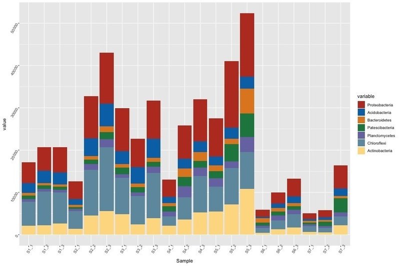
菌相解析などで組成を比較したい場合には、パーセンテージで揃えた積み重ねグラフにします。
> g <- ggplot(df, aes(x = Sample, y = value, fill = variable))
> g <- g + geom_bar(stat = "identity", position = "fill")
> g <- g + scale_y_continuous(labels = percent)
> plot(g)
> g <- g + theme(axis.text = element_text(angle = 60))
> plot(g)> png("demo_2.png", 900, 600)
> plot(g)
> dev.off()
quartz
2 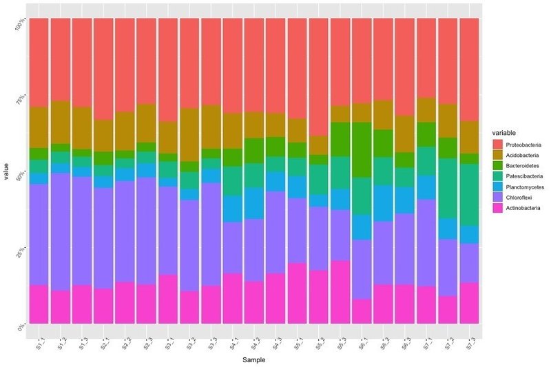
デフォルトのカラーはグラデーションで見づらいので、scale_fill_nejm()でカラーをつけます。
(ただし、このコマンドではデフォルトで最大8色までしか色付けされません)
> g <- g + scale_fill_nejm()
> plot(g)> png("demo_3.png", 900, 600)
> plot(g)
> dev.off()
quartz
2 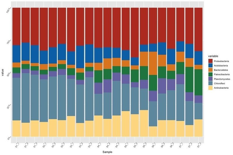
カウント数を重ねずに横に並べてグラフを描く場合には、以下のようになります。
> g <- ggplot(df, aes(x = Sample, y = value, fill = variable))
> g <- g + geom_bar(stat = "identity", position = "dodge")
> g <- g + scale_fill_nejm()
> plot(g)
> g <- g + theme(axis.text = element_text(angle = 60))
> plot(g)
> png("demo_4.png", 900, 600)
> plot(g)
> dev.off()
quartz
2 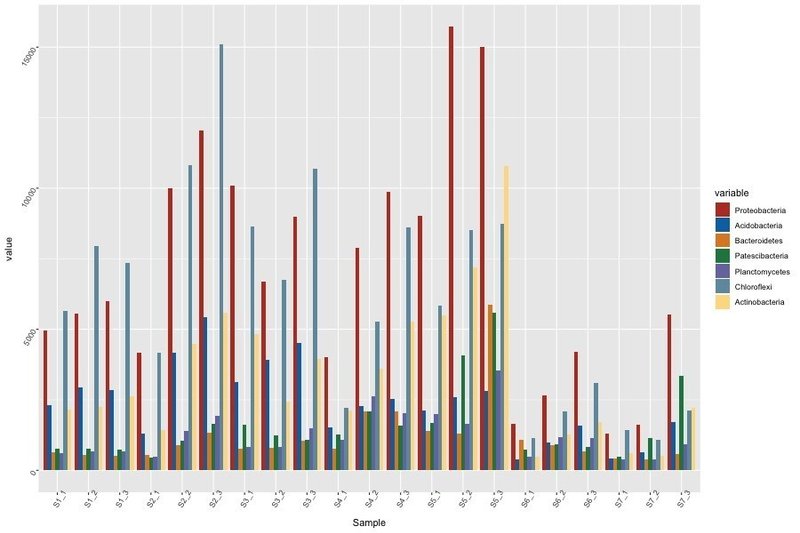
以前紹介したような方法で、背景の透明化、枠の太さ、文字のサイズなどを変えることができます。
この記事が気に入ったらサポートをしてみませんか?