SwiftUIでNavigationBarをカスタマイズ

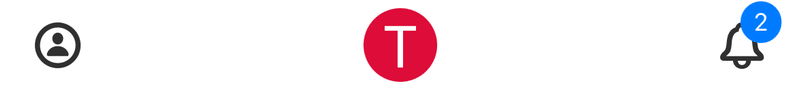
この画像のように、ナビゲーションバーのアイコンにバッジを付与したり、タイトルをカスタムビューにするのはよくある要件だが、今回はSwiftUIでの実装方法を紹介したい。
UIKitの場合
まずUIKitでの実装方法について少し触れたいが、アイコンにバッジを付与したい場合は、UIBarButtonItem(customView:)にバッジのカスタムビューを渡して初期化すればよいが、こちらの記事のようにUIBarButtonItemのサブクラスを作るのも良い方法。
また、タイトルの場合はnavigationItem.titleViewにカスタムビューをセットするだけでよい。
注意
公式ドキュメントによれば、上記メソッドで初期化した場合は、ユーザー操作でアクションメソッドを呼ばなくなるので、自前でハンドリングする必要がある。
SwiftUIの場合
SwiftUIの場合はもっと簡単な方法で実現でき、toolbarというmodifierを使うことで、ナビゲーションバーやツールバーにToolBarItem,ToolBarItemGroupを位置を指定して配置することができる。
ToolBarItem,ToolBarItemGroupには任意のViewを含むことができるので、上記のようなバッジ付きアイコンも簡単に実現できる。
enum Path: String, Hashable {
    case account
    case notification
}

struct TopView: View {
    @State private var path = [Path]()

    var body: some View {
        NavigationStack(path: $path) {
            Text("Top")
                .navigationBarTitleDisplayMode(.inline)
                .navigationTitle("Top")
                .navigationDestination(for: Path.self) { path in
                    switch path {
                    case .account:
                        AccountView()
                    case .notification:
                        NotificationView()
                    }
                }
                // ナビゲーションバーに要素を配置
                .toolbar {
                    ToolbarItem(placement: .navigationBarLeading) {
                        AccountIcon()
                    }

                    ToolbarItem(placement: .principal) {
                        principalIcon()
                    }

                    ToolbarItem(placement: .navigationBarTrailing) {
                        notificationIcon()
                    }
                }
        }
        // ナビゲーションバー全体にtintColorを指定
        .tint(.init(red: 0.2, green: 0.2, blue: 0.2))
    }

    private func AccountIcon() -> some View {
        Button {
            path.append(.account)
        } label: {
            Image(systemName: "person.circle")
                .fontWeight(.bold)
        }
    }

    private func principalIcon() -> some View {
        Image("taat")
            .resizable()
            .scaledToFill()
            .frame(width: 36, height: 36)
            .clipShape(Circle())
    }

    private func notificationIcon() -> some View {
        // アイコンとバッジを右上揃えにする
        ZStack(alignment: .topTrailing) {
            Button {
                path.append(.notification)
            } label: {
                Image(systemName: "bell")
                    .fontWeight(.bold)
            }

            Text("2")
                .frame(minWidth: 14)
                .padding(3)
                .font(.system(size: 12))
                .foregroundColor(.white)
                .background(.blue)
                .cornerRadius(40)
                // バッジの位置をアイコンに対してやや右上にずらす
                .offset(x: 6, y: -4)
                // バッジ部分でのタップイベントをアイコンに透過させる
                .allowsHitTesting(false)
        }
    }
}
補足
アイコン上にバッジが重なっているが、バッジで.allowsHitTesting(false)を適用することで、タップイベントを下のアイコンに透過させることができるので、バッジの数値によって重なる部分が大きくなってもタップ領域を確保できる。
リポジトリ
参考
この記事が気に入ったらサポートをしてみませんか?