【R Shiny】厚生労働省オープンデータで陽性者数推移を可視化できるShiny Webアプリケーションを作る。

◆はじめに
前回の記事をShinyでwebアプリケーション化する例です。
shinyの練習に作ってみました。
作成環境はWindows10+Rstudioです。
- Session info -------------------------------------------------------------------------------------------------------------------------------------------------
setting  value
version  R version 4.0.2 (2020-06-22)
os       Windows 10 x64
system   x86_64, mingw32
ui       RStudio
language (EN)
collate  Japanese_Japan.932
ctype    Japanese_Japan.932
tz       Asia/Tokyo
date 2021-10-17 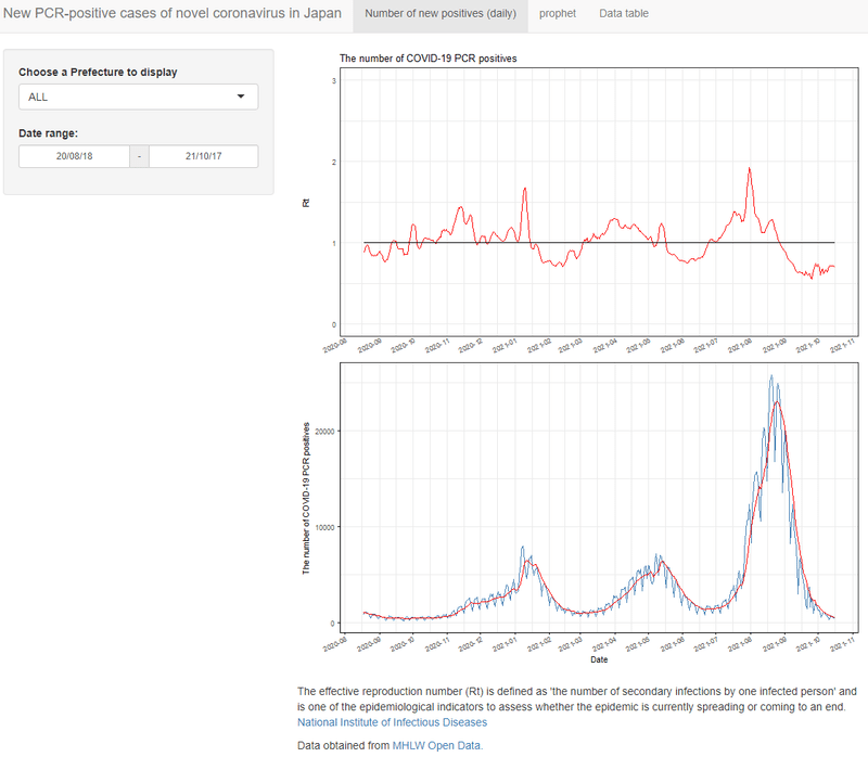
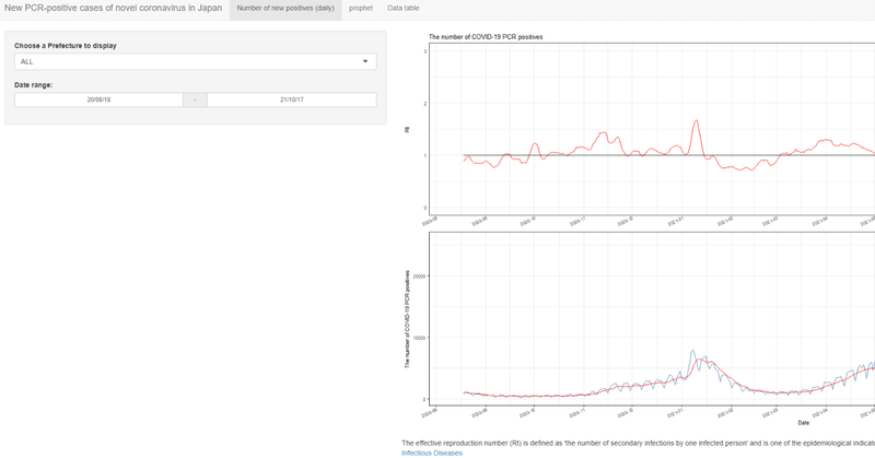
こんな感じの指定した県と期間のPCR陽性者数の推移+7日間移動平均線+簡易実効再生産数(Rt)を表示するページと
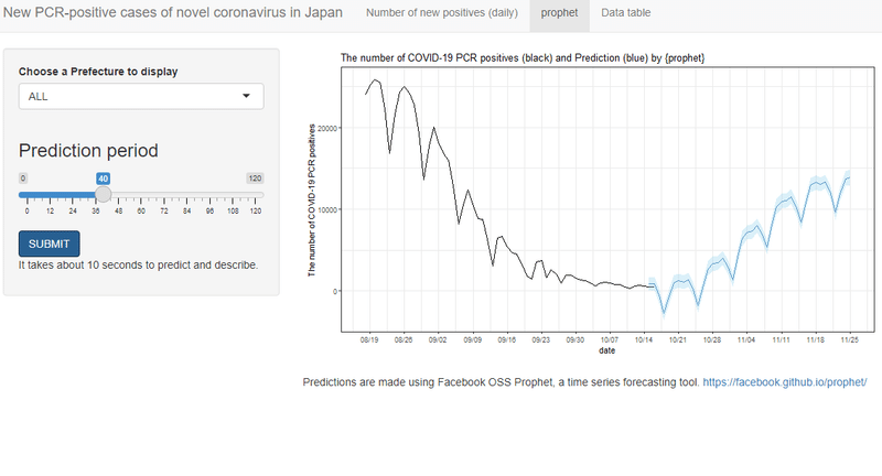
こんな感じの選択された各都道府県の指定期間日分予測のグラフをボタンを押すと作成するページと
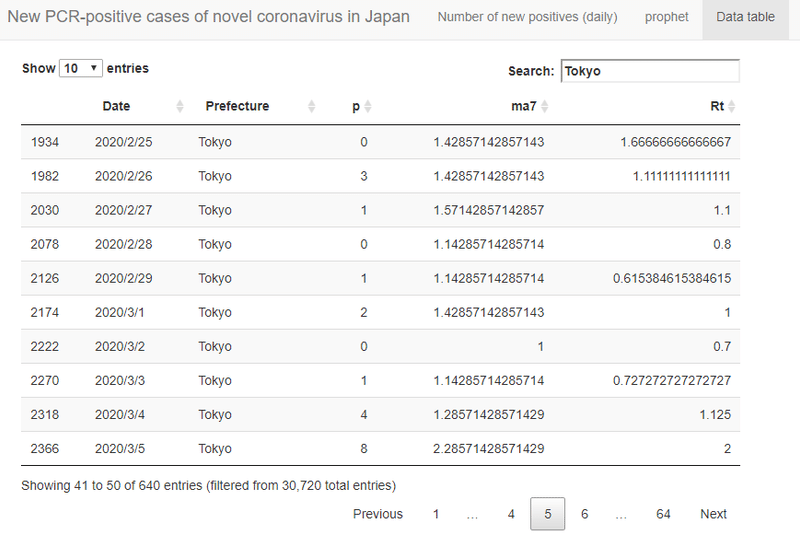
使用したデータを表形式で表示するアプリケーションを作ります。
shinyapps.ioにdeployする時にpacmanではうまく行きませんでしたので、libraryの読み込みの部分は以下のようにしました。
library(shiny)
library(curl)
library(tidyverse)
library(prophet)
library(lubridate)
library(zoo)
library(scales)
library(DT)
Rstudio上で動作させるだけならばpacmanでも動きます。
●ui.R
if (!require("pacman")) install.packages("pacman")
pacman::p_load(shiny,
              curl,
              tidyverse,
              prophet,
              lubridate,
              zoo,
              scales,
              gridExtra,
              DT)

# Define UI for application that draws a histogram
shinyUI(navbarPage("New PCR-positive cases of novel coronavirus in Japan",
                  tabPanel("Number of new positives (daily)",
                           sidebarLayout(
                               sidebarPanel(
                                   selectInput("pref",
                                               label = "Choose a Prefecture to display",
                                               choices = list("ALL","Hokkaido","Aomori","Iwate","Miyagi","Akita","Yamagata","Fukushima","Ibaraki","Tochigi","Gunma","Saitama","Chiba","Tokyo","Kanagawa","Niigata","Toyama","Ishikawa","Fukui","Yamanashi","Nagano","Gifu","Shizuoka","Aichi","Mie","Shiga","Kyoto","Osaka","Hyogo","Nara","Wakayama","Tottori","Shimane","Okayama","Hiroshima","Yamaguchi","Tokushima","Kagawa","Ehime","Kochi","Fukuoka","Saga","Nagasaki","Kumamoto","Oita","Miyazaki","Kagoshima","Okinawa"),
                                               selected = "ALL"),
                                   dateRangeInput("date", "Date range:",
                                                  start  = Sys.Date()-365-60,
                                                  end    = Sys.Date(),
                                                  min    = "2020-01-26",
                                                  max    = Sys.Date(),
                                                  format = "yy/mm/dd",
                                                  separator = " - ")
                               ),

                               # Show a plot of the generated distribution
                               mainPanel(
                                   plotOutput("gnew2"),
                                   plotOutput("gnew1"),
                                   br(),
                                   p("The effective reproduction number (Rt) is defined as 'the number of secondary infections by one infected person' and is one of the epidemiological indicators to assess whether the epidemic is currently spreading or coming to an end.",
                                     a("National Institute of Infectious Diseases",
                                       href = "https://www.niid.go.jp/niid/ja/2019-ncov/2502-idsc/iasr-in/10465-496d04.html")),
                                   p("Data obtained from ",
                                     a("MHLW Open Data.",
                                       href = "https://www.mhlw.go.jp/stf/covid-19/open-data.html"))

                               )
                           )
                  ),
                  tabPanel("prophet",
                           sidebarLayout(
                               sidebarPanel(
                                   selectInput("pref2",
                                               label = "Choose a Prefecture to display",
                                               choices = list("ALL","Hokkaido","Aomori","Iwate","Miyagi","Akita","Yamagata","Fukushima","Ibaraki","Tochigi","Gunma","Saitama","Chiba","Tokyo","Kanagawa","Niigata","Toyama","Ishikawa","Fukui","Yamanashi","Nagano","Gifu","Shizuoka","Aichi","Mie","Shiga","Kyoto","Osaka","Hyogo","Nara","Wakayama","Tottori","Shimane","Okayama","Hiroshima","Yamaguchi","Tokushima","Kagawa","Ehime","Kochi","Fukuoka","Saga","Nagasaki","Kumamoto","Oita","Miyazaki","Kagoshima","Okinawa"),
                                               selected = "ALL"),
                                   sliderInput("prophet_range", h3("Prediction period"),
                                               min = 0, max = 120, value = 60),
                                   actionButton("submit", "SUBMIT", class = "btn-primary"),
                                   p("It takes about 10 seconds to predict and describe.")
                               ),
                               mainPanel(
                                   plotOutput("prophet_plot"),
                                   br(),
                                   p("Predictions are made using Facebook OSS Prophet, a time series forecasting tool.\n",
                                     a("https://facebook.github.io/prophet/",
                                       href = "https://facebook.github.io/prophet/"))
                               )
                               )
                           ),
                  tabPanel("Data table",
                           mainPanel(
                             DT::dataTableOutput("data_vis")
                             )
                  )
                  )
)
タブを3つ作成し以下の様にUIを作成します。
・新規陽性者数と簡易実効再生産数を並べて表示するページ
─県の設定
─表示期間の設定
・Prophet予測データを表示するページ
─県の設定
─予測日数の設定
─実行ボタン
・取得したデータを表にして表示
─DT packageを使ったsearchやsortができる表に
Prophetは計算が重いため、SUBMITボタンを押した際に計算を実施するようにします。
●server.R
if (!require("pacman")) install.packages("pacman")
pacman::p_load(shiny,
              curl,
              tidyverse,
              prophet,
              lubridate,
              zoo,
              scales,
              gridExtra,
              DT)

url <- "https://covid19.mhlw.go.jp/public/opendata/newly_confirmed_cases_daily.csv"
dat_x <- readr::read_csv(curl::curl(url=url),
                        locale = locale(encoding = "utf8"))
dat_l <- dat_x %>%
 group_by(Prefecture) %>%
 rename(p = 'Newly confirmed cases') %>%
 mutate(ma7 = rollmean(p, 7L, align = "right", fill = 0),
        Rt = ma7/lag(ma7, n = 5L, default = 0, fill = 0)) %>%
 pivot_longer(col = -c(Prefecture,Date), names_to = "item", values_to = "y")
df_wider <- dat_l %>%
 pivot_wider(names_from = "item", values_from = "y")

# Define server logic required to draw a histogram
shinyServer(function(input, output) {
 graph_data <- reactive({
   date_start <- as.Date(input$date[1], origin = "1970-01-01")
   date_end <- as.Date(input$date[2], origin = "1970-01-01")
   dat_l2 <- dat_l %>%
     filter(Prefecture == input$pref) %>%
     filter(Date >= date_start & Date <= date_end)
   dat_l2
 })

 output$gnew1 <- renderPlot({
   datt <- graph_data()
   gl <- datt %>%
     ggplot() +
     geom_line(data = subset(datt, item == 'p'),
               aes(x = ymd(Date), y = y), color = "steelblue", size = 0.3) +
     geom_line(data = subset(datt, item == 'ma7'),
               aes(x = ymd(Date), y = y), color = "red", size = 0.3) +
     theme_bw() +
     theme(#panel.border = element_blank(),
           #panel.grid.minor = element_blank(),
           #panel.grid.major = element_blank(),
           axis.ticks = element_line(colour = "black"),
           axis.ticks.length = unit(1, "mm"),
           axis.text.x = element_text(margin = unit(rep(0,4), "mm"), angle = 25, vjust = 1, hjust = 1),
           axis.text.y = element_text(margin = unit(rep(1.5, 4), "mm")),
           #axis.title.y = element_text(margin = margin(t = 0, r = 30, b = 0, l = 0)),
           axis.line.x = element_line(colour = 'black', size=0.5, linetype='solid'),
           axis.line.y = element_line(colour = 'black', size=0.5, linetype='solid'),
           #panel.background = element_blank(), # element_rect(fill = "transparent",color = NA),
           #plot.background = element_blank() # element_rect(fill = "transparent",color = NA)
           ) +
     scale_x_date(date_breaks="1 month",
                  labels = date_format("%Y-%m"),
                  limits = as.Date(c(min(ymd(datt$Date)), max(ymd(datt$Date))))) + # x label date_breaks
     labs(x = "Date", y = paste0("The number of COVID-19 PCR positives"))
   plot(gl)
 })

   output$gnew2 <- renderPlot({
     datt <- graph_data()
     gRt <- datt %>%
       ggplot() +
       geom_line(data = subset(datt, item == 'Rt'),
                 aes(x = ymd(Date), y = y), color = "red", size = 0.5)+
       geom_line(data = subset(datt, item == 'Rt'),
                 aes(x = ymd(Date), y = 1), color = "black", size = 0.5) +
       theme_bw() +
       ylim(0, 3) +
       theme(axis.text.x=element_text(margin = unit(rep(0,4), "mm"), angle = 25, vjust = 1, hjust = 1),
             axis.title.x=element_blank(),
             axis.text.y = element_text(margin = unit(rep(2,4), "mm")),
             axis.ticks = element_line(colour = "black"),
             axis.ticks.length = unit(0, "mm"),
             axis.title.y = element_text(margin = margin(t = 0, r = 23, b = 0, l = 0)),
             panel.background = element_blank(), # element_rect(fill = "transparent",color = NA),
             plot.background = element_blank()) + # element_rect(fill = "transparent",color = NA)) +
       scale_x_date(date_breaks="1 month",
                    labels = date_format("%Y-%m"),
                    limits = as.Date(c(min(ymd(datt$Date)), max(ymd(datt$Date))))) +
     labs(x = "", y = paste0("Rt"),
          title = "The number of COVID-19 PCR positives")
     plot(gRt)
     })

   # prophet
   observeEvent(input$submit, {
     withProgress(message = 'Making plot', value = 0, {
       dat <- dat_l %>%
         filter(Prefecture == input$pref2 & item == "p") %>%
         ungroup() %>%
         select(Date, y)
       colnames(dat) <- c("ds","y")
       dat <- dat %>%
         mutate(ds = ymd(ds))

       model <- dat %>%
         prophet(growth = "linear", # or "logistic"
                 yearly.seasonality = TRUE,
                 weekly.seasonality = TRUE,
                 daily.seasonality = FALSE,
                 seasonality.mode = "multiplicative", # or "additive"
                 changepoint.prior.scale = 0.05,
                 changepoint.range = 1,
                 n.changepoints = 25)
       future <- make_future_dataframe(model, input$prophet_range) #
       pred <- predict(model, future)
       ftdata <- as_tibble(predict(model, future))
       # merge actual and forecast data
       forecast <- ftdata %>%
         mutate(ds = ymd(ds),
                segment = case_when(ds > dat$ds[nrow(dat)]-2 ~ 'forecast',
                                    TRUE ~ 'actual') # SEGMENT ACTUAL VS FORECAST DATA
         ) %>%
         select(ds, segment, yhat_lower, yhat, yhat_upper) %>%
         left_join(dat) # JOIN ACTUAL DATA

       output$prophet_plot <- renderPlot({
         gpr <- forecast %>%
           dplyr::filter(ds >= Sys.Date()-60) %>%
           rename(date = ds,
                  actual = y) %>%
           ggplot() +
           geom_line(aes(date, actual)) + # PLOT ACTUALS DATA
           geom_line(data = subset(forecast, segment == 'forecast'),
                     aes(ds, yhat), color = 'steelblue', size = 0.1) + # PLOT PREDICTION DATA
           geom_ribbon(data = subset(forecast, segment == 'forecast'),
                       aes(ds, ymin = yhat_lower, ymax = yhat_upper),
                       fill = 'skyblue', alpha = 0.3) + # SHADE PREDICTION DATA REGION
           theme_bw() +
           scale_x_date(breaks = function(x)
             seq.Date(from = ymd(min(forecast$ds)),
                      to = ymd(max(forecast$ds)),
                      by = "7 days"),
             date_labels="%m/%d") + # x label date_breaks by 7 days
           labs(x= "date",
                y= "The number of COVID-19 PCR positives",
                title = "The number of COVID-19 PCR positives (black) and Prediction (blue) by {prophet}"
           )
         plot(gpr)
       })
     })
   })

   output$data_vis <- DT::renderDataTable(df_wider)


}
)
Prophetの計算が重いのでボタンを押した後にグラフが描写されるまで数秒のラグがあります。このため、不安にならないように(あまり意味がない)Progress barもつけておきました。
内部の処理は前回記事をご確認ください。
以上、ご参考になりましたら幸いです。