R言語時系列データで遊ぶ2 {prophet}編

●本記事でやること
・Rで時系列データを取り扱う。
・{prophet}パッケージでコロナウイルスPCR陽性者数データの予測モデルを作成する。(当然予測はできません。)
・実データを加工し予測データと組み合わせ、ggplotで図示する。
・残差によって予測モデルの正確性を評価する。
●前置き
前回のnoteに引き続き時系列データで遊んでいきます。
過去の時系列データを元に未来を予測するのは大変に興味深いところです。
売上データ、トレンドデータ、客数等々、為替チャート...様々なことに応用可能です。
今回は例として、前回のnoteでも用いたコロナウイルスPCR陽性者数データを用いて、{prophet}パッケージで将来の予測を行いました。
なんと言ってもprophetは使いやすさとそれっぽい予測、実データのトレンド分析まで簡単にできるのが最高です。
当然ですが通年データが一年分しかありませんので予測はできていません...が、例としては参考にできるのではないかと思います。
●prophetを使ってみる
・パッケージを読み込む
# load library
if(!require("tidyverse")){
 install.packages("tidyverse", dependencies=TRUE)
}
if(!require("prophet")){
 install.packages("prophet", dependencies=TRUE)
}
if(!require("lubridate")){
 install.packages("lubridate", dependencies=TRUE)
}
使用するライブラリーは以下の通りです。
・データ成型と図示、パイプ演算子に用いるtidyverse。
dplyrとtidyrとggplot2とmagrittrでも良いのでしょうけど...やっぱりtidyverse!
・予測モデル作成に使うprophet
・時系列データの取り扱いに使うlubridate
・データを用意する。
前回のnoteと同様、厚生労働省HPからコロナウイルスPCR陽性者数データを取得します。
prophetでは時系列の日付けデータが「ds」予測に使用する数値データが「y」という列名でなければいけないので変えてやります。
# data import
url <- "https://www.mhlw.go.jp/content/pcr_positive_daily.csv"
dat <- readr::read_csv(url, locale = locale(encoding = "utf8"))
colnames(dat) <- c("ds","y")
dat <- dat %>% mutate(ds = ymd(ds))
str(dat) # check data
・コレログラムを描いてみる
時系列予測の前に、データに周期性(自己相関)がないか、コレログラムを作成してみます。
# Correlogram
dat$y %>% diff() %>% acf()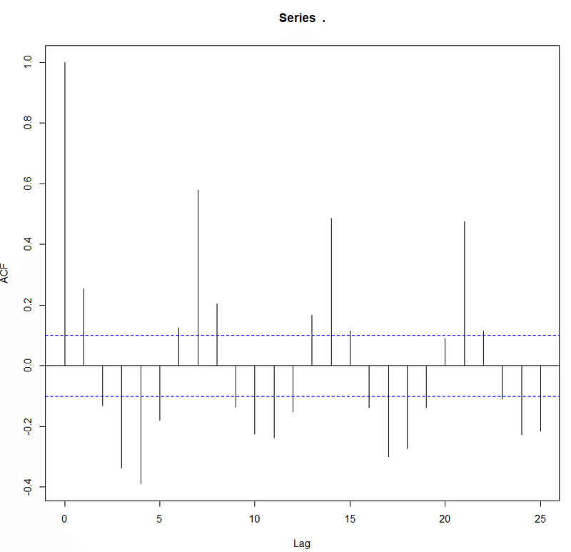
美しいサインカーブを描いており、明らかに強い周期性があります。
これはウイルスの感染による潜伏期間や、PCR検査数の週変動に起因していそうです。当然、前日の陽性者数が多ければクラスター対策によるPCR検査数は増えるでしょうし、一週間後の感染者数も増えるでしょうから当然かもしれません。
prophetは週成分を考慮してくれるため、イイ感じにモデル化してくれることを期待します。
・まずはグラフを図示
# line plot
dat %>%
 ggplot() +
 geom_line(aes(x= ds, y= y), size = 0.5) +
 scale_x_date(date_breaks="1 month") +
 theme_bw() +
 labs(x = NULL,
      y = "pcr_positive_daily",
      color = NULL,
      title = "全国の日あたりコロナ陽性者数")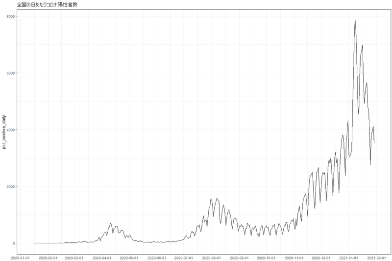
・モデルを作成
色んなパラメーターがありますが、これは作りながら当てはまりが良いようにテキトーに調整していきます。
# Creating model with prophet
model <- dat %>%
 # dplyr::filter(ds >= as.Date("2020-04-01")) %>% # use data after Mar.
 # filter(between(ds, as.Date("2020-04-01"), as.Date("2020-12-10"))) # range
 prophet(growth = "linear", # or "logistic" 線形トレンドか非線形トレンドか
         yearly.seasonality = TRUE,
         weekly.seasonality = TRUE,
         daily.seasonality = FALSE,
         seasonality.mode = "multiplicative", # or "additive"
         changepoint.prior.scale = 0.05, # トレンド変化点での傾きの変化の大きさ
         changepoint.range = 0.9, # default0.8, 1で直近のデータまでトレンド変化予想に使用する
         n.changepoints = 25 # トレンド変化点候補の数default25
 )
・30日分の予想データを作成し、実データとくっつける
# scaleを大きくするならnを小さく、nを大きくするならscaleを小さく調整したほうが良さそう。
future <- make_future_dataframe(model, 30) # 30日分予想
pred <- predict(model, future)
ftdata <- as_tibble(predict(model, future))
plot(model, pred) # plot
prophet_plot_components(model,pred) # plot component

# merge actual and forecast data
forecast <- ftdata %>%
 mutate(ds = ymd(ds),
        segment = case_when(ds > dat$ds[nrow(dat)]-2 ~ 'forecast',
                            TRUE ~ 'actual'), # SEGMENT ACTUAL VS FORECAST DATA
        keyword = paste0("word")) %>%
 select(ds, segment, yhat_lower, yhat, yhat_upper, keyword) %>%
 left_join(dat) # JOIN ACTUAL DATA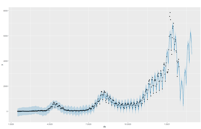
plot(model, pred)で作成できるグラフ。点が実データ、青線が予測モデルです。将来の推定はともかく、過去の当てはまりは見た感じ良さそうですね。
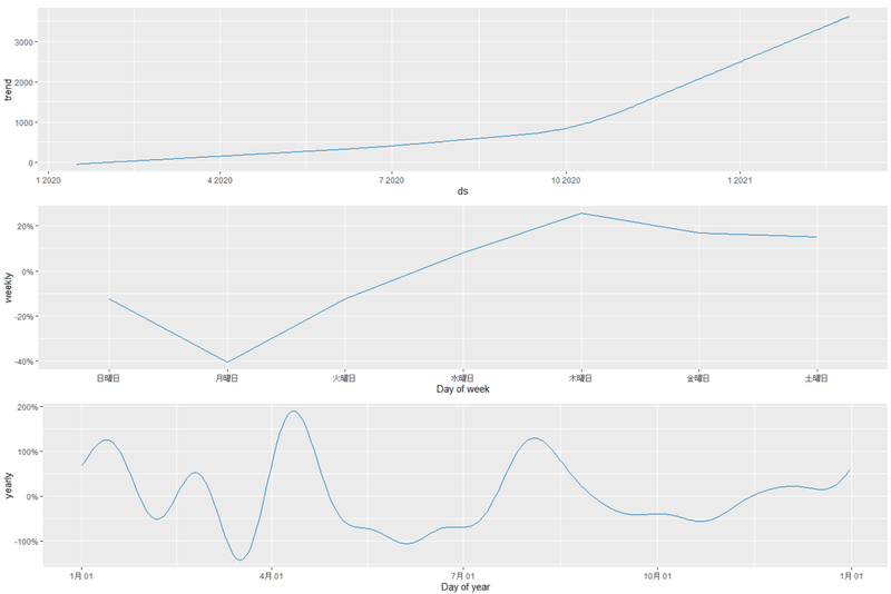
prophet_plot_components(model,pred)で作成できる予測式のコンポーネントを表示してくれるプロット。とっても面白いです。これまでのデータの分析や解釈にも使えますね。
これまでのトレンド、週成分、年成分等を表示してくれます。実データから分かる通り、増加数のトレンドは10月を境に一気に上がってしまったようです。(原因は...うん)
週成分を見るとPCR検査数による陽性者の増減をしっかり反映してくれてますね。年成分は数年分のデータがあればしっかり機能してくれるでしょうけれども。1年だけなのであまり参考にはなりません。今回は例ということで。
・ggplotで予測モデルを図示
plot(model, pred)で書けるようなものをggplotで書いてみます。
# Plot forecasting model
g_model <- forecast %>%
 rename(date = ds,
        actual = y) %>%
 ggplot() +
 geom_point(aes(date, actual)) + # PLOT ACTUALS DATA
 geom_line(aes(date, yhat), color = 'steelblue', size = 0.1) + # PLOT PREDICTION DATA
 geom_ribbon(aes(date, ymin = yhat_lower, ymax = yhat_upper),
             fill = 'skyblue', alpha = 0.3) + # SHADE PREDICTION DATA REGION
 theme_bw() +
 scale_x_date(date_breaks="1 month") + # x label date_breaks
 labs(x = "Date", y = "The number of COVID-19 PCR positives",
      title = "The number of COVID-19 PCR positives (black pont) \nand forecasting model (blue line) by {prophet}")
suppressWarnings(print(g_model))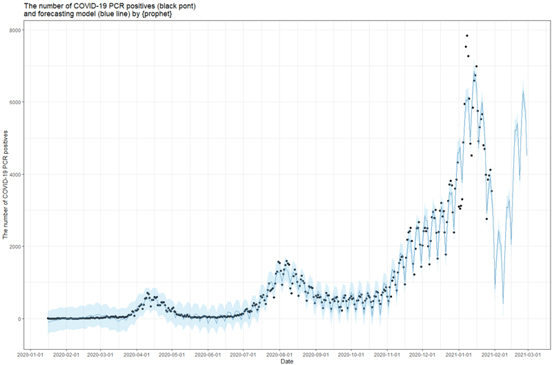
・実データと予測モデルの色を分ける
実データを黒線、将来の予測部分を別にして赤線にしてみます。推定値の上下の部分はgeom_ribbonで帯にします。
# Plot forecasting results with all date
g_all <- forecast %>%
 rename(date = ds,
        actual = y) %>%
 ggplot() +
 geom_line(aes(date, actual)) + # PLOT ACTUALS DATA
 geom_line(data = subset(forecast, segment == 'forecast'),
           aes(ds, yhat), color = 'salmon', size = 0.1) + # PLOT PREDICTION DATA
 geom_ribbon(data = subset(forecast, segment == 'forecast'),
             aes(ds, ymin = yhat_lower, ymax = yhat_upper),
             fill = 'salmon', alpha = 0.3) + # SHADE PREDICTION DATA REGION
 theme_bw() +
 scale_x_date(date_breaks="1 month") + # x label date_breaks
 labs(x = "Date", y = "The number of COVID-19 PCR positives",
      title = "The number of COVID-19 PCR positives (black) and Prediction (blue) by {prophet}")
suppressWarnings(print(g_all))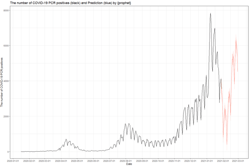
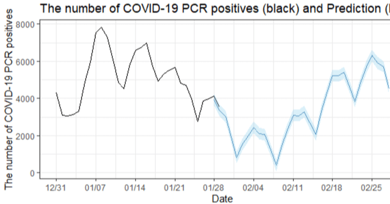
・予測部分をアップに
予測値の時系列を詳細に見るために、実データ30日から先だけをズームしてみます。
# Plot forecasting results with recent 30 days data
g_30 <- forecast %>%
 dplyr::filter(ds >= Sys.Date()-30) %>%
 rename(date = ds,
        actual = y) %>%
 ggplot() +
 geom_line(aes(date, actual)) + # PLOT ACTUALS DATA
 geom_line(data = subset(forecast, segment == 'forecast'),
           aes(ds, yhat), color = 'steelblue', size = 0.1) + # PLOT PREDICTION DATA
 geom_ribbon(data = subset(forecast, segment == 'forecast'),
             aes(ds, ymin = yhat_lower, ymax = yhat_upper),
             fill = 'skyblue', alpha = 0.3) + # SHADE PREDICTION DATA REGION
 theme_bw() +
 scale_x_date(breaks = function(x) seq.Date(from=ymd(min(forecast$ds)),to=ymd(max(forecast$ds)),by="7 days"),date_labels="%m/%d") + # x label date_breaks by 7 days
 labs(x = "Date", y = "The number of COVID-19 PCR positives",
      title = "The number of COVID-19 PCR positives (black) and Prediction (blue) by {prophet}")
suppressWarnings(print(g_30))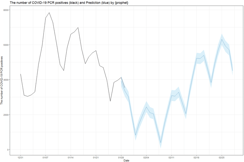
うん...こんなに下がらないと思いますね。一年分のデータしかないため、年成分データがうまく推定できてないのではないかとおもいます。
●モデルの評価
・{prophet}の交差検証
{prophet}にも交差検証用の関数があり、MAPEによる予測モデルと実データ間の当てはまり検証ができます。ありがたい!
# cross-validation
df_cv <- cross_validation(model,
                         initial = 60,
                         horizon =56,
                         period =10,
                         units = "days")
plot_cross_validation_metric(df_cv ,metric = "mape")+
 geom_hline(yintercept = 0.5,color="red")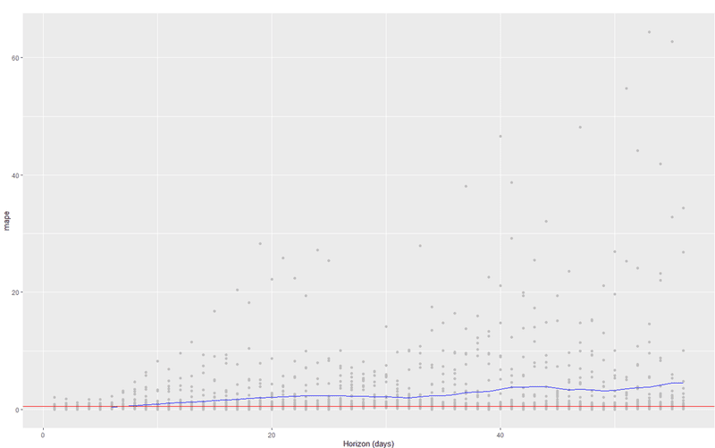
一週間くらいは予測できそうでしょうか。
・残差ヒストグラム
きちんと予測できていれば、予測値と実データとの残差のヒストグラムは0を中心とした正規分布っぽくなるはずです。予測に偏りがないかを検証できます。
# residuals histgram
forecast %>%
 drop_na(y) %>%
 mutate( residual = yhat - y ) %>%
 rename(date = ds) %>%
 ggplot(aes(x=residual)) +
 geom_histogram(color="darkblue",fill="skyblue")+
 labs(title = "residual histgram") +
 theme_bw()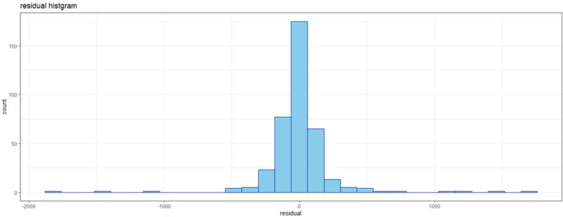
概ね予測できていますが、大きくぶれた時の予測が出来てない感じです。
・残差時系列プロット
# residual timeseries lineplot
forecast %>% drop_na(y) %>%
 mutate(residual=yhat-y) %>%
 rename(date = ds) %>%
 ggplot(aes(x=date, y=residual)) +
 geom_line(color='darkblue') +
 scale_x_date(date_breaks="1 month") +
 labs(title = "residual timeseries lineplot") +
 theme_bw()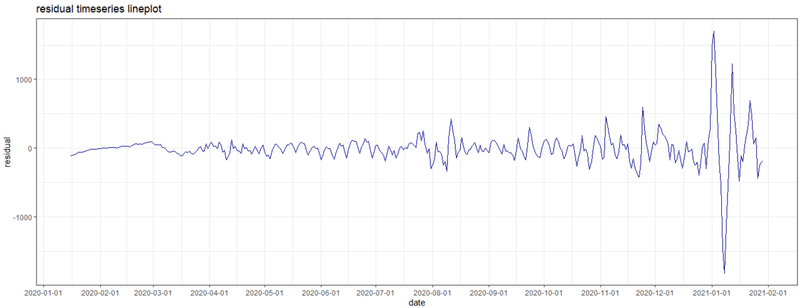
残差を時系列で表示したもの。
モデルと実データ間に差があるのは当然ですが、そのばらつきに周期性があるようですと、きちんとモデル化できていないこととなります。
週成分のバラツキををカバーしきれていない事と、急激な増加に対応できていません。
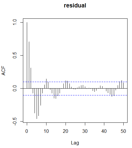
・残差コレログラム
# residual correlogram
forecast %>%
 drop_na(y) %>%
 mutate( residual = yhat - y ) %>%
 select(residual) %>%
 acf(type = "correlation",
     plot = T, lag.max=50)
残差の自己相関をチェックできます。
やはり強い周期性があり、サインカーブを描いています。自己相関が予測モデルでカバーできていませんね。
・累積残差時系列プロット
予測モデルの初めから終わりまで均一に誤差が分布していれば直線状となり、バランスの良い予測ができています。途中で残差が大きくなり曲がっていますと、ある期間予測が上手くいかなくなっていると言えるため調整が必要です。
# cumulative residuals timeseries lineplot
forecast %>%
 drop_na(y) %>%
 mutate( residual = yhat - y ) %>%
 rename(date = ds) %>%
 mutate(cumulative_residual = cumsum(abs(residual))) %>%
 ggplot(aes(x=date,y=cumulative_residual)) +
 geom_line(color="darkblue") +
 labs(title = "cumulative Abs. residuals") +
 scale_x_date(date_breaks="1 month") +
 theme_bw()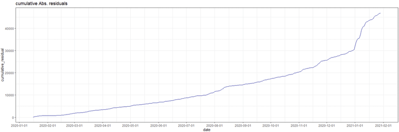
やはり8月と1月、急激な感染者数増加を予測できていない感じですね。
こういう場合にはprophetのイベント成分を使用する必要があります。
●結論
時系列予測は楽しい。
これまでのデータが輝きますし、毎日のデータ取りも有意義で楽しくなります!
●参考
残差診断はこちらを参考にさせていただきました。
「あまりに暑いので、ごく簡単に Prophet の分析の質を向上させる方法を書いた」
https://qiita.com/s_katagiri/items/f579fe339cf7e664ea21
●全コード
# load library
if(!require("tidyverse")){
 install.packages("tidyverse", dependencies=TRUE)
}
if(!require("prophet")){
 install.packages("prophet", dependencies=TRUE)
}
if(!require("lubridate")){
 install.packages("lubridate", dependencies=TRUE)
}
# data import
url <- "https://www.mhlw.go.jp/content/pcr_positive_daily.csv"
dat <- readr::read_csv(url, locale = locale(encoding = "utf8"))
colnames(dat) <- c("ds","y")
dat <- dat %>% mutate(ds = ymd(ds))
str(dat) # check data
# Correlogram
dat$y %>% diff() %>% acf()
# line plot
dat %>%
 ggplot() +
 geom_line(aes(x= ds, y= y), size = 0.5) +
 scale_x_date(date_breaks="1 month") +
 scale_color_brewer(palette = 'Set2') +
 theme_bw() +
 labs(x = NULL,
      y = "pcr_positive_daily",
      color = NULL,
      title = "全国の日あたりコロナ陽性者数")

# Creating model with prophet
model <- dat %>%
 # dplyr::filter(ds >= as.Date("2020-04-01")) %>% # use data after Mar.
 # filter(between(ds, as.Date("2020-04-01"), as.Date("2020-12-10"))) # range
 prophet(growth = "linear", # or "logistic" 線形トレンドか非線形トレンドか
         yearly.seasonality = TRUE,
         weekly.seasonality = TRUE,
         daily.seasonality = FALSE,
         seasonality.mode = "multiplicative", # or "additive"
         changepoint.prior.scale = 0.05, # トレンド変化点での傾きの変化の大きさ
         changepoint.range = 1, # default0.8, 1で直近のデータまでトレンド変化予想に使用する

         n.changepoints = 25 # トレンド変化点候補の数default25
 )
# scaleを大きくするならnを小さく、nを大きくするならscaleを小さく調整したほうが良さそう。
future <- make_future_dataframe(model, 30) # 30日分予想
pred <- predict(model, future)
ftdata <- as_tibble(predict(model, future))
plot(model, pred) # plot
prophet_plot_components(model,pred) # plot component

# merge actual and forecast data
forecast <- ftdata %>%
 mutate(ds = ymd(ds),
        segment = case_when(ds > dat$ds[nrow(dat)]-2 ~ 'forecast',
                            TRUE ~ 'actual'), # SEGMENT ACTUAL VS FORECAST DATA
        keyword = paste0("word")) %>%
 select(ds, segment, yhat_lower, yhat, yhat_upper, keyword) %>%
 left_join(dat) # JOIN ACTUAL DATA

# cross-validation
df_cv <- cross_validation(model,
                         initial = 60,
                         horizon =56,
                         period =10,
                         units = "days")
plot_cross_validation_metric(df_cv ,metric = "mape")+
 geom_hline(yintercept = 0.5,color="red")


# residuals histgram
forecast %>%
 drop_na(y) %>%
 mutate( residual = yhat - y ) %>%
 rename(date = ds) %>%
 ggplot(aes(x=residual)) +
 geom_histogram(color="darkblue",fill="skyblue")+
 labs(title = "residual histgram") +
 theme_bw()

# residual timeseries lineplot
forecast %>% drop_na(y) %>%
 mutate(residual=yhat-y) %>%
 rename(date = ds) %>%
 ggplot(aes(x=date, y=residual)) +
 geom_line(color='darkblue') +
 scale_x_date(date_breaks="1 month") +
 labs(title = "residual timeseries lineplot") +
 theme_bw()

# residual correlogram
forecast %>%
 drop_na(y) %>%
 mutate( residual = yhat - y ) %>%
 select(residual) %>%
 acf(type = "correlation",
     plot = T, lag.max=50)

# cumulative residuals timeseries lineplot
forecast %>%
 drop_na(y) %>%
 mutate( residual = yhat - y ) %>%
 rename(date = ds) %>%
 mutate(cumulative_residual = cumsum(abs(residual))) %>%
 ggplot(aes(x=date,y=cumulative_residual)) +
 geom_line(color="darkblue") +
 labs(title = "cumulative Abs. residuals") +
 scale_x_date(date_breaks="1 month") +
 theme_bw()

# Plot forecasting model
g_model <- forecast %>%
 rename(date = ds,
        actual = y) %>%
 ggplot() +
 geom_point(aes(date, actual)) + # PLOT ACTUALS DATA
 geom_line(aes(date, yhat), color = 'steelblue', size = 0.1) + # PLOT PREDICTION DATA
 geom_ribbon(aes(date, ymin = yhat_lower, ymax = yhat_upper),
             fill = 'skyblue', alpha = 0.3) + # SHADE PREDICTION DATA REGION
 theme_bw() +
 scale_x_date(date_breaks="1 month") + # x label date_breaks
 labs(x = "Date", y = "The number of COVID-19 PCR positives",
      title = "The number of COVID-19 PCR positives (black pont) \nand forecasting model (blue line) by {prophet}")
suppressWarnings(print(g_model))

# Plot forecasting results with all date
g_all <- forecast %>%
 rename(date = ds,
        actual = y) %>%
 ggplot() +
 geom_line(aes(date, actual)) + # PLOT ACTUALS DATA
 geom_line(data = subset(forecast, segment == 'forecast'),
           aes(ds, yhat), color = 'salmon', size = 0.1) + # PLOT PREDICTION DATA
 geom_ribbon(data = subset(forecast, segment == 'forecast'),
             aes(ds, ymin = yhat_lower, ymax = yhat_upper),
             fill = 'salmon', alpha = 0.3) + # SHADE PREDICTION DATA REGION
 theme_bw() +
 scale_x_date(date_breaks="1 month") + # x label date_breaks
 labs(x = "Date", y = "The number of COVID-19 PCR positives",
      title = "The number of COVID-19 PCR positives (black) and Prediction (blue) by {prophet}")
suppressWarnings(print(g_all))

# Plot forecasting results with recent 30 days data
g_30 <- forecast %>%
 dplyr::filter(ds >= Sys.Date()-30) %>%
 rename(date = ds,
        actual = y) %>%
 ggplot() +
 geom_line(aes(date, actual)) + # PLOT ACTUALS DATA
 geom_line(data = subset(forecast, segment == 'forecast'),
           aes(ds, yhat), color = 'steelblue', size = 0.1) + # PLOT PREDICTION DATA
 geom_ribbon(data = subset(forecast, segment == 'forecast'),
             aes(ds, ymin = yhat_lower, ymax = yhat_upper),
             fill = 'skyblue', alpha = 0.3) + # SHADE PREDICTION DATA REGION
 theme_bw() +
 scale_x_date(breaks = function(x) seq.Date(from=ymd(min(forecast$ds)),to=ymd(max(forecast$ds)),by="7 days"),date_labels="%m/%d") + # x label date_breaks by 7 days
 labs(x = "Date", y = "The number of COVID-19 PCR positives",
      title = "The number of COVID-19 PCR positives (black) and Prediction (blue) by {prophet}")
suppressWarnings(print(g_30))