Challenges of UI in VR -Part 1-
![[VRゲームスタジオ]MyDearest公式](https://assets.st-note.com/production/uploads/images/82505830/profile_6159ce22f597c428c73cdde82e80f14a.png?width=60)
Hi, everyone!
I’m Hiyoko, Production Assistant for DYSCHRONIA: Chronos Alternate!
Evolution of UI in VR!
In the Chronos Universe games, VR-unique UI is one of the points that fans are interested in!
UI in VR is still developing.
MyDearest has tackled new expressions in “TOKYO CHRONOS” and “ALTDEUS: BC”.
What new expressions are we implementing in DYSCHRONIA: Chronos Alternate?
Let’s ask Motoyama-san, who has been the Lead UI Designer for several AAA games! (Games that many of you would probably be familiar with!)
Please introduce yourself!
Motoyama:
I’m Motoyama, a UI Artist.
I joined the company to work on DYSCHRONIA: Chronos Alternate.
My hobby is to relax outside, like going camping.
Thanks for having me!
What is a UI Artist?
Motoyama:
The artists working for DYSCHRONIA: Chronos Alternate are divided into several teams, each working on motions, 3D, backgrounds, and so forth.
I’m in charge of the UI, which is the part that the players interact with directly, such as the menu icons.
I also make the 2D graphics used in the game, so my scope of work may be wider than that of a typical UI Artist.
HIYOKO:
UI is a topic of conversation in VR,
but what role does it play in DYSCHRONIA: Chronos Alternate?
Motoyama:
This game relies on UI, and in a good way!
VR games in the past tended to avoid displaying words in VR space, and have as few UI elements as possible.
DYSCHRONIA: Chronos Alternate utilizes UI in a very clever way as the story progresses.
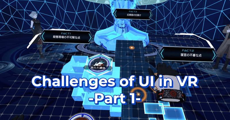
As the crime investigation continues, the players are required to gather various information.
And the UI plays a big role in it, more so than in ALTDEUS: BC.
Hiyoko:
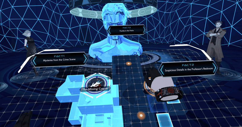
I noticed information is displayed when picking up items!
Like this scene in the gameplay video.
The Aim of UI in DYSCHRONIA: Chronos Alternate
Hiyoko:
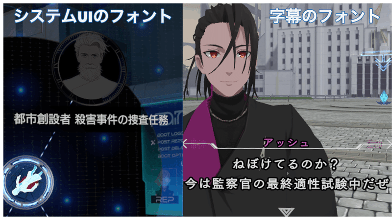
One of the UI that the players see the most is the subtitles.
What kind of work went into it?
Motoyama:
We made sure the subtitles don’t interfere with the story experience!
Hiyoko:
Not interfering…
How did you accomplish that?
Motoyama:
We used a different font from the font used for the system UI, which has more of a story feel to it!
Hiyoko:
So the subtitles have a unique font?
Motoyama:
Correct.
We used a font called “Tsukushi” for the subtitles.
ALTDEUS: BC used the same font for both system UI and subtitles.
But from early in development, I kept saying that I want to use 2 fonts in DYSCHRONIA: Chronos Alternate.
Hiyoko:
Does using 2 fonts make development more difficult?
Motoyama:
It makes the game size bigger.
The storage of the player's hardware is limited, so we need to avoid the game becoming too big.
So the engineers told me early in development, “We’ll try to have 2 fonts in the game, but we can’t promise you anything. We may have to go with a single font in the end.”
Hiyoko:
And what happened…?
Motoyama:
2 fonts! They made it happen!
Choosing the Best Font for Story Experience
Hiyoko:
Why did you choose “Tsukushi” as the font to use?
Motoyama:
Some may be familiar with this font, but it’s often used in written stories.
Hiyoko:
I see!
Now that you mention it, I think I’ve seen it in books.
Motoyama:
Since the font has a “story” feel to it, I thought that it wouldn’t interfere with the story experience.
Hiyoko:
Looking back on my test play, it does feel like the lines sank right in.
Interesting!
Legibility of Subtitles
Hiyoko:
“Tsukushi” with the story feel to it.
Is it harder to read than the font used for the menu?
Did you have to find a way around it?
Motoyama:
Exactly!
The Quest 2 has higher resolution than VR headsets that came before it, so the words are less likely to get smudged.
But in addition to that, we made the default setting so that the subtitles are displayed closer to the players.
Hiyoko:
I see!
You made sure it’s legible by displaying the words closer.
Motoyama:
Compared to ALTDEUS: BC, there’s more freedom to the player’s movement, and the characters move around more.
So the best position for the subtitles changes depending on the scene.
Therefore, the Game Designers checked each scene one by one, and adjusted the positions of the subtitles if necessary.
Hiyoko:
That’s a lot of work!
Were there any findings about the best positionings?
Motoyama:
Try asking Natsumi-san the Game Designer, when she has time!
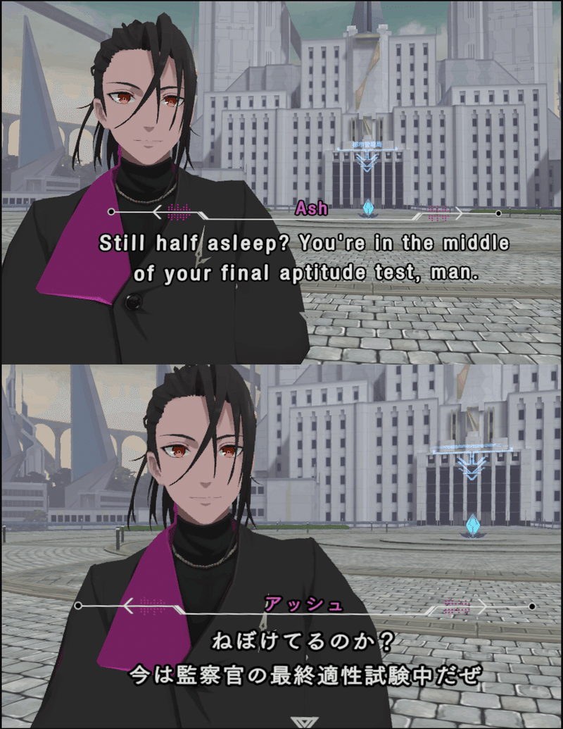
Choosing the Font for English Subtitles
Hiyoko:
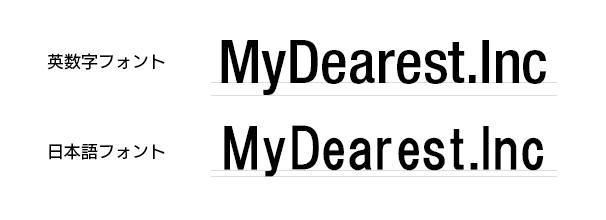
DYSCHRONIA: Chronos Alternate is being developed in multiple languages, but how did you choose the fonts for English?
Motoyama:
In ALTDEUS: BC, we used the Japanese font in the English version too, but this time we are using English specific fonts.
That way the kerning would look cleaner in typesetting, and the bumps and dips of the letters would be more evident.
*Kerning
Adjusting the spacing between individual letters or characters.
Hiyoko:
The bumps and dips…?
Motoyama:
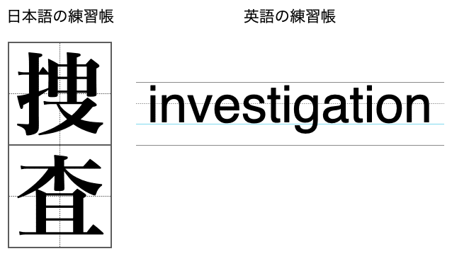
About the difference between English and Japanese,
Japanese tend to have letters that fit in a square.
Remember the writing practice that you did in elementary school?
Hiyoko:
I do! Like the Kanji practice workbooks!
Motoyama:
Compared to that, English tends to decipher its letters with the diagonal bumps and dips.
Even as Japanese, I’m sure we all practiced writing English in the notebooks with 4 horizontal lines!
Motoyama:
That’s why for English, we chose a font with easier to see bumps and dips.
Japanese fonts are designed to fit in a square, so the alphabets in it are made to be that way too.
The bumps tend to get smoothed out, and it becomes difficult for native English speakers to read.
Hiyoko:
Each font has a language that it’s good at!
Motoyama:
Also, there’s little or no variation to the width in Japanese font alphabets.
There tends to be more letters when Japanese is localized to English, so they’ll require more space.
In VR only a limited scope is suitable for reading, so we use a font with narrow letters in order to fit the words in a compact space.
Hiyoko:
In articles like this, the English version does become longer than the Japanese version.
Coming up with the best UI depending on the characteristics of each language… Interesting!
Motoyama:
UI sure is interesting!
Hiyoko:
We’ve asked you about what kind of work went into this game.
Next can we ask why you continue to make UI in VR?
Motoyama:
I simply like to see words floating in VR space.
Hiyoko:
That caught my attention!
Tell me more about it!
Continued in Part 2
The conversation continues, and we were able to hear about the joys of making UI in VR, and the role that it plays.
Look forward to Part 2!
この記事が気に入ったらサポートをしてみませんか?