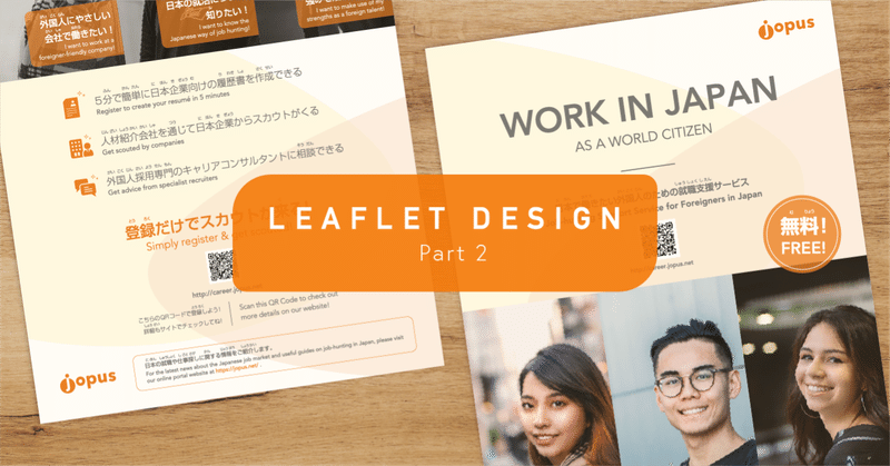
Jopus Leaflet Design (Part 2)

In my previous post, I shared the first half of my process designing a leaflet for Jopus, one of the services by our company. This is a continuation of that where I'll cover the later half of the process towards completion and the end product. Link for part 1 is as below~
Without further ado, here's part 2!
5. Design Variations
With the drafts brought over to digital, I started playing around to make different design variations while waiting for the full content copy to come in.
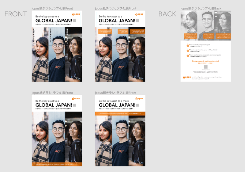
To get a better picture and getting it closer to the real thing, I started to design the back of the leaflet as well, with placeholder copy taken from the service webpage to inform of the USPs (unique selling points) as well as call-to-action. This eventually formed the structure of the leaflet to share with the team as a proposal and to gauge if this is something we could go with or if there's any other missing information that needs to be prepared.
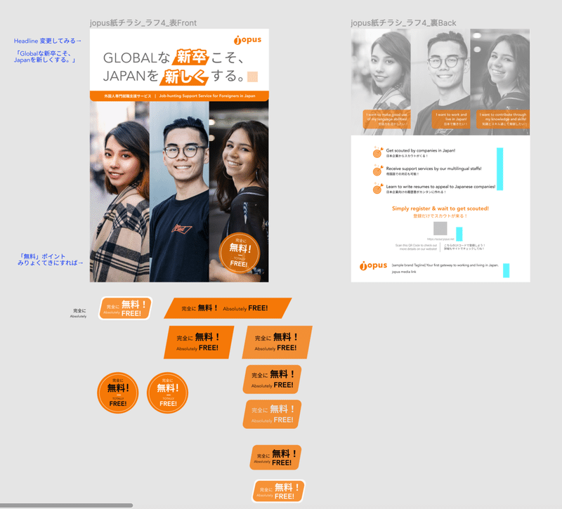
With that the ball started rolling, I was able to get some feedback, and H-san provided some interesting headlines for me to work with, so I started swapping them around as well as did some type treatments to make the composition more appealing. An additional sticker-like icon to promote that the service is free was also requested so I played around to find the right fit for that as well.
On top of that I also tried different ways to mask/shape treatments to the images in the attempt to find that right spot for the appeal.
I then narrowed down the design options to two, to showcase the proposed treatments to the elements, and also the two headline options that we were a little undecided about to be the best.
Having done print before, I was aware of the differences and surprises that may occur while designing on computer and its outcome when printed on paper, even more so (just then I realized) when the software that I was using (Figma) is geared towards digital & UI design. So I did a print out of it and there was indeed some proportional issues in the font sizes and image sizes.
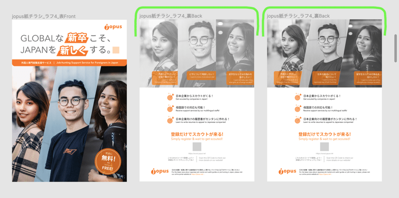
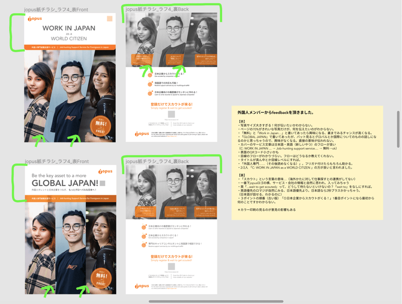
When V-san came by my desk and took a peek at the leaflet out of curiosity, I thought it was a great chance to do a mini 'user test' to see if the message is able to get across, and also as a good way to receive honest feedback and have fresh eyes to catch some blindspots.
After getting a number of useful feedback from V-san and several other international staff members, I compiled them, shared with the team and made the design amendments through careful consideration of the feedbacks.
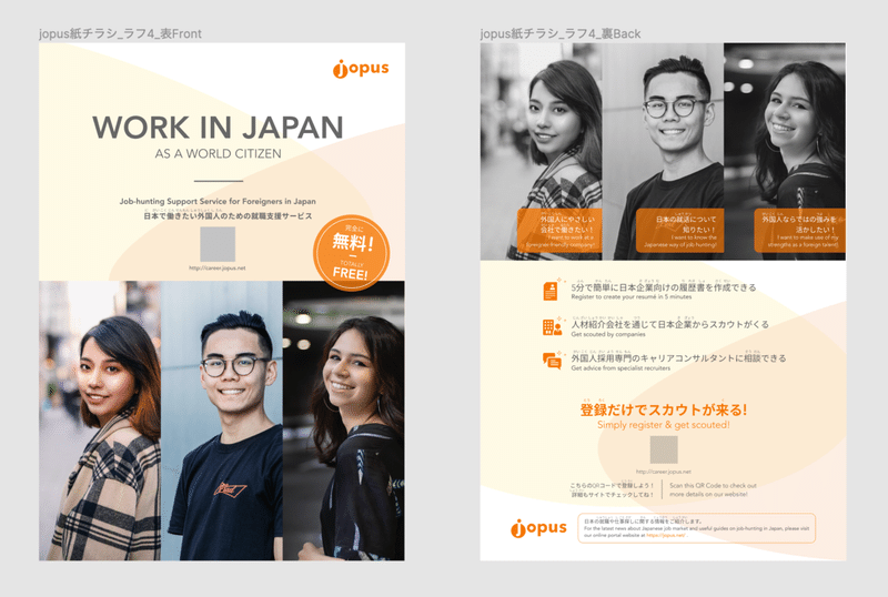
...and this was the result. There were still some confirmations and tweaks left but seeing it was close to completion, I decided to make advance preparations for print.
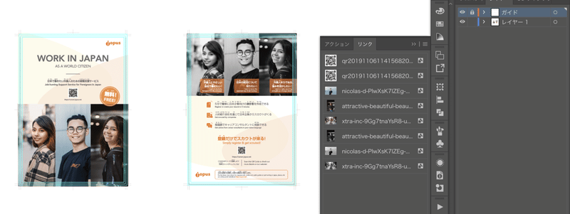
6. Moving from Figma to Illustrator
Being aware that Figma is mainly for designing the digital interface, once we had the design direction pretty much sealed, I started the move from Figma to Illustrator, also as a measure to get everyone on the same page of understanding the possibility of colour dullness occuring when viewing/creating it in RGB mode (for digital) versus the outcome in CMYK mode(for print). I was hoping to simply copy and paste the design over to Illustrator, but my hunch was right that it was better to recreate the thing on Illustrator, thank goodness for following my intuition!
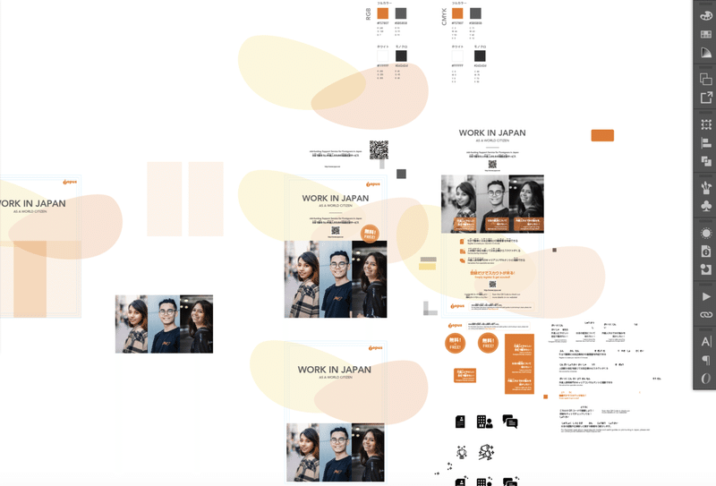
There were a number of other finer details to check and prepare as well during the move, so I'm glad my previous experiences helped me make the intuitive call to move over earlier. Things like colours in CMYK mode, image treatments and resolutions, as well as vector graphics.
7. Edit, Refine (7←→8)
We then went through some back and forth on copy checks, amendments and all the small refinements, and I also took time to ensure things were aligned, colours, fonts and sizes were uniform too. As there was some slight change in schedule plans, and a little uncertainty as to when we would send it for print, I decided also to start preparing the file for print in case we do decide to expedite it in a short amount of time.
8. Prep FA & Hard Copy Checking (7←→8)
Preparing FA (final artwork) for print is quite a lot of work to do, in my opinion. Perhaps my previous experience working in advertising had trained me to check very thoroughly as we dealt with clients that had print ads for newspapers, large POSM (Point of Sale Materials). So during FA we would ensure colour modes, image links, fonts/paths outlined and all are done well before we really send it off.
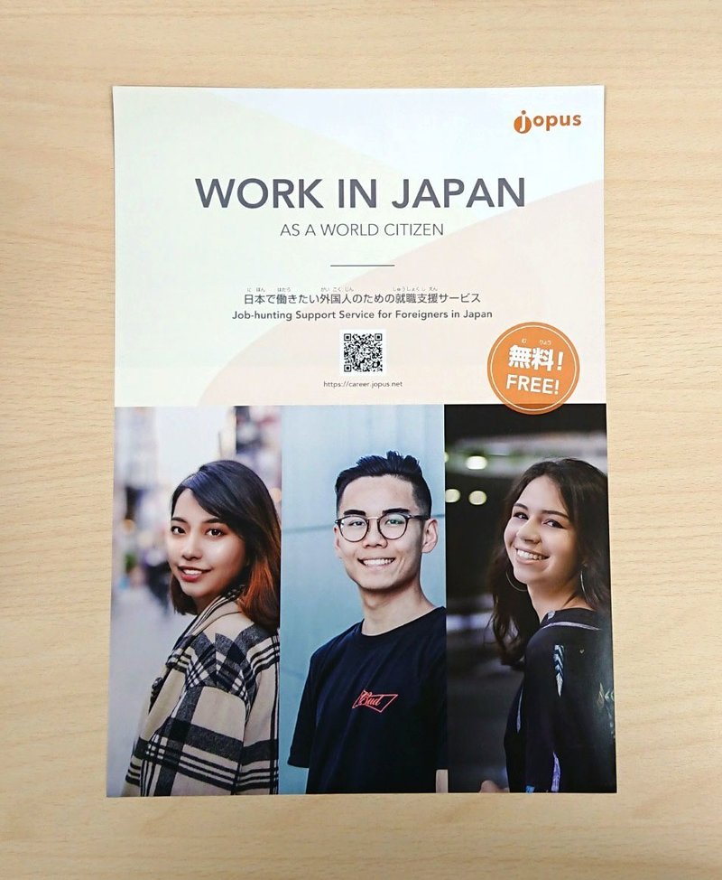
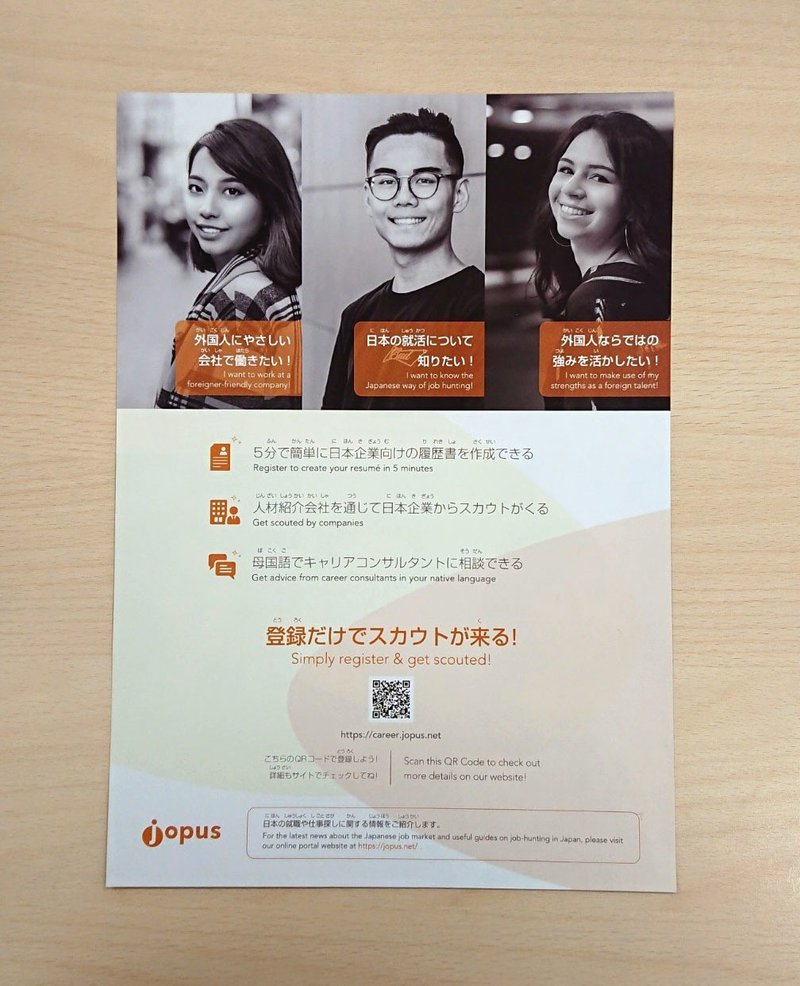
The leaflet is then printed in-house as well to check on the sizes, colour (although worth noting that prints using in-house printers and professional printing companies vary quite a lot), typing errors, and overall feel of it when viewed in physical form.
Unlike digital design, print involves heavy cost, production time and labour, and if things do go wrong (and often times it does happen ;___; ), it is a huge responsibility to take. So, very often as a designer a keen eye is necessary and we would check over and over again to ensure misses are minimized.
Preparing for FA also means cleaning up the work file, ensuring layers are tidy, trim lines, bleeds and all are there so that the printing company are able to do their job with ease (and less chances for heart-attacks from careless errors when receiving the final prints ;(; ◜ ᵕ◝): ).
9. Final Confirmation > Send for Print
With the final go ahead, I passed over the files to H-san who helped to place it into order. In Japan, orders can be made online and seem to barely need any direct communication with the print company. All seem to be done via the internet and all we needed to do is wait for it to be delivered.
While I have not personally printed at the print shop or dealt with a printing company here in Japan, from conversations with colleagues and previous experience on another leaflet design, printing companies here seem pretty reliable and the colours are satisfactory. Through my experience while studying and working in Singapore, good print shops/printing companies were hard to find and print quality can be rather unpredictable, so experiencing this in Japan as a designer is quite a relief :)
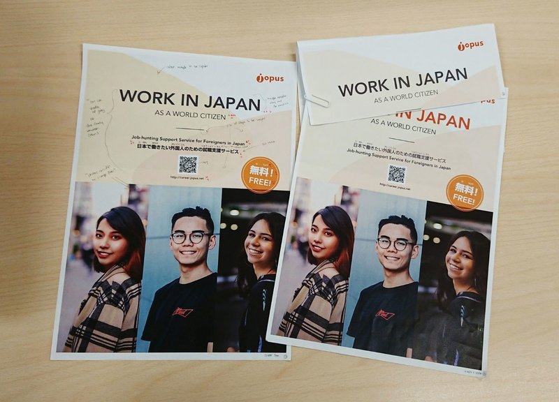
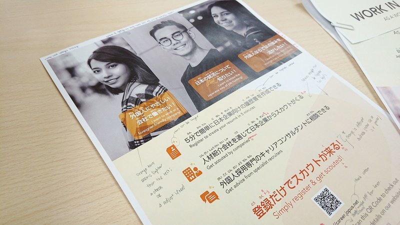
10. Final Print Out
A couple of days later, H-san came over with a smile and handed me this! We're really glad it turned out well! ☆
Thank you for following through this design process and hope there are some useful points for you to takeaway :) till the next post! ✿
この記事が気に入ったらサポートをしてみませんか?