Jopus Leaflet Design (Part 1)

In recent months, a leaflet design for Jopus, one of our services that supports foreigners looking for work in Japan has been requested and I had been given the chance to take on the task. Here, I'll be sharing the process throughout designing the leaflet. Since it'll be a long one, I will be breaking up the post into a few parts and today I will share the first part of it. Enjoy!
1. Briefing & References
Like most design process, I started off by collating information by getting a run down of the project and asked questions to better understand the situation and expected requirements. On a special note, this act, which I came to learn, is called ヒアリング (hearing) in Japanese.
Overview Brief:
Purpose:
Create awareness of Jopus and to increase registration of applicants to our service.
Target:
・International students who want to work in Japan after graduation and are looking to apply for work.
・Foreigners in Japan who are job-hunting and looking for services to assist them in it.
Outreach Method:
・Leaflet to be put up on the noticeboards of Career Counseling Centers in universities so students can view at available options for job-hunting. In this case, the leaflet would be viewed passively (no physical person there to explain about the service).
・Remaining leaflets to be hand-distributed on other occasions.
Tone of Voice:
Friendly, approachable, while maintaining a slightly formal tone.
Other Specifications:
Dual language (English & Japanese), double-sided, full colour, A4 size print.
Next, I started researching and looking up references to get my mind jogging for inspiration and ideas.
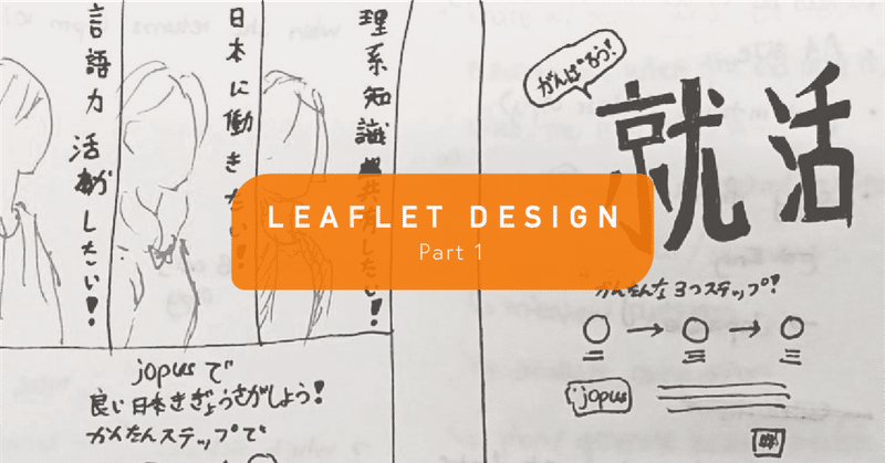
2. Drafts - Hand Drawn Sketches
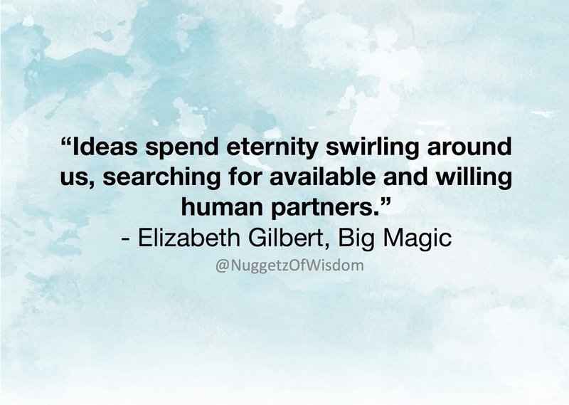
Once I had a feel of some ideas, I quickly drafted them on pen and paper. Quick drafts help for a number of reasons. One of them is so that you could capture the idea/concept before it goes away (inspired by words from Elizabeth Gilbert's book, "Big Magic" (^_−)☆ ).
Another reason is to get an overview of what item goes where in the layout and from there you'll start realizing things you need, like missing information and whether or not some concepts are able to be carried out. Well, let's face it, because sometimes there are ideas that appear very awesome in the head, but when put into physical form in reality, it looks pretty...crap (。•́︿•̀。)
Where there's a need, I wrote some notes under each draft for things worth noting about the idea or its 'selling point', to make it easier for consideration and as useful pointers when discussing with others.
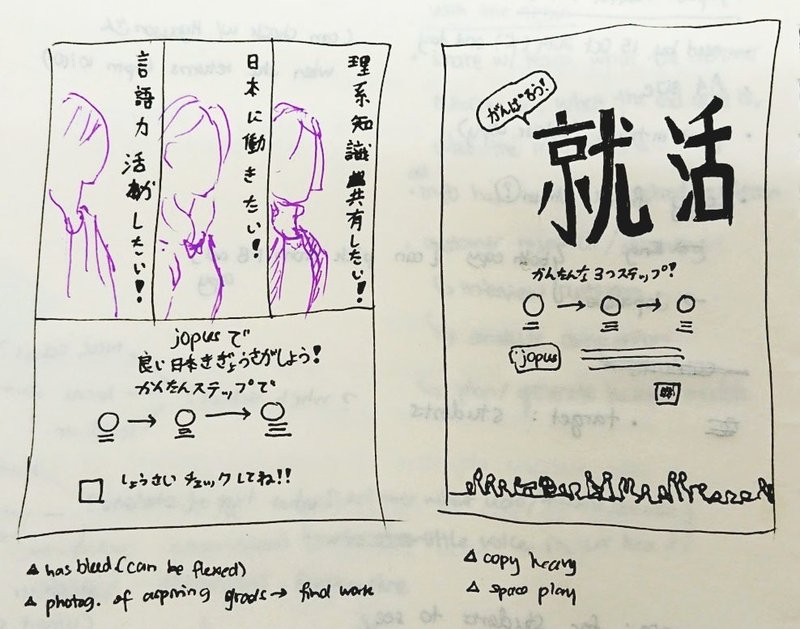
At this point, I started to realize that I don't have solid content to put into the leaflet. Things like what we want to say, what information we want include into the leaflet and the main message we'd like to communicate through to the viewers. I realized too that we need a headline as the main message to put out there and to help us navigate the overall idea. Hence I collated these missing parts and requested for them, as well as used them as a guide to propose suggestions.
Previously while working in an advertising firm, we had an art director, a copywriter and a designer working in a team on projects, so we could rely on the copywriter for copy content, but different organizations work differently, so this time in a different setting where we don't have a copywriter on hand, I took it on to come up with some headline copy suggestions and worked around them as placeholders in drafts while waiting for suggestions and ideas from H-san, our GHR (Global HR) staff member who was in-charge of the leaflet request.
3. Drafts - Digital Layout / Placement Tryouts
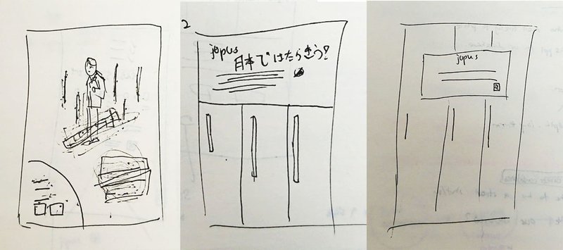
Next, to get things moving and getting it closer to visualization, I transferred ideas from paper into digital. Moving hand-drawn sketches into digital enables us to see how it can be executed closer to the real thing.
At this stage, I started looking for whether or not the angles and look of the images imagined can be found in open sources. In terms of spacing of the content on the page, I played around with the layout and the elements, such as sizes of placeholder headline and body texts, content copy and what item goes where. And for ideas that need vectors or graphic elements, I started looking for them and putting them in to see how they fit in, as well as playing with colours to match the brand and to complement the overall look.
4. Collaborative & Real Time View through Figma
By putting them on digital and switching around, trying things out, it makes it easier for myself and everyone on the team to visualize.
Even more so with collaborative online software like Figma, I now could do it up quickly and share with the team, so they can have a look and make comments on them in real time.
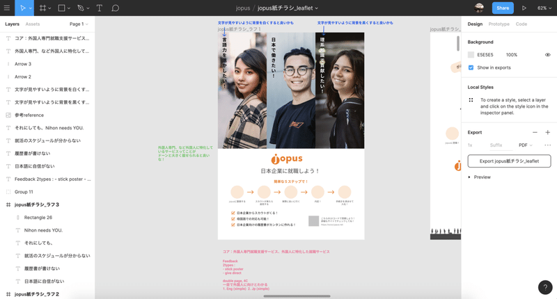
here, the notes in blue are comments from W-san, our design department head, while the notes in green are comments I picked up from H-san and notes in pink are my notes from discussions to keep me on track of the project requirements.
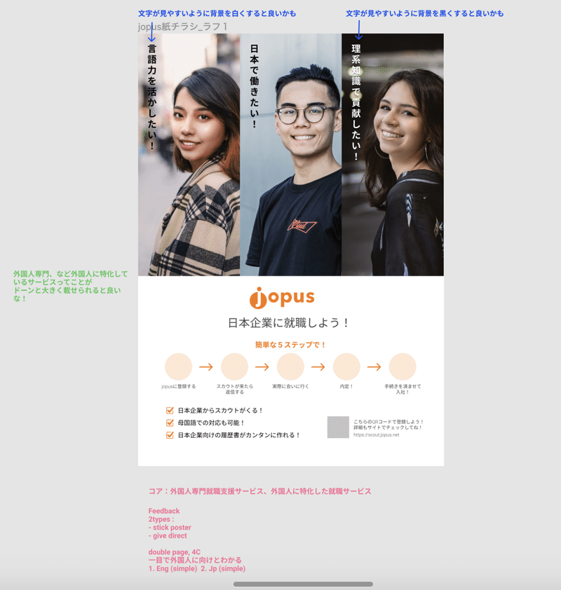
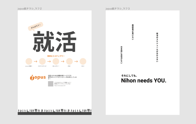
These are the 3 main drafts I did up. The 3rd idea was something H-san and I had discussed on and wanted to try out, unfortunately, I couldn't find a suitable photo in the open source to express that idea and we kind of went along to develop on the 1st idea so I left it as it is. Maybe this idea could be reused at some point in the future. In the design process, this happens quite often, where there are seeds of ideas we'd like to work on but they aren't really ready for this time and we just got to put them on the back burner, and when the time and opportunity is right, it will be of good use in future :)
For the next part, I will share on the version variations, finalizing of the design and the final product. Hope these will be a useful reference in understanding one of many designers' work process, till then! :)
この記事が気に入ったらサポートをしてみませんか?