Creation of Jopus Connecter logo

As the Japanese borders are opening up shortly, the opportunities are increased to travel and work in Japan!
To make job hunting easy, we’ve developed a platform to find jobs or find candidates. The platform is the connector between candidates and companies and vise vera.
Learn more about it here ->
For candidates: https://connecter.jopus.net/en/
For companies: https://connecter.jopus.net/company/ (Japanese)
When building the platform we had to create the identity for the service, Jopus Connecter.
First we started with understanding the current situation. What are we dealing with? As the new design should be based on the current “Jopus” logo, with its existing rules. The Jopus brand already has “Jopus” and “Jopus Biz” logo’s being used.

We couldn’t make changes to the “Jopus” logo and we had to add something instead, but Initially adding the word “Connecter” like “Jopus Biz”, would make the logo quite long, so we had to go to the drawing board to come up with a solution.
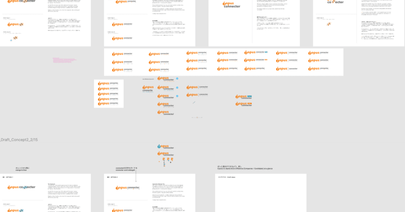
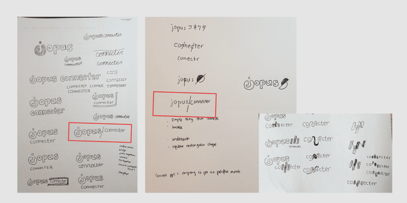
Internally we drew out some sketches, ….
After digitalizing some of the ideas, we tried to retain the brand of Jopus we had to stay true to the base colours, which are orange and grey.
And by understanding the materials we had to work with, we came up for a few options to choose from. Doing so we could get a better understanding about our clients, what the projects owner and other stake holders design taste was like.
We tried different ways to resemble a connection and slimmed the selection down to four options.
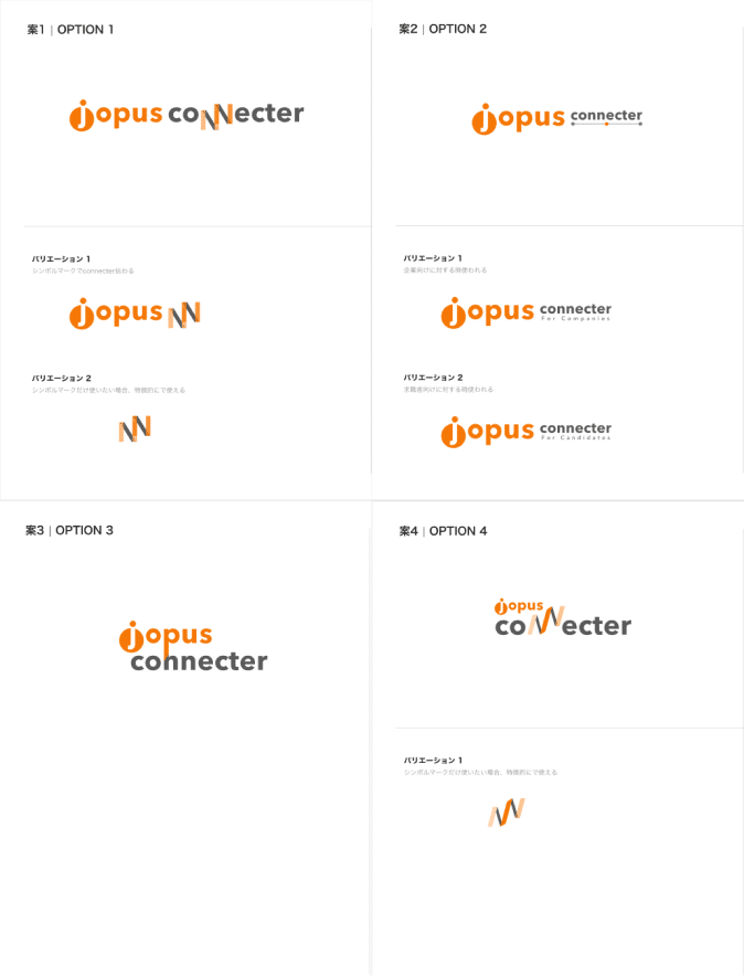
From these options we received feedback about readability of the word “connecter”, the text sizes and the idea to have individual variants for each side, by adding the text for the corporate side and the candidates side, inspired some other ideas to explore.
It became more clear that Jopus Conencter would have two services that would communicate from different directions, there would be initially two problems to solve;
1) Create an overall brand logo for Jopus Connecter that would represent it overall
2) Create two different variants for the candidates (search for jobs) and the corporate side (create jobs positions and search for candidates) of the platform.
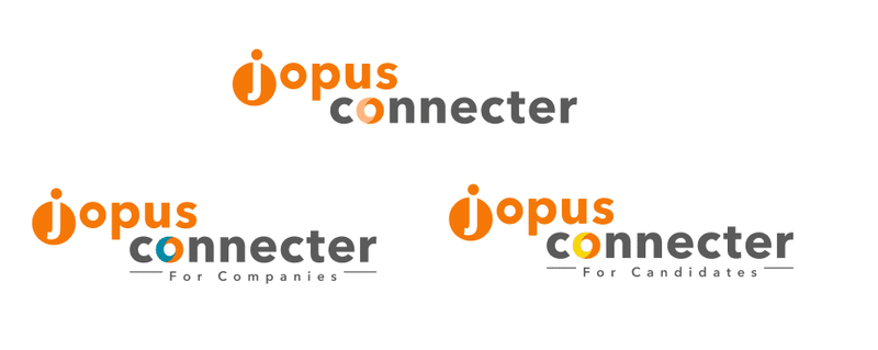
One general logo, that could be used as the brand, and two for the independent services, “For Candidates” and “For Companies”.
We shared some ideas internally and sketched various ideas before presenting them to the project owner and stake holders.
The “For Corporate” we wanted to give a professional look and decided on blue, orange and grey. For the “For Candidates” we thought of a colour that would a gives joyful feeling. As job hunting can be a challenging, we wanted to give a bright and positive feeling, that we are there for the user and choose the colour combination, yellow, orange and gray.
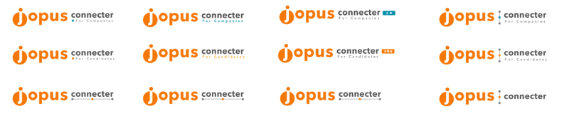
The challenges to overcome would be to make the logo recognizable for the overall brand and the individual sides (Corporate and Candidate).
Eventually the design would lead to the logo that is currently being used.
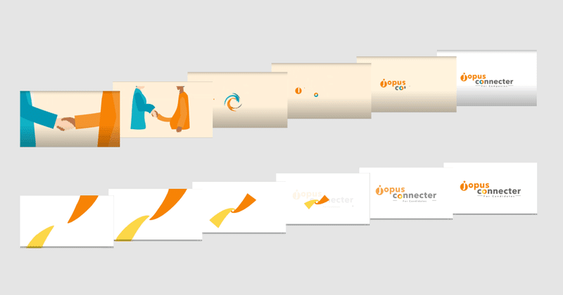
Since the logo is quite long, we needed something that would symbolize Jopus Connecter when displayed on smaller screens or social networks.

We came up with the idea for the “o” from connecter to became our symbol, making two sides one (Blue for Corporate, Yellow For candidate and Orange For Jopus).
When designing we already had an animation in mind, so when the client mentioned they were going to make short videos, it made the circle complete.
Job hunting made easy, Jopus Connecter
Learn more here ->
For candidates: https://connecter.jopus.net/en/
For companies: https://connecter.jopus.net/company/ (Japanese)
この記事が気に入ったらサポートをしてみませんか?