Design update that increased the CVR of Jopus Connecter by over 200%!

Jopus Connecter Registration Process update.
As the service (Jopus Connecter) had launched, we looked for ways on how to improve our system.
I looked at the overall project and was able to identify a few places where we could improve on. One place that could benefit from an update was at the registration process and I already had some ideas how we could improve on it.
First we had to look at how the currently situation (problem) is and what is the behavior of the users.
The Problem.
Users are not completing the registration process.
With the problem identified, we can now look into how we solve the issue.

Looking at the current design and the (somewhat limited) user data.
It became clear that the service was losing potential users due to the flow of the registration process.
Users would access the registration page, be on the page for a moment and would dropout. Since the system and UI/UX design was not designed to measure the behavior of the users in mind, so it was difficult to pinpoint at which stages the users would dropout.
To improve the current and be able to make effective tweaks in the long term, we had to design the system and the UI/UX with measurement in mind.
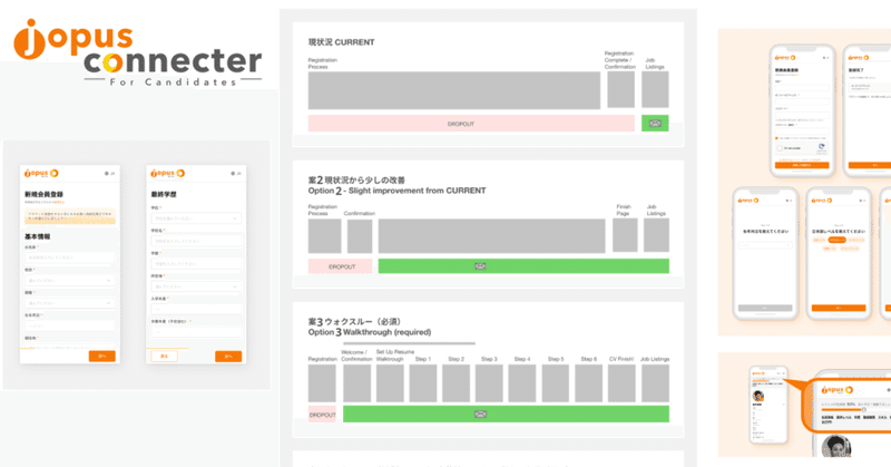
In the image below we have the current situation and a few ideas (Options 1 has been removed).

Current,
Users would access the registration page, enter their information and would have to activate their account in order to have their data saved in the database and being able to login to the service.
Option 2,
Slight improvement from current, keep the same design and steps, but by putting the confirmation email in the beginning instead of at the end. There would be a risk of users not login and enter their information, which would require the database be cleaned up. But in this case the support team would be able to contact and follow up with the user even though the user didn’t enter their information.
Option 3,
This option would simply the registration process, but would require a number of questions to be entered (based on the requirements of the stakeholders involved) in an easy to use, step by step walkthrough.
This would reduce the amount of questions, and in addition, by simplifying the steps, it would allow to take measurements at which step users would get stuck or drop out. (for future tweaks)
Option 4,
This would be similar to Option 3, however this options would make the “walkthrough” optional, but would require to have filled once the user applies for a job. In the meantime support team could contact the user with guides and tips to help enter information that would increase the chance of being found by companies.
Eventually the decision was Option 3.
We filtered down the most critical questions to ask the users and made it easy to enter information with
a few taps.

Standing still about the goal, the current situation and the future are important, as it will help guide with the design process and images of what is needed become clear.
It resulted in an increase of more than 200% conversation rate, compared to the previous month before the improvement, so believe this has been an successful improvement!
We also created a way to increase engagement in the application after the registration process, but that will be for next time…
Here is a sneak peak!

Job hunting made easy, Jopus Connecter
Learn more here ->
For candidates: https://connecter.jopus.net/en/
For companies: https://connecter.jopus.net/company/ (Japanese)
この記事が気に入ったらサポートをしてみませんか?