カプラン・マイヤー曲線をpythonで書く!(ログランク検定してp<0.05の結果を自動で保存)

こんにちはKazuです。
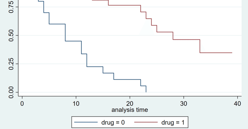
仕事でカプラン・マイヤー曲線(kaplan meier curve)、ログランク検定をする機会があったのでまとめます。
ある指標で患者群を2群に分けた際に、2群間でoutcomeに差があるか?
これを自動で行いたいと思いまとめました。
全体のコードです
特に解説不要の方はmetric, input_dir, event, event_typeという変数をご自身の状況に合うように指定すれば動いてくれると思います(例えばevent=’treatment_score'など)
以下これを解説していきます
import os
import matplotlib.pyplot as plt
import pandas as pd
import lifelines
from lifelines import KaplanMeierFitter, CoxPHFitter
from lifelines.statistics import logrank_test

tumor_csv=pd.read_csv('{input_dir}/result.csv')

thresh_list=sorted(tumor_csv[f'{metric}'].to_list())


for i in thresh_list:

    thresh=i


    tumor_csv.loc[tumor_csv[f'{metric}'] <=thresh, f'effect'] = 1

    tumor_csv.loc[tumor_csv[f'{metric}'] >thresh, f'effect'] = 0

    good_response = tumor_csv.query('effect == 1')
    bad_response = tumor_csv.query('effect == 0')

    try:

        kmf_good = KaplanMeierFitter()

        kmf_bad = KaplanMeierFitter()

        result = logrank_test(good_response[f'{event_type}'], bad_response[f'{event_type}'], good_response[f'{event}'], bad_response[f'{event}'])


        if result.p_value<0.05:
            fig = plt.figure(figsize=(8,8))
            ax=kmf_good.fit(durations=good_response[f'{event_type}'], event_observed=good_response[f'{event}'], label='good')
            ax=kmf_bad.fit(durations=bad_response[f'{event_type}'], event_observed=bad_response[f'{event}'], label='bad')
            kmf_good.plot(ci_show=False)
            kmf_bad.plot(ci_show=False)
            lifelines.plotting.add_at_risk_counts(kmf_good, kmf_bad, labels=['good', 'bad'])
            plt.tight_layout()

            output_dir=f'./p_0.05_add_at_risk/{event_type}/{metric}/kaplan}'

            if not os.path.exists(output_dir):
                os.makedirs(output_dir)
            print(output_dir)
            print(f'p={result.p_value}')

            print(f'thresh={thresh}')

            plt.savefig(f'{output_dir}/thresh={thresh}_p={result.p_value}.png')
            plt.show()
            plt.close()

    except:
        continue
この記事の方法で以下のことを自動で行えます。(python使用)
(カプラン・マイヤー曲線やログランク検定の詳細は割愛)
①患者群を2群に分ける閾値の自動調整
Pythonでカプラン・マイヤー曲線やログランク検定を扱う場合にはlifelinesというモジュールが必要です。
まず前提として下記でlifelinesをインストールしておきます。
conda install -c conda-forge lifelinesまず下記をインポートしておきます
import os
import matplotlib.pyplot as plt
import pandas as pd
import lifelines
from lifelines import KaplanMeierFitter, CoxPHFitter
from lifelines.statistics import logrank_test
outcomeや、2群に分けるための評価指標(なにかのスコアなど)の情報の入ったcsvデータを読み込む
#input_dirはcsvが置いてあるディレクトリ
#result.csvは生存分析したい情報が記載されたcsv

tumor_csv=pd.read_csv('input_dir/result.csv')
評価指標の閾値をどこで区切るかのlistの取得
#metricは評価したい項目 (なにかのスコアなど csvデータの列名を入れる)
thresh_list=sorted(tumor_csv[f'{metric}'].to_list())
②カプラン・マイヤー曲線を2群で描きログランク検定を行いp値を出す
for i in thresh_list:
  #thresh_listに入っているthreshを順々に試していく
    thresh=i

  #評価指標(metric)がthresh以下であれば治療効果あり群=1
  #threshより大であれば治療効果なし群=0

    tumor_csv.loc[tumor_csv[f'{metric}'] <=thresh, f'effect'] = 1

    tumor_csv.loc[tumor_csv[f'{metric}'] >thresh, f'effect'] = 0

    good_response = tumor_csv.query('effect == 1')
    bad_response = tumor_csv.query('effect == 0')

    try:
#カプランマイヤーを施行

        kmf_good = KaplanMeierFitter()

        kmf_bad = KaplanMeierFitter()
 #ログランク検定
        result = logrank_test(good_response[f'{event_type}'], bad_response[f'{event_type}'], good_response[f'{event}'], bad_response[f'{event}'])
③p<0.05である(有意差が合った)場合に特別なフォルダに結果を保存
#ログランク検定を行いp値が0.05より下であれば結果を保存

 #event_type 何を観察したいか 死亡などの生じた時 30 (month)など エクセルの列名を入れる
#event=死亡したかどうか 死亡=1 生存=0 エクセルの列名を入れる
#output_dir 結果を保存するディレクトリ 自然と生成されます


    if result.p_value<0.05:
            fig = plt.figure(figsize=(8,8))
            ax=kmf_good.fit(durations=good_response[f'{event_type}'], event_observed=good_response[f'{event}'], label='good')
            ax=kmf_bad.fit(durations=bad_response[f'{event_type}'], event_observed=bad_response[f'{event}'], label='bad')
            kmf_good.plot(ci_show=False)
            kmf_bad.plot(ci_show=False)
            lifelines.plotting.add_at_risk_counts(kmf_good, kmf_bad, labels=['good', 'bad'])
            plt.tight_layout()

            output_dir=f'./p_0.05_add_at_risk/{event_type}/{metric}/kaplan}'

            if not os.path.exists(output_dir):
                os.makedirs(output_dir)
            print(output_dir)
            print(f'p={result.p_value}')

            print(f'thresh={thresh}')

            plt.savefig(f'{output_dir}/thresh={thresh}_p={result.p_value}.png')
            plt.show()
            plt.close()

    except:
        continue
まとめ
閾値をどんどん調整して2群に分けて(治療効果あり群、治療効果なし群など)、2群間の生存曲線に有意差があるか判定し有意差があれば結果を保存するコードを作成しました。
何万通りでも色々な組み合わせを検討して有意差がでる組み合わせを探索できます
論文化の際に思っていた結果が出ず、色々調整して何とか良い結果を出したい場合(自身の経験)有用かと考えます。
参考になれば幸いです。
この記事が気に入ったらサポートをしてみませんか?