
Next.js Server Actions で作るフォームが快適すぎる

先日、Next.js の leerob 氏が動画を公開してくれたことをきっかけに、以前から気になっていた Server Actions を試してみることにしました。ソースコードは公式の「next-forms」使用しますが、そのままではつまらないので、この機会に新しい話題のツールを使ったり、フォームにちょっと手を加えたりしてみます。
ついでに試す新しいツール:
Bun: Node.js互換のパッケージマネージャを備えた、高速JavaScriptランタイム
shadcn/ui: Radix UIとTailwind CSSを使用して構築された再利用可能なコンポーネント
いくつかのコンポーネント
ダークモード
公式版に追加したツール・機能:
フォームリセット機能
Server Actions とは?
Server Actions は、Next.js 13.4 から追加された新しい機能です。フロントエンドからサーバー上のデータを直接呼び出すことができるため、APIエンドポイントを手動で作成する必要がありません。
Server Actions の何がいいの?
例えば、Next.jsにおける従来のフォーム処理では、サーバー上でフォームデータを処理するためのAPIルートを設定していましたが、form要素の action prop を通してサーバーアクションを使用することで、APIルートを個別に設定する必要がなくなり、より合理的なアプローチが可能になります。
サーバー上でデータの更新を行えるため、クライアント側でそのためのコード(fetch関数など)を記述する必要がなく、結果としてコードの削減につながります。
プロジェクトの作成
Bunを使用して create-next-app を実行し、「next-forms」をブートストラップします:
bun create next-app --example next-forms nextjs-server-actions-formBunをインストールしていない場合は、公式のドキュメントに従ってください。Bunを使いたくない場合は、お好きなパッケージマネージャ(npm、Yarn、pnpm)をお使いください。
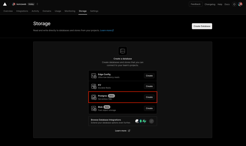
Vercel Postgres のセットアップ
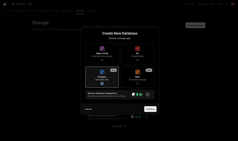
Vercelのダッシュボードから「Storage」タブに移動して「Postgres (Beta)」を作成します:
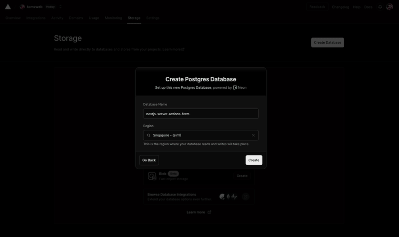
データベースの名前とリージョンを設定します。まだ日本のリージョンはないので、今回はシンガポールを選択します:
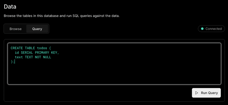
作成が完了したら、下段左サイドの「Data」に移動して、テーブルを作成します。「Browse」を「Query」に切り替えて、以下のSQLクエリ(プロジェクトの app/actions.ts ファイル内でコメントアウトされている)を実行します:
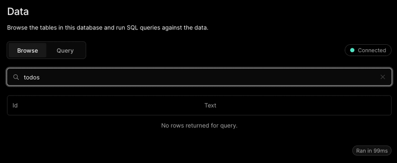
「Browse」に切り替えて検索してみると、テーブル todos が作成されているのがわかります:
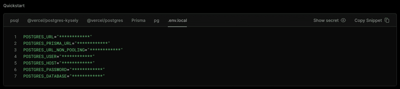
最後に、上段「Quickstart」セクションの「.env.local」タブに移動して、スニペットをコピーしておきます:
動作テスト
プロジェクトに戻って、プロジェクトルートに .env.local ファイルを作成し、先ほどコピーしたデータベース情報をペーストします。(元々 .env.example ファイルが用意されていますが、今回はそれは使わないことにします)
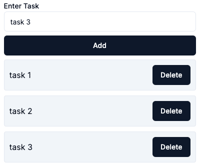
それでは、bun run dev でサーバを起動、http://localhost:3000 にアクセスして、いくつかタスクを作成してみます:
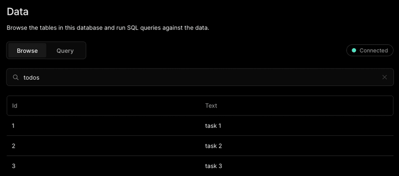
素晴らしい。Vercelダッシュボードを見てみると、データベースにしっかり格納されていることを確認できます:
Tailwind CSS の導入
Tailwind CSS を使わない方は、このセクションは飛ばしてください。
1. Tailwind CSS のインストール
bun install -d tailwindcss postcss autoprefixer
bunx tailwindcss init -p
2. パスの設定
// tailwind.config.js

/** @type {import('tailwindcss').Config} */
module.exports = {
  content: [
    "./app/**/*.{js,ts,jsx,tsx,mdx}",
    "./components/**/*.{js,ts,jsx,tsx,mdx}",
  ],
  theme: {
    extend: {},
  },
  plugins: [],
}
3. グローバルCSSの設定
/* app/global.css */

@tailwind base;
@tailwind components;
@tailwind utilities;
Tailwind CSS の初期設定は完了です。CSSは初期化されているので、この時点でブラウザで確認してみると無装飾の状態であることがわかります。ここから Tailwind CSS のみでスタイリングして、先ほどと同じデザインにすることも可能ですが、せっかくなので話題の shadcn/ui を試してみましょう。
shadcn/ui の導入
shadcn/ui に興味がない方は、このセクションは飛ばしてください。
1. shadcn/ui のセットアップ
bunx shadcn-ui@latest init
✔ Would you like to use TypeScript (recommended)? … no / yes
✔ Which style would you like to use? › Default
✔ Which color would you like to use as base color? › Slate
✔ Where is your global CSS file? … app/global.css
✔ Would you like to use CSS variables for colors? … no / yes
✔ Where is your tailwind.config.js located? … tailwind.config.js
✔ Configure the import alias for components: … @/components
✔ Configure the import alias for utils: … @/lib/utils
✔ Are you using React Server Components? … no / yes
✔ Write configuration to components.json. Proceed? … yes
このプロジェクトでは、グローバルCSSファイル名は、デフォルトの globals.css ではなく global.css であることに注意してください。
2. コンポーネントのインストール
今回は、フォームに使用する、Button、Input、Label コンポーネントを追加してみます:
bunx shadcn-ui@latest add button input label3. コンポーネントの使用
以下のように、ファイル内でコンポーネントをインポートして使用します。button、input、label 要素を、Button、Input、Label コンポーネントに変更するだけです:
// app/add-form.tsx

import { Button } from '@/components/ui/button'
import { Input } from '@/components/ui/input'
import { Label } from '@/components/ui/label'

function SubmitButton() {
  ...
  return (
    <Button type="submit" aria-disabled={pending}>
      Add
    </Button>
  )
}

export function AddForm() {
  ...
  return (
    <form action={formAction}>
      <Label htmlFor="todo">Enter Task</Label>
      <Input type="text" id="todo" name="todo" required />
      ...
    </form>
  )
}
app/delete-form.tsx ファイルも同様に行います。
ブラウザで確認してみてください。これだけで各パーツはいい感じに仕上がってます。カスタマイズも自由自在とのことで、shadnc/ui なかなか便利です。
仕上げのスタイリング
最後に、Tailwind CSS のスタイルを追加して仕上げていきます。
// app/add-form.tsx

function SubmitButton() {
  ...
  return (
    <Button
      ...
      className={`my-2 w-full ${
        pending ? 'cursor-not-allowed opacity-50' : ''
      }`}
    >
      Add
    </Button>
  )
}
// app/delete-form.tsx
function DeleteButton() {
...
return (
<Button
...
className={pending ? 'cursor-not-allowed opacity-50' : ''}
>
Delete
</Button>
)
}// app/page.tsx
export default async function Home() {
...
return (
<main className="flex h-screen items-center justify-center">
<div className="w-96">
<h1 className="sr-only">Todos</h1>
<AddForm />
<ul>
{todos.map((todo) => (
<li
key={todo.id}
className="mb-2.5 flex items-center justify-between rounded border bg-slate-100 p-2.5"
>
<span className="mr-4">{todo.text}</span>
<DeleteForm id={todo.id} todo={todo.text} />
</li>
))}
</ul>
</div>
</main>
)
}では、もう一度ブラウザで確認してみてください。全体的に最初のデザインと同じように仕上がっていると思います。
Tailwind CSS と shadcn/ui のコンビネーション、私は好きです。
ダークモードの追加
今ではダークモードは必須の機能ですので、shadcn/ui でサクッと追加してみたいと思います。
1. next-themes のインストール
bun add next-themes2. テーマプロバイダの作成
components フォルダ内に theme-provider.tsx ファイルを作成し、以下のコードを記述します:
// components/theme-provider.tsx

'use client'

import * as React from 'react'
import { ThemeProvider as NextThemesProvider } from 'next-themes'
import { type ThemeProviderProps } from 'next-themes/dist/types'

export function ThemeProvider({ children, ...props }: ThemeProviderProps) {
  return <NextThemesProvider {...props}>{children}</NextThemesProvider>
}
3. テーマプロバイダの設置
// app/layout.tsx

import { ThemeProvider } from "@/components/theme-provider"

export default function RootLayout({
  children,
}: {
  children: React.ReactNode
}) {
  return (
    <html lang="en">
      <body className={inter.className}>
        <ThemeProvider
          attribute="class"
          defaultTheme="system"
          enableSystem
          disableTransitionOnChange
        >
          {children}
        </ThemeProvider>
      </body>
    </html>
  )
}
4. モードスイッチの作成
components フォルダ内に mode-toggle.tsx ファイルを作成し、以下のコードを記述します:
// components/mode-toggle.tsx

'use client'

import * as React from 'react'
import { Moon, Sun } from 'lucide-react'
import { useTheme } from 'next-themes'

import { Button } from '@/components/ui/button'
import {
  DropdownMenu,
  DropdownMenuContent,
  DropdownMenuItem,
  DropdownMenuTrigger,
} from '@/components/ui/dropdown-menu'

export function ModeToggle() {
  const { setTheme } = useTheme()

  return (
    <DropdownMenu>
      <DropdownMenuTrigger asChild>
        <Button variant="outline" size="icon">
          <Sun className="h-[1.2rem] w-[1.2rem] rotate-0 scale-100 transition-all dark:-rotate-90 dark:scale-0" />
          <Moon className="absolute h-[1.2rem] w-[1.2rem] rotate-90 scale-0 transition-all dark:rotate-0 dark:scale-100" />
          <span className="sr-only">Toggle theme</span>
        </Button>
      </DropdownMenuTrigger>
      <DropdownMenuContent align="end">
        <DropdownMenuItem onClick={() => setTheme('light')}>
          Light
        </DropdownMenuItem>
        <DropdownMenuItem onClick={() => setTheme('dark')}>
          Dark
        </DropdownMenuItem>
        <DropdownMenuItem onClick={() => setTheme('system')}>
          System
        </DropdownMenuItem>
      </DropdownMenuContent>
    </DropdownMenu>
  )
}
5. コンポーネントのインストール
bunx shadcn-ui@latest add dropdown-menu6. モードスイッチの設置
// app/page.tsx

import { ModeToggle } from '@/components/mode-toggle'

export default async function Home() {
  ...
  return (
    <main className="...">
      <div className="...">
        <h1 className="...">Todos</h1>
        <div className="text-right">
          <ModeToggle />
        </div>
        ...
      </div>
    </main>
  )
}
7. スタイルの追加
// app/page.tsx

export default async function Home() {
  ...
  return (
    <main className="...">
      <div className="...">
        ...
        <ul>
          {todos.map((todo) => (
            <li
              ...
              className="... dark:bg-slate-900"
            >
              ...
            </li>
          ))}
        </ul>
      </div>
    </main>
  )
}
それでは、ブラウザで確認してみましょう:
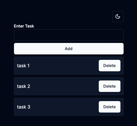
完璧です。モードスイッチでモード切り替え可能なので試してみてください。こんなに簡単に見栄えのいいダークモードを追加できるとは。恐れ入りました。
今回の実験はこんなところで良いかと思ったのですが、タスクを追加した後にインプットフィールド内の入力がクリアされないのが気になったので、その機能を実装して終わりにします。
フォームリセットの実装
// app/add-form.tsx

import { useRef } from 'react'

export function AddForm() {
  const ref = useRef<HTMLFormElement>(null)
  ...
  return (
    <form
      ref={ref}
      action={async (formData) => {
        await formAction(formData)
        ref.current?.reset()
      }}
    >
      ...
    </form>
  )
}
従来のフォームリセットの方法はシンプルでしたが、Server Actions を使う場合は、少し迷うかもしれません。ですが、上記のように useRef を使用して、action 内でリセットするだけです。わかってしまえばとても簡単です。
今回使用したソースコードは、GitHubで確認できます。
おしまい。
この記事が気に入ったらサポートをしてみませんか?