Computing Colors 色を計算する

カラーモデルにはそれぞれ特徴があるので、行いたい操作によってモデルを選ぶようにしましょう。このページではいくつか例をあげてみます。
Each color model has its own characteristics, and it is useful to choose a model according to the operation you want to perform. Below are some examples.
足し算と掛け算
Since RGB values simply represent the intensity of the three primary colors, they can be added and multiplied. In fact, 3D graphics make extensive use of RGB addition and multiplication.
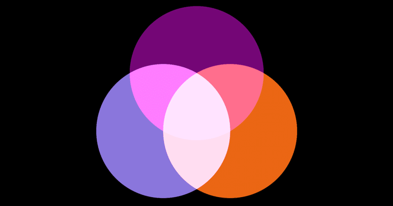
RGBの値は単純に三原色の量を表しているので足し算や掛け算ができます。実際に3DグラフィックスではRGBの足し算と掛け算を多用します。
RGB addition can reproduce additive color mixing, such as adding green light to red light to produce yellow. However, since the values have a hard maximum, the result can be unnatural when mixing bright colors. For example, mixing pale pink and light blue will result in pure white because all the RGB calues hit the maximum. In the real world, because there is no limit to the amount of light, and the eyes adjust the sensitivity according to the brightness, the mix should appear slightly purplish.
RGBの足し算は赤い光に緑の光を足すと黄色になるといった加法混色を再現できます。ただし値がすぐ頭打ちになるので、例えば薄いピンクと水色を混ぜても真っ白になるなど明るい色を混ぜる場合には不自然な結果になります。現実世界では光の量に限界はなく明るさに応じて目が感度を調整するので、少し紫がかった色になるはずです。
In the demo below, you can randomize the colors by clicking on the canvas.
下のデモではキャンバスをクリックすと色がランダムに変化します。
Or subtractive color mixing can be done as well by subtraction values.
引き算で減法混色もできます。
Multiplication corresponds to the case such as a yellow object appears dark when illuminated by blue light. The light reflected off the surface of an object will be the light from the source multiplied by the reflective property of the object. The effect of color filters attached to the camera lens can be also represented as multiplications.
掛け算は黄色の物体に青の光を当てると黒っぽく見えるといった場合に相当します。物体の表面で反射する光は、照明からの光に物体の反射特性を掛け合わせたものになります。カメラのレンズに着けるカラーフィルターの効果も掛け算になります。
Using Hue 色相を使う
The best part of HSV is probably the intuitive hue concept. It is useful in cases like when you want a variation of greenish colors, or when you want to select a set of complementary colors. On the other hand, the mismatch of the S and V values to the human perception is a bit annoying. If you need a more deliberate control of colors, you might want to choose CIELAB.
HSVで最も便利なのはおそらく直感的な色相の概念でしょう。緑っぽい色のバリエーションが欲しい、とか補色の組み合わせを選びたいといった場合に便利です。一方で、S, Vの値と人間の感覚との不一致はちょっと厄介です。もう少し丁寧な色のコントロールが必要な場合は、CIELABを選ぶとよいかもしれません。
Below is a color chart similar to the HSV example above, but is made by rotating hue (by sampling the ab plane using polar coordinates) in the CIE LAB space. CIE LAB in polar coordinates is called CIE LCh. The distance between adjacent colors appears more even, except where the values go beyond the RGB gamut and clamped.
CIE LAB空間で色相を回転させて(極座標を使ってab平面をサンプリングして)、上のHSVの例に似た色見本を作ってみました。CIE LABを極座標で表したものはCIE LChと呼ばれます。RGBの色域を超えて潰れてしまっているところを除けば、隣り合う色同士の距離がより均等に見えます。
Interpolating colors 色を補完する
When interpolating between colors, the results can vary depending on the color model used. The demo below compares RGB, CIE LAB, HSB, and CIE LCh. You can change the color randomly by clicking on the canvas.
ある色と色の間を補完する場合、どのカラーモデルを使うかによって結果に差がでます。下のデモではRGB, CIE LAB, HSB, CIE LChを比較できます。キャンバスをクリックするとランダムに色が変わります。
RGB and CIE LAB are linear changes. When colors of different hues are interpolated, the saturation will go down in the middle of the change. Though the difference is subtle, CIE LAB often appears more even than RGB in general.
RGBとCIE LABは直線的な変化です。色相が異なる色同士の場合、変化の途中では彩度が下がります。違いは微妙ですが、一般にはCIE LABの方がRGBより均等に見える場合が多いでしょう。
HSB and CIE LCh use polar coordinates and the change goes around the color space. Since they maintain the vividness(saturation/chroma), they produce rainbow-like changes when interpolating between near opposite hues.
HSBとCIE LChは極座標なので色空間をぐるっと回り込むような変化になります。色の鮮やかさを維持するので、色相が反対に近い色の場合は虹色の様な変化になります。
Grayscale conversion グレースケール変換
There are many possible ways to convert an RGB image to grayscale. One of the most common methods is to use the Y value from CIE XYZ or xyY as luminance. It fits our intuition that G contributes the most to the apparent brightness, and B has the least effect.
RGB画像をグレースケールに変換する方法は色々考えられますが、CIE XYZまたはxyYのYの値を輝度として用いる方法がよく使われます。Gが最も見た目の明るさに寄与し、Bが最も影響が少ないのは直感にも合っていると言えるでしょう。
$${(R',G',B') = Inverse\: gamma\: correction (R,G,B)}$$
$${V' = 0.2126729\,R' + 0.7151522\,G' + 0.0721750\,B'}$$
$${V = Gamma\: correction(V')}$$
Simulating color vision deficiency 色覚異常のシミュレーション
Color vision deficiency is caused by reduced sensitivity of some of the L, M, and S cones. For example, red-green color blindness(deuteranopia) is the most common color vision deficiency and is caused by low sensitivity of the M cone.
色覚異常(color vision deficiency)はL、M、S錐体のうちいくつかの感度が低くなることが原因で起きます。例えば赤緑色覚異常(第2色覚異常)は最も一般的な色覚異常でM錐体の感度が低い状態です。
To simulate color vision deficiency, first convert the color to LMS stimulus values, adjust the values according to the type of the deficiency, and then convert the values back to the original color model. For example if the original color space is sRGB, you can follow this order.
sRGB → XYZ → LMS → adjust the values → XYZ → sRGB
色覚異常をシミュレートするには色を一旦LMSの刺激量に変換してから色覚異常のタイプによって値を調整し、それを元のカラーモデルに戻してやります。例えば元がsRGBであれば下記の順番で作業します。
sRGB → XYZ → LMS → 値を調整する → XYZ → sRGB
The demo below is based on this paper and simulates red-green color blindness(deuteranopia). The matrix used for the conversion shows that the M-cone input is ignored.
下のデモはこの論文を参考に赤緑色覚異常(第2色覚異常)をシミュレートしたものです。変換に使われている行列を見るとM錐体の入力が無視されるようになっていることが分かります。
$${\begin{bmatrix}L_d \\ M_d \\ S_d\end{bmatrix} = \begin{bmatrix} 1 & 0 & 0 \\ 0.37095 & 0 & 1.24827 \\ 0 & 0 & 1 \end{bmatrix} \begin{bmatrix}L \\ M \\ S\end{bmatrix}}$$
It is estimated that there are approximately 300 million people in the world with color vision deficiency, and we need to be cautious when using color to communicate information.
世界には色覚異常を持った人がおよそ3億人いるとされており、情報伝達のために色を用いる際には注意が必要です。
It is always a good idea to check how color perception is affected by color blindness when designing something. You can search for "color deficiency" + environment or tool name (Web, Photoshop, Figma, etc.) to find a variety of tools. Also, avoid relying "only" on color to convey something in the first place, and use text, symbols, and approrpeate contrasts in brightness.
何かをデザインするときには、色覚異常で色の知覚がどう変化するかを常に確認する様にしましょう。「color deficiency」+ 環境やツール名(Web, Photoshop, Figmaなど)といったキーワードで検索すると色々見つかります。また、そもそも何かを伝えるために色の種類に「だけ」に頼るのを避け、文字や記号、明るさのコントラストを的確に用いるようにしましょう。
This is a copy from kyndinfo.notion.site. Here's the original page.
このページはkyndinfo.notion.site からの転載です。元のページはこちら。
この記事が気に入ったらサポートをしてみませんか?