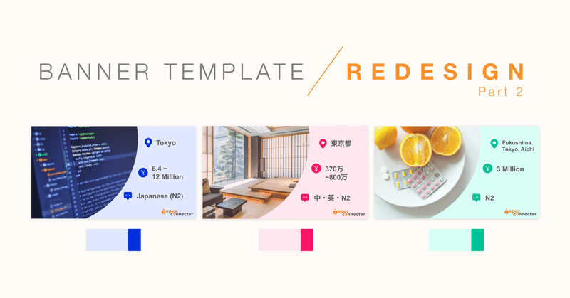
Job List Banner Template Redesign (Part 2)

In the previous post, I shared about the preparation work and the before-after outcome of redesigning a set of job list banners template.
Today, I will share a little more in detail the colours and image selection for the redesigned banners.
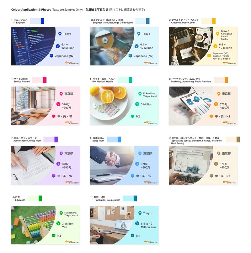
In order to identify and keep track of which job industries are in the list as well as their current assigned colours, I created a table based on provided information to make it visually easier to reference. This also helps give an overview of which colours are being used and to see if they are still a good match or if some tweaks are needed, and if so, what the new colours would be.
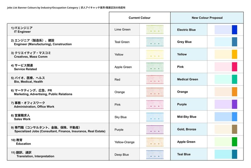
Colours play an important role in delivering communication visually, as it invokes emotions and helps us relate to things in an instant. Although I selected the new colours mostly by instinct and previous background knowledge on colours, for reference, more information on colour meaning and psychology can be found in this article below by Graph1x.
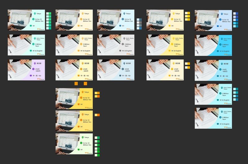
Similar to mixing the 'right' colours for a painting, I did several try-outs to find the best colour combinations within the banner itself, to ensure there's an overall balance between the 11 listed categories (job industries), and that they can be distinctive of each other while still keeping its colour consistency.
Once I had the colour range pretty much set, I then moved on to searching and selecting images to compliment/represent the respective job industries. Pexels is a very useful resource when it comes to quality, royalty free images, I'd totally recommend :) ☆
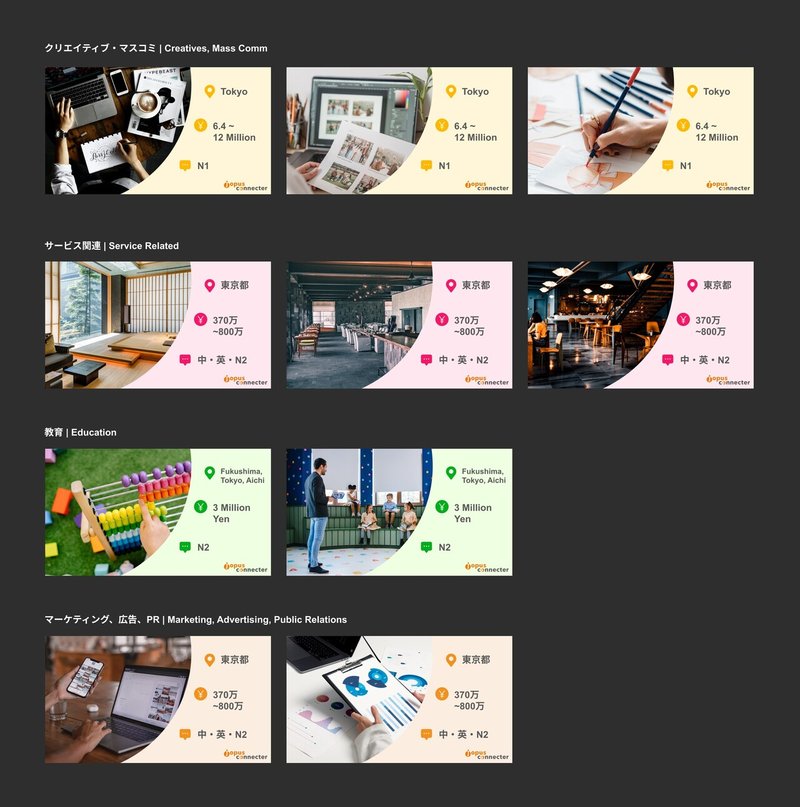
Since it is a template, the image needs to be generic enough to fit the most common job positions that may come in, yet specific enough to provide the visual hint right away what industry it represents so job seekers can scan through and pick out quickly at a glance.
In addition, as most positions offered in the jobs list are located in Japan and targeted at foreigners living in Japan, the feel of the environment and demographic representation is something to take note of when making image selections as well. Most royalty free images available may not have as much Asian representation and/or will very quickly give away that it isn't located in Japan. For example, the image of a classroom environment in Japan is very different from that in the United States and Europe, and therefore can't exactly be used, or to be used very selectively.
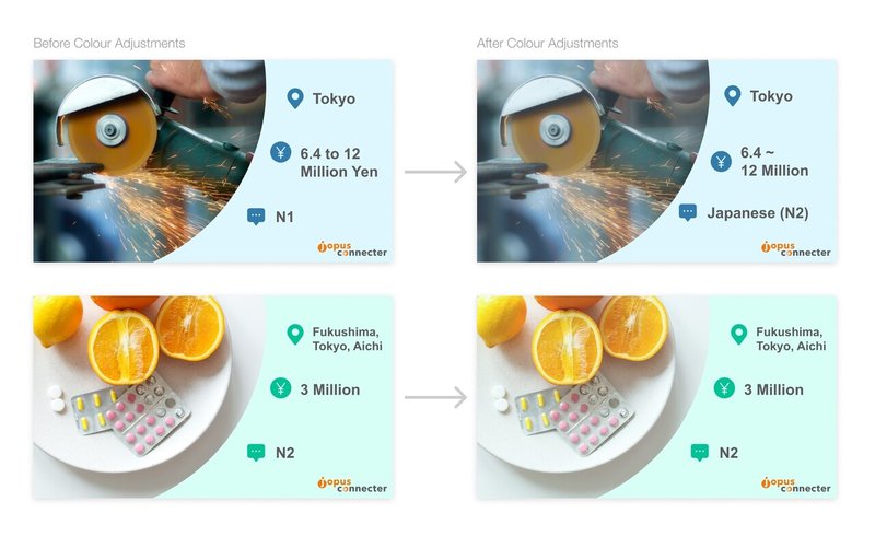
After narrowing down and making final selections of the images to suit each industry, I then did some colour adjustments to each of the images. Since the images are sourced from all over, they will have different colour tones in their original state.
Colour adjustments are highly recommended to ensure colour and overall consistency when creating a series of banners (or any other series of visual items for that matter). It does make a subtle, but powerful impact, in my opinion :) ✿
In this case, slight colour adjustments on the images here helps the image blend into the banner & sets the image to play the role as a background complimentary element, thus bringing the job information to the forefront as the focus, where the viewer may be most interested in. At the same time, this colour adjustment also helps bring the entire series together when it is set to a similar colour tone.
Thereafter, with a little bit of final overall tweaks and adjustments, here is a sample set of the redesigned jobs list banners that I shared with the team.
With this sample set and the team's approval, I then moved on to creating the templates for dual languages (Japanese & English) on Google Slides, making fine adjustments to the layout, spacing and text formatting etc..
In the next part, I will share more of that process, towards the final delivery!
So please look out for that soon! ;) ☆
Till then, take care! ✿
この記事が気に入ったらサポートをしてみませんか?