デザトレ!(Dezatore!): Colours in Logo Design

Continuing the デザトレ!(Dezatore!) series, today I'll be sharing about another デザトレ!(Dezatore!) session that I conducted with the design team members. The topic was about Colours in Logo Design and some simple tips when working with colours in logo design.
※デザトレ!(Dezatore!) is a one-hour session set out weekly within our design team to explore, experiment, share skills, knowledge and ideas among ourselves. A little more detailed explanation can be read here :)
As humans, we are visual creatures, hence, when it comes to viewing and recognizing logos, it is natural that we pick up on the shapes and colours of them on the first impression. Therefore making colours being one of the key elements in logo design, as well as brand recognition.
・
・
・
・
・
・
・
・
・
・
・

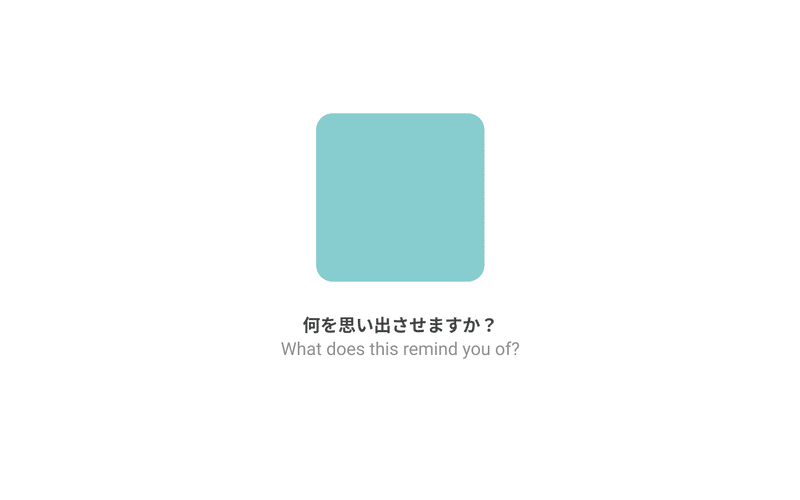
It's quite likely you may have an idea that that colour reminded you of a certain jewellery brand, or the name 'Tiffany' in serif font may have popped up in your mind. Members in the team had the answer quite quickly as well. Strength in marketing and advertising definitely plays a part in the brand exposure, however, the example above shows how colour plays a big part, and often times, goes a long way in carrying the logo & brand recognition.
So to start off, how are colours used in logo design (or any design for that matter)?
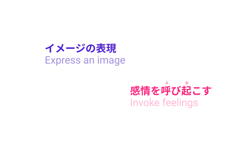
Colours help express imagery (like being in a candy cane wonderland, or raging fiery pit) and invokes feelings (like a soft loving hug, or a fresh lush garden of greenery).
There are different tones & shades within a colour itself as well, for example, pink can have shocking pink that expresses something very vibrant & wild & is so attention grabbing to the eyes it's hard to ignore. There's is also soft pink on the other side of the spectrum, that has such a gentle touch to it, that could remind you of feelings you have for someone you love, or a soft cuddly toy you used to cuddle as a child or the beautiful scenery of pink cherry blossoms in spring you enjoyed that one time.
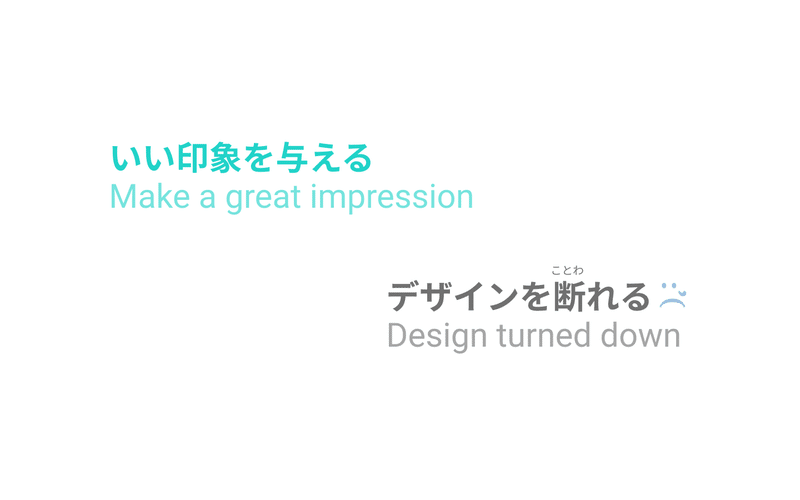
When colours are used well in a logo, it can help make a great impression & in expressing a brand & its identity. Hence, choice of colour(s) in design does have an important role, and at times, it may make or break a design.
Upon doing some research, gathering notes from the research & also pulling in some knowledge gained from experience, here are some tips when it comes to making colour choices in logo design.
1- Research
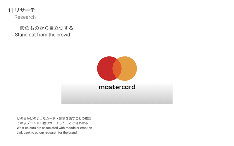
As with most design process, start with research. What colours & styles are currently being used in logos of the similar industry you're working your logo design on? Are there any ones that go against the grain, & do they work well? How do they do it? How are the colours being applied/used in the logos?
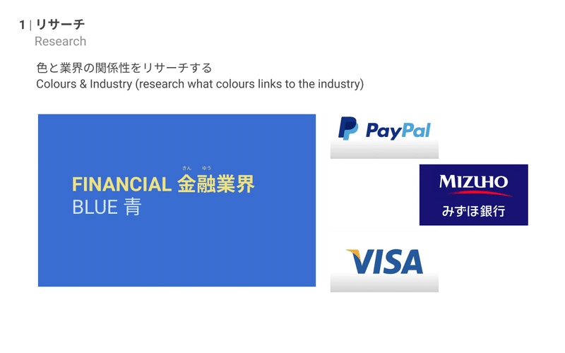
What colours are associated to the moods or emotion for the brand that you're designing for? How do you link & express that mood or emotion through colour, so the viewer empathizes with & relates to it at first glance?
It also helps to have an idea of the typical consumer/target audience of the logo you're designing for. What are they like? Is there a particular style they lean towards?
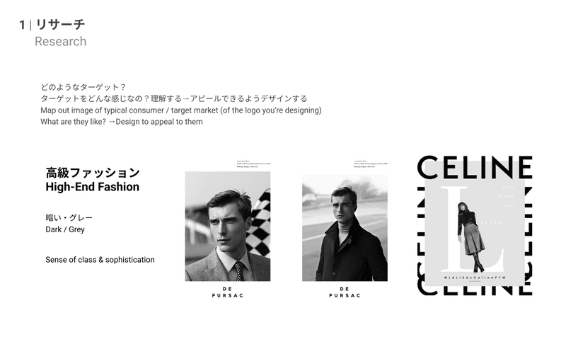
In addition, it may also be worthwhile to consider where will the logo be used, so you'll have a better judgement of the colour range, tones etc. that you use while doing the design.
2- Limit Number of Colours
Another tip would be to limit the amount of colours, in other words, avoid overuse of colours, unless you know how to play with it & it plays a strong role in your concept.
Limiting the amount of colours used to between 1 to 3 will help make your logo easy & clear to digest, making it an effective communication of the brand in a fraction of the time.
Overuse of colours may run the risk of causing confusion, weaker brand impression into the minds of the viewer, as well issues with legibility and or print or when it goes onto various platforms. Sometimes keeping it simple is best.

3- Keywords
The next tip would be to list up or map out keywords for the look & feel, impression you'd like to give for the logo you're about to design.
How this could come about will usually be based on the client brief or after having conversations with the client to understand what they're looking for. Upon looking into the brief or information from client conversation, consider how you want to express that, what look & feel you'd like to communicate across to the viewer through the logo - list all the keywords or map them out on a piece of paper or drawing pad (whichever you feel works best for you). Freely brain dump all those keywords into that paper (or papers, when you do start going on a flow ;)).
This will help you visualize better & you'll be able to group, organize & categorize certain keywords together & that will help you in forming ideas, as well as selecting which direction you'd like to take with your logo design & the colour selection to go with.
When you'd like to go a little further, consider also listing down/mapping out where the logo would be used, utilized and seen. This will also help with your colour decision-making for your logo.
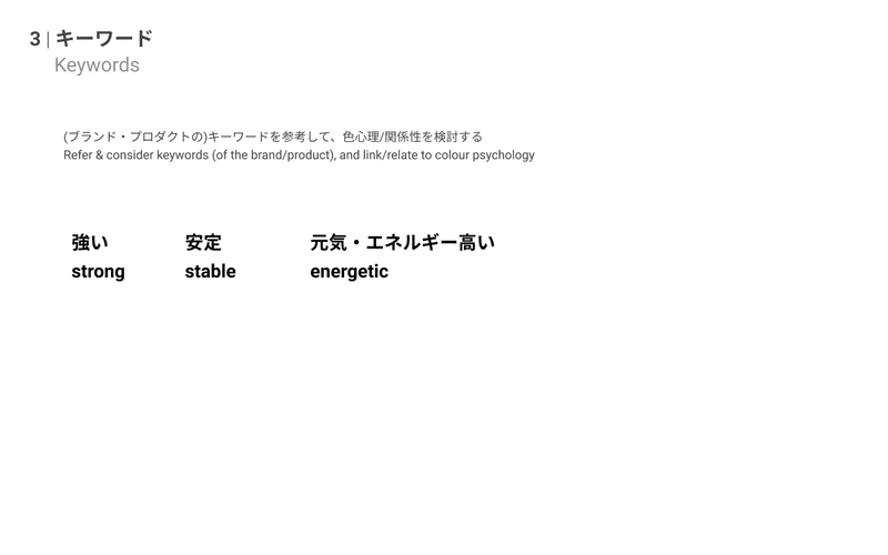
For example keywords like 'strong' & 'energetic', you will have certain colours & its tones & shades that will express that imagery/feeling. Namely orange, warm colours & it is very likely to be pretty highly saturated.
Hence this method of listing up keywords can really help you go a long way, I dare even say throughout your design process, as you will continuously come back & refer to help you stay on track with what you're trying to create & express through your logo.
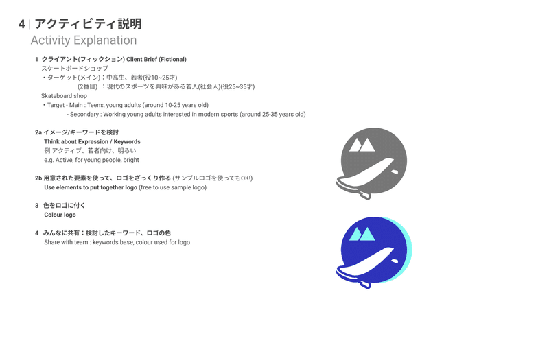
In the later half of the Dezatore! session, I had the team try out a little activity. Based on the tips shared earlier on, they were to design a logo for a fictional client, one that would like a logo designed for his/her skateboard shop.
I provided some simple information as a brief, then suggest they consider & list up expressions & keywords for the logo that they'll design for the skateboard shop.
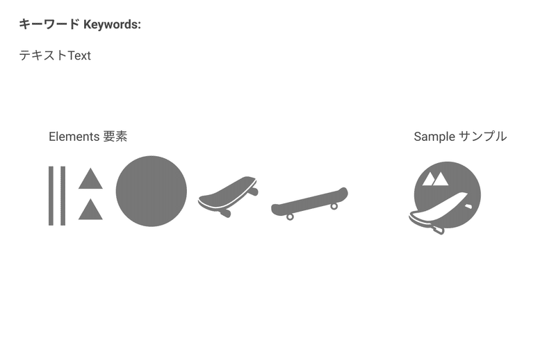
As we were short on time (approximately 15-20mins) & it was just a light & easygoing activity I'd like the members to enjoy fiddling around, I provided some elements for the logo for them to put together and also a sample logo if they wish to use it so they can focus on playing around with the colours & expression they wish to bring across.
Here are some of the designs & shared thought process & research done by members of the team. We did a round-the-table sharing with the logos we created & how we came about it.
As always, it is really interesting to see even with same provided elements, how each one of us interprets it in our own way, creating a range of designs of various styles. Listening to their each other's thought process & how they came about with the idea & the piece itself, is also always very intriguing & fun to me. It helps me (and hopefully all of us in the team) to understand one another better & see the potential & skills that each of us have to offer through our creative work :)
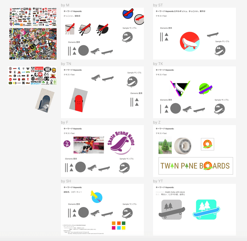
Even though it was within a short span of time, I felt it was a good opportunity for creative exploration in that small yet essential aspect of design; colours in logo design. As well as a time for us to witness different styles & approach we each take in expressing the logo designs we made.
I hope this inspired you a little to do a little fun activity of your own or with your team members, and that the tips shared can help you when you're working on your logo design :)☆
Feel free to like & share when you find this helpful with regards to colours in logo design!
Till then, take care & happy colouring ;)✿
::::::::::::::::::::::::::::::::::::::::::::::::::::::::::::::::::::::::::::::::::::::::::::::::::::::::::::::::::::::::::::
Header credits:
Template Design by asato
この記事が気に入ったらサポートをしてみませんか?