[Python] Matplotlib でグラフを操る

機械学習では、データセットの深い理解が必要で、そのデータを理解する方法として、最も効率的なのが「データの可視化」することです。人はだれでも図や絵で見たほうが理解が深まりますからね。
そこで、大規模データの可視化を効率的かつ簡単に行えるのが、Matplotlib(マットプロットリブ)です。MatplotlibはPythonのデファクトスタンダードのグラフ描写ライブラリとしての地位を築いていて、Numpyも併せて使うし、Pythonで勉強しておこうと思います。
正規分布をヒストグラムで可視化
import numpy as np
import matplotlib.pyplot as plt
%matplotlib inline

#np.random.seed(0)

""" 正規分布(ガウス分布 randn """
x = np.random.randn(100000)

""" 可視化する """
plt.hist(x, bins='auto')
plt.show()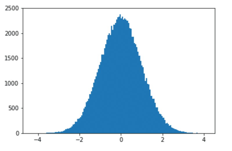
二項分布グラフ
確率が0.5である試行を100回やったときの成功数 × 100回 をヒストグラムで可視化してみる。
例えば、コインの裏表どちらが出るか(0.5の確率)を100回検証した結果の成功数(例えば 成功=表) → それを 100回やった結果
nums = np.random.binomial(100,0.5, size=100)
print(nums)

"""  実行結果 """
[51 56 53 52 54 53 58 43 43 47 44 44 46 41 41 51 51 47 47 49 49 48 47 51
 46 48 56 53 54 56 45 53 48 46 56 51 52 65 44 61 50 54 48 55 46 53 50 51
 47 57 55 53 47 48 44 59 49 50 46 49 47 54 49 53 43 47 52 53 42 51 51 47
 57 48 49 49 53 49 38 51 57 53 51 47 55 43 52 53 52 45 50 50 57 41 49 41
 52 53 46 49]

""" 可視化する """
plt.hist(nums, bins='auto')
plt.show()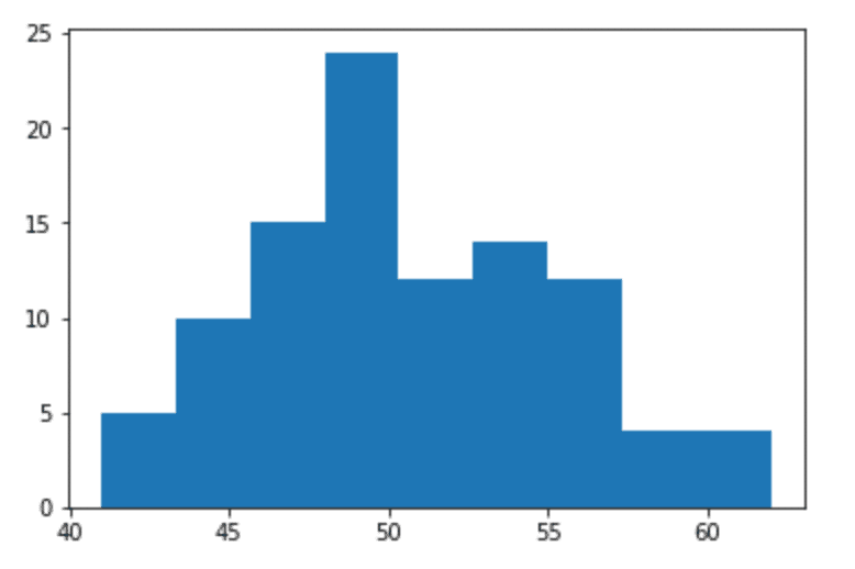
目盛りやラベル
以下は y = sin(x) をグラフで表したもの。目盛りやラベル、グリッドにタイトル等を追加して分かりやすく可視化させる。
import matplotlib.pyplot as plt
import numpy as np

%matplotlib inline

""" np.pi は円周率を表す """
x = np.linspace(0, 2*np.pi)
y = np.sin(x)

""" タイトル """
plt.title("y=sin(x)(0 <y <1)")

""" x軸/y軸 ラベル """
plt.xlabel("x-axis")
plt.ylabel(" y-axis")

""" 目盛りラベルとポジション """
positions = [0, np.pi/2, np.pi, np.pi*3/2, np.pi*2]
labels = [0, 90, 180, 270, 360]
plt.xticks(positions, labels)

""" グラフをプロット"""
plt.plot(x,y)

""" グリッド """
plt.grid(True)

""" 表示 """
plt.show()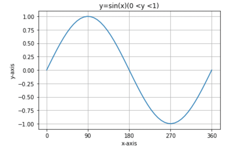
複数グラフ
import matplotlib.pyplot as plt
import numpy as np

%matplotlib inline

x = np.linspace(0, 2*np.pi)
y1 = np.sin(x)
y2 = np.cos(x)

plt.title("graphs of trigonometric functions")
plt.xlabel("x-axis")
plt.ylabel("y-axis")

positions = [0, np.pi/2, np.pi, np.pi*3/2,np.pi*2]
labels = [0, 90, 180, 270, 360]
plt.xticks(positions, labels)
plt.plot(x,y1, color="g", label="y=sin(x)")
plt.plot(x,y2, color="b", label="y=cos(x)")
plt.legend(["y=sin(x)", "y=cos(x)"])
plt.grid(True)
plt.figure(figsize=(5,5))
plt.show()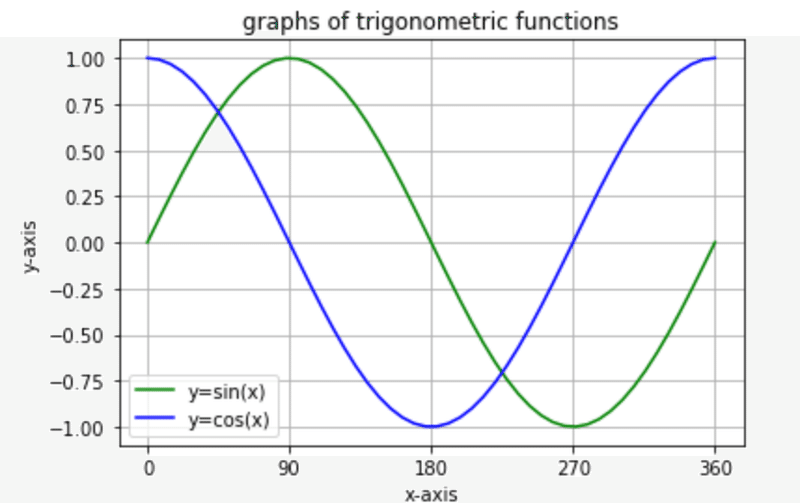
サブプロットで複数グラフ
import matplotlib.pyplot as plt
import numpy as np

%matplotlib inline

x_upper = np.linspace(0, 5)
positions_upper = [i for i in range(5)]
# = positions_upper = [0,1,2,3,4]
labels_upper = [i for i in range(5)]
# = labels_upper = [0,1,2,3,4]

fig = plt.figure(figsize=(9,6))

plt.subplots_adjust(wspace=0.4, hspace=0.4)

""" 上段のグラフ x 3 """
""" y=x**1  y=x**2  y=x**3 """
for i in range(3):
    y_upper = x_upper ** (i + 1)
    ax = fig.add_subplot(2,3,i+1)
    ax.grid(True)
    ax.set_title("$y=x^%i$" % (i+1))
    ax.set_xlabel("x-axis")
    ax.set_ylabel("y-axis")
    ax.set_xticks(positions_upper)
    ax.set_xticklabels(labels_upper)
    ax.plot(x_upper, y_upper)

x_lower = np.linspace(0, 2 * np.pi)
positions_lower = [0, np.pi /2 , np.pi, np.pi * 3/2, np.pi * 2 ]
y_lower_list = [np.sin(x_lower), np.cos(x_lower)]
title_list = ["$y=sin(x)$", "$y=cos(x)$"]
labels_lower = [0, 90, 180, 270, 360]

""" 下段のグラフ x 2 """
""" y=sin(x), y=cos(x) """

for i in range(2):
    y_lower = y_lower_list[i]
    ax = fig.add_subplot(2,3, i+4)
    ax.grid(True)
    ax.set_title(title_list[i])
    ax.set_xlabel("x-axis")
    ax.set_ylabel("y-axis")
    ax.set_xticks(positions_lower)
    ax.set_xticklabels(labels_lower)
    ax.plot(x_lower, y_lower)

""" y=tan(x) """
x_tan = np.linspace(-np.pi / 2, np.pi / 2)
positions_tan = [-np.pi /2, 0, np.pi /2 ]
labels_tan = ["-90", "0", "90"]

ax = fig.add_subplot(2, 3, 6)
ax.grid(True)
ax.set_title("$y=tan(x)$")
ax.set_xlabel("x-axis")
ax.set_ylabel("y-axis")
ax.set_xticks(positions_tan)
ax.set_xticklabels(labels_tan)
ax.set_ylim(-1, 1)
ax.plot(x_tan, np.tan(x_tan))

plt.show()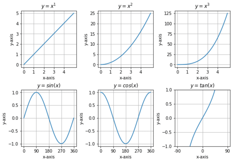
散布図
plt.scatter(x,y, s=z, c=z, cmap="Greens")としてみます。「s=z」は、zの値によってサイズを変え、「c=z」では、zの値によって濃さを変えています。cmapは色です。
import numpy as np
import matplotlib.pyplot as plt
%matplotlib inline

np.random.seed(0)
x = np.random.choice(np.arange(100),100)
y = np.random.choice(np.arange(100),100)
z = np.random.choice(np.arange(100),100)
plt.title("random scatter")
plt.xlabel("x label")
plt.ylabel("y label")

plt.scatter(x,y, s=z, c=z, cmap="Greens")
plt.show()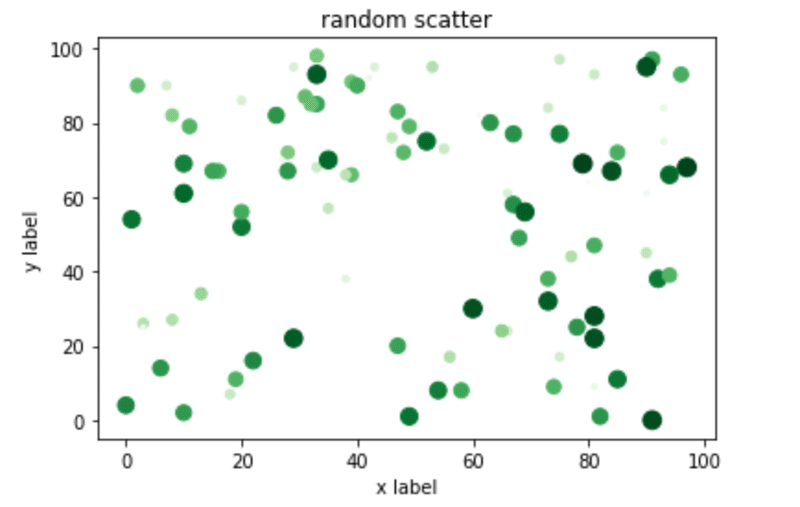
円グラフ
ある特定データを explode を利用して強調させた円グラフ。
data = [100,70,30,20,10,1]
labels = ["Car", "Train", "Bus", "Airplane", "Bike", "Ship"]
explode= [0,0,0,0.1,0,0]
plt.pie(data, labels=labels, explode=explode)
plt.axis("equal")
plt.show()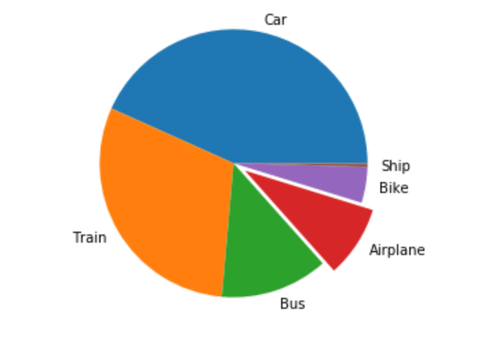
3Dグラフ
from mpl_toolkits.mplot3d import Axes3D と ax = fig.add_subplot(1,1,1, projection="3d") を使って書く。
import numpy as np
import matplotlib.pyplot as plt
from mpl_toolkits.mplot3d import Axes3D
%matplotlib inline

n = m = np.linspace(-5, 5)
N, M = np.meshgrid(n, m)
Z = np.exp(-(N**2 + M**2)/2) / (2*np.pi)

fig = plt.figure(figsize=(6,6))

ax = fig.add_subplot(1,1,1, projection="3d")

ax.plot_surface(N,M,Z)
plt.show()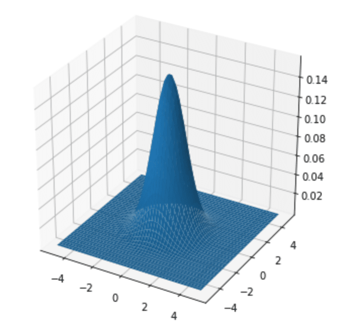
3D ヒストグラム
z軸に値をプロットさせてみる。ax.bar3d(x,y,z, dx,dy,dz) でやってみる。
fig = plt.figure(figsize=(5,5))

ax = fig.add_subplot(1,1,1, projection="3d")

xpos = [i for i in range(10)]
ypos = [i for i in range(10)]
zpos = np.zeros(10)
print(zpos)

# x, y, z
dx = np.ones(10)
dy = np.ones(10)
dz = [i for i in range(10)]
print(dz)

plt.title("3D Histgram")
plt.xlabel("x label")
plt.ylabel("y label")

ax.bar3d (xpos, ypos, zpos, dx, dy, dz)
plt.show()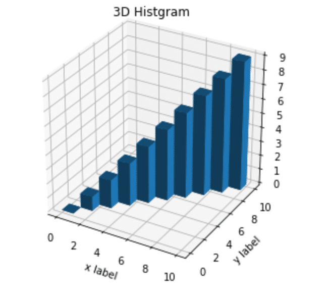
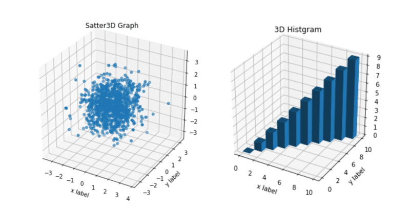
3D 散布図
このグラフはなんかデータサイエンスっぽいですね!
e = np.random.randn(1000)
f = np.random.randn(1000)
g = np.random.randn(1000)

fig = plt.figure(figsize=(6,6))
ax = fig.add_subplot(1,1,1, projection="3d")

e = np.ravel(e)
f = np.ravel(f)
g = np.ravel(g)

plt.title("Satter3D Graph")
plt.xlabel("x label")
plt.ylabel("y label")

ax.scatter3D(e,f,g)
plt.show()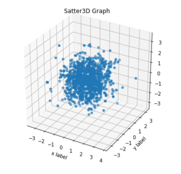
アイリス(iris)のデータプロット
urlから 3種類のirisデータ(がく片長、がく片幅、花びら長、花びら幅)を取得してプロットさせる。機械学習のグラフっぽくなってきました!
import pandas as pd
df_iris = pd.read_csv("http://archive.ics.uci.edu/ml/machine-learning-databases/iris/iris.data", header=None)
df_iris.colums = ["sepal length", "sepal width", "patel length", "patel width", "class"]
fig = plt.figure(figsize=(10,10))

#sentosa
plt.scatter(df_iris.iloc[:50,0], df_iris.iloc[:50,1], label="sentosa", color="k")

#versicolor
plt.scatter(df_iris.iloc[50:100,0], df_iris.iloc[50:100,1], label="versicolor", color="b")

#versinica
plt.scatter(df_iris.iloc[100:150,0], df_iris.iloc[100:150,1], label="versinica", color="g")

plt.xlabel("sepal length")
plt.ylabel("sepal width")

plt.legend(loc="best")
plt.grid(True)
plt.show()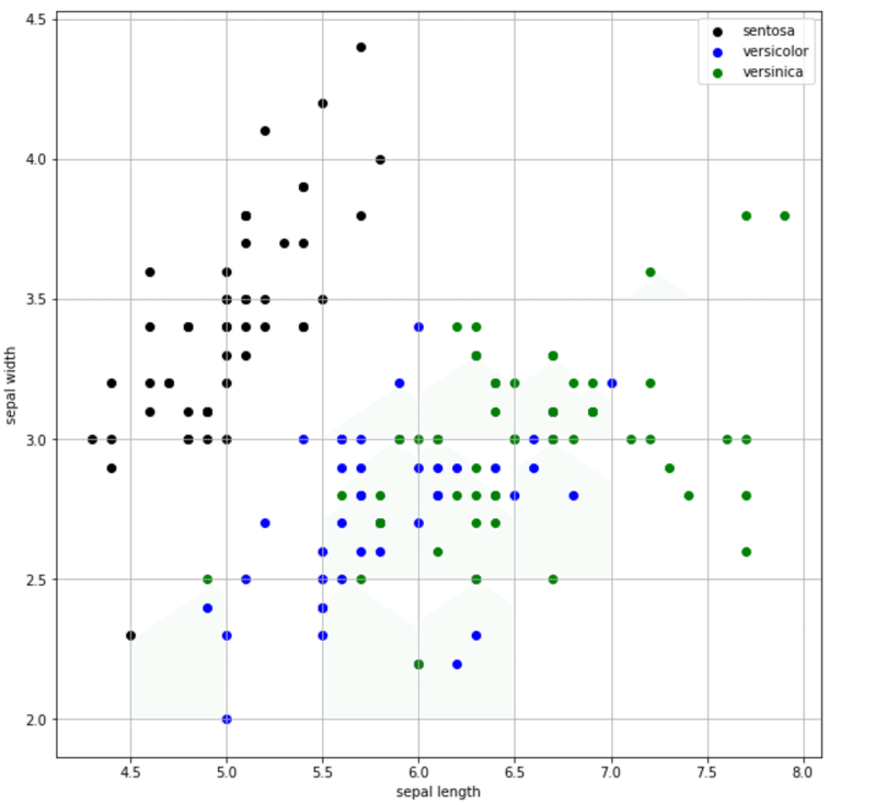
このように、matplotlibを使って 様々なグラフを描写することができました。次回は、matplotlibを使った応用編にチャレンジしてみます!
今回の"note"を気に入って頂けましたら、是非サポートをお願いいたします!