
Photo by
believe2023
プログラミング備忘録

◆はじめに
pythonのプログラミングをするうえで、毎回同じものを検索していたので、忘れそうなものを備忘録としてまとめてみました。
適宜更新します。
◆基本構文
1.Dataframeの基礎
-1.0 import
import pandas as pd-1.1 行列の抽出
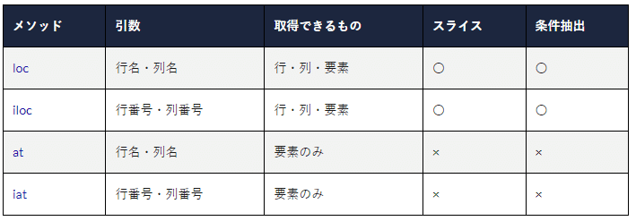
loc: location→要素名で取り出し
i: index→要素番号で取り出し
-1.2 よく使う操作
# 特定列の取り出し
y=df_tmp['c']
 #colums ,indexの取り出し
df.columns
df.index
 #読み込み
df = pd.read_csv("ファイル名", header=None)
 #保存
df.to_csv("ファイル名.csv")
 #追加・結合 (縦方向)
df_sum = df_sum.append(df_y)
 #seriasで結合
s= pd.Series([date_value, aaa, bbb, ccc],index=df_y.columns)
df_y=df_y.append(s,ignore_index=True)
-1.参考URL
●Dataframe操作全般
●Dataframeの結合
●Dataframe要素の抽出
●Dataframeのフィルタ操作
●Dafaframeのフィルタisin(テキストフィルタ)
●Dataframeのフィルタ(数値フィルタ)
2.Matplotによる可視化
-2.参考URL
●matplotlibの使い方1
●matplotlibの使い方2
●matplot subplotsの使い方
●matplot axesの設定
3.その他
-3.1 時刻の取り扱い
strptimeでdatetimeに変換
from datetime import datetime as dt
 #dt .strptime('datetime型に変換する文字列', '書式化コード')
date_value = dt.strptime(tt, '%Y%m%d_%H%M')
-3.参考URL
●テキスト→datetime
◆作成コード集
1.数値列のcsvファイルを読み込み、窓関数をかけて、閾値以上のみの領域の平均を求めグラフ表示するコード
import numpy
import pandas as pd
import glob
import matplotlib.pyplot as plt
import datetime
from datetime import datetime as dt


indir="./in_/"
outdir="./out/"
csvs = glob.glob(indir+'*.csv')

columns=['c']
df_sum = pd.DataFrame()
df = pd.DataFrame(columns=columns)

n_plot = 10 #プロット本数
n_plotx = 3 #列数
n_ploty = int(n_plot/3)
fig,axes = plt.subplots(n_ploty+1, n_plotx, figsize=(10, 6))
axes_1d = axes.ravel() #axを1次元に

for i, csv_ in enumerate(csvs):
    print(csv_)
    df['c'] = pd.read_csv(csv_, delimiter=',', header='infer', encoding="utf-8")
    df['c'] = df['c'].rolling(10000,min_periods=10000,center=True).mean() #移動平均


    #中央値以上のみ抽出
    medi=df['c'].median()
    max_=df['c'].max()
    print("中央値:",medi)
    df['c'] =df[df['c'] >= medi] #中央値以上のみ抽出 、中央値以下はNan
    f_width = 60000

    #全体表示
    fig2,axes2 = plt.subplots(1, 1, figsize=(10, 6))
    x=df.index
    y=df['c']
    axes2.plot(x,y)
    axes2.set_ylim([medi,  max_])
    axes_1d[0].plot(x,y)
    axes_1d[0].set_ylim([medi,  max_])

    f_end = 0
    n_y = 0
    columns_y=['datetime','n_y','average','max','min']
    df_y = pd.DataFrame(columns=columns_y)
    while f_end < len(df):
        n_y +=1
        if n_y > n_plot:
            break

        #中央値以上の領域を抽出
        df_tmp=df[df.index > f_end] #f_end以降を新しいdfに
        df_up=pd.DataFrame(list(df_tmp[df_tmp['c'] >= medi].index))
        f_start_ini = df_up.iloc[0,0] #最初の値
        f_start = int(f_start_ini-f_width/2)
        f_end = int(f_start+2*f_width)
        print("n_y:",n_y)
        print("start:",f_start)
        print("end:",f_end)

        #plot
        df_tmp = df[f_start:f_end]
        x=df_tmp.index
        y=df_tmp['c']
        axes_1d[n_y].plot(x,y,label=n_y)
        axes_1d[n_y].legend(loc='lower right', fontsize=8)
        axes_1d[n_y].set_ylim([medi,  max_])

        #統計値計算 ,dfへ保存
        print("mean:",y.mean(), "max:",y.max(),"min:",y.min())
        tt = csv_[-17:-4]
        date_value = dt.strptime(tt, '%Y%m%d_%H%M')
        s= pd.Series([date_value,int(n_y), y.mean(), y.max(),y.min()],index=df_y.columns)
        df_y=df_y.append(s,ignore_index=True)

    #保存
    #print (df_y)
    df_y.to_csv(outdir+tt+".csv")

    #表示
    plt.show()

    #合算して保存
    df_sum = df_sum.append(df_y)
df_sum.to_csv(outdir+"sum.csv")
2.時系列データを可視化してアニメーション表示するコード
import pandas as pd
from datetime import datetime as dt
import matplotlib.animation as ani
import matplotlib.pyplot as plt
 #stateの国名だけ合計計算し行追加
def append_sum_row_label(df,state): #state ='China'
    df_interest = df.loc[df['Country/Region'].isin([state])& ~df['Province/State'].isna()]
    df.loc[state] = df_interest.sum(numeric_only=True)
    df.at[state, 'Country/Region']=state
    return df


df = pd.read_csv("./owid-covid-data.csv", delimiter=',', header='infer')
df_interest = df.loc[df['location'].isin(['Israel'])]
df_interest.rename(index=lambda x: df_interest.at[x, 'date'], inplace=True)
print(df_interest.head())
df_interest.to_csv("./df_interest.csv")
columns=['total_deaths','people_vaccinated','new_vaccinations']
df1 = pd.DataFrame(columns=columns)
for col in columns:
    df1[col]=df_interest[col]
df1 = df1.fillna(0) #nanを0に
df1.index = pd.to_datetime(df1.index)

m=5 #間引き間隔
n_index=(len(df1.index)-1)//m
print(len(df1.index)) #行数  #df1  = df1.iloc[n_index//5:n_index]
df1 =df1[::m] #間引き

print(df1.head()) #input ()
 #fig作成
color = ['red', 'green', 'blue', 'orange']
fig = plt.figure()
ax1 = fig.add_subplot(3, 1, 1)
ax2 = fig.add_subplot(3, 1, 2)
ax3 = fig.add_subplot(3, 1, 3) #plt .xticks(rotation=45, ha="right", rotation_mode="anchor") #rotate  the x-axis values #plt .subplots_adjust(bottom = 0.2, top = 0.9) #ensuring  the dates (on the x-axis) fit in the screen #plt .ylabel('No of Deaths') #plt .xlabel('Dates')
def buildmebarchart(i=int):
    p1 = ax1.plot(df1[:i].index, df1[columns[0]][:i].values)
    p1[0].set_color(color[0])
    p2 = ax2.plot(df1[:i].index, df1[columns[1]][:i].values)
    p2[0].set_color(color[1])
    p3 = ax3.plot(df1[:i].index, df1[columns[2]][:i].values)
    p3[0].set_color(color[2])

 #アニメーション  #animator  = ani.FuncAnimation(fig, buildmebarchart, interval = 100,frames=n_index) #animator .save('./Animation.gif') #animator  = ani.FuncAnimation(fig, buildmebarchart, interval = 100,frames=n_index) #animator .save('./basic_animation.mp4', writer='ffmpeg')
animator = ani.FuncAnimation(fig, buildmebarchart, interval = 100,frames=n_index)
plt.show()
3.画像を読み込みハフラインを求めるコード
import cv2
import numpy as np
import glob
import csv
 #初期
indir="./in/"
outdir="./out/"
csv_name="./lines.csv"
files = glob.glob(indir+'*.jpg')
top = 190 #cropの上座標
bottom = 250 #cropの下座標
with open(csv_name, 'w') as csvfile:
    pass

for file in files:
    #ハフ変換  http://labs.eecs.tottori-u.ac.jp/sd/Member/oyamada/OpenCV/html/py_tutorials/py_imgproc/py_houghlines/py_houghlines.html
    name = file.split("\\")
    img = cv2.imread(file)
    gray = cv2.cvtColor(img,cv2.COLOR_BGR2GRAY)
    # サンプル1の切り出し、保存
    gray = gray[top : bottom, 100: 350] # img[top : bottom, left : right]
    edges = cv2.Canny(gray,100,200,apertureSize = 5)
    cv2.imwrite(outdir+"edges_"+name[1],edges)
    minLineLength = 100
    maxLineGap = 10
    lines = cv2.HoughLinesP(edges,1,np.pi/180,100,minLineLength,maxLineGap)

    if lines is None:
        print(name[1],"---no line---")
        continue

    upper = 0
    lower = 0
    avg = 0
    n_line_u=0
    n_line_l=0
    n_line=len(lines)
    print(n_line)

    #仮の平均の高さ算出
    for nn in range(n_line):
        for x1,y1,x2,y2 in lines[nn]:
            avg = avg + (y1 + y2)/2.
            #print (nn)
    avg = avg/n_line
    print("avg hight:",top+avg)

    #線を書く 、各ラインの平均算出
    for nn in range(n_line): #すべてのライン
        for x1,y1,x2,y2 in lines[nn]:
            y3=(y1+y2)/2.
            cv2.line(gray,(x1,y1),(x2,y2),(0,255,0),2)
            #仮の平均以下はupperに足し 、以上はlowerに足す
            if y3 <= avg:
                upper = upper + y3
                n_line_u +=1
            else:
                lower = lower +y3
                n_line_l +=1


    #各ラインの平均値を算出しcsvへ出力
    upper = upper / n_line_u
    lower = lower / n_line_l
    avg_zahyo=[name[1],top+upper,top+lower]
    print(avg_zahyo)

    with open(csv_name, 'a',newline='') as f:
        writer = csv.writer(f)
        writer.writerow(avg_zahyo)

    cv2.imwrite(outdir+name[1],gray)
4.画像を読み込みRGBの値を求め、CSVに保存するコード
import cv2
import glob
import csv
 #初期
indir="./in/"
csv_name="./rgb.csv"
files = glob.glob(indir+'*.png')
top = 190 #cropの上座標
bottom = top + 100 #cropの下座標
left = 190
right = left + 100
with open(csv_name, 'w',newline='') as csvfile:
    writer = csv.writer(csvfile)
    writer.writerow(["name","blue", "green","red"])

for file in files:
    name = file.split("\\")
    img = cv2.imread(file) #h  , w , c(BGR)
    img = img[top : bottom, left: right]
    b, g, r = cv2.split(img)
    with open(csv_name, 'a',newline='') as f:
        writer = csv.writer(f)
        writer.writerow([name[1], b.mean(), g.mean(),r.mean()])