
How do you graph the number of people you need to hire ?

日本語Verは👉こちら
To utilize numbers in recruitment activities
For example, if 1 in 8 employees leaves the company, how many people should the company hire in a year ?
How can you share the goal of how many people you need to hire with team members ?
To demonstrate this, it is important to graph it clearly and logically.
Therefore, I'll show you how to graph the probability of the number of employees leaving with turnover rate and number of employees.
How to create a graph showing the probability of occurrence for each number of people leaving the company.
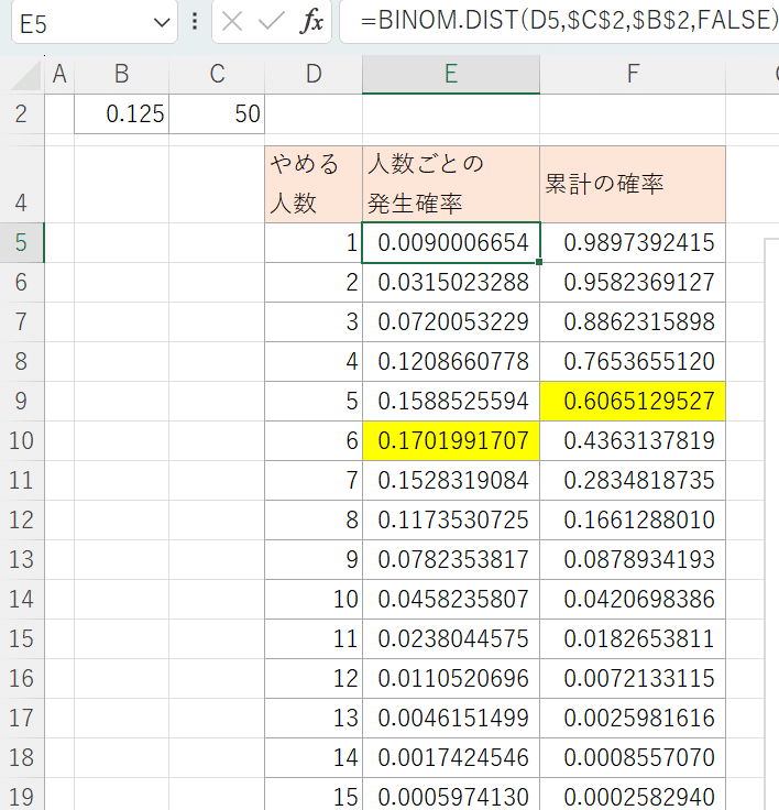
I'll create a graph that shows "How many people will leave a company if the company has 50 employees and each employee leaves at a rate of 12.5% per year."
1.Write data to Excel
First, write the data to Excel as shown below:
B2: probability that each employee will quit(12.5%=0.125)
C2: Number of employees
column D: Number of people who quit(1 - 15)
column E: occurrence probability of each person quitting.
Use BINOM.DIST function.
BINOM.DIST( Number_s, Trials, probability_s, False)
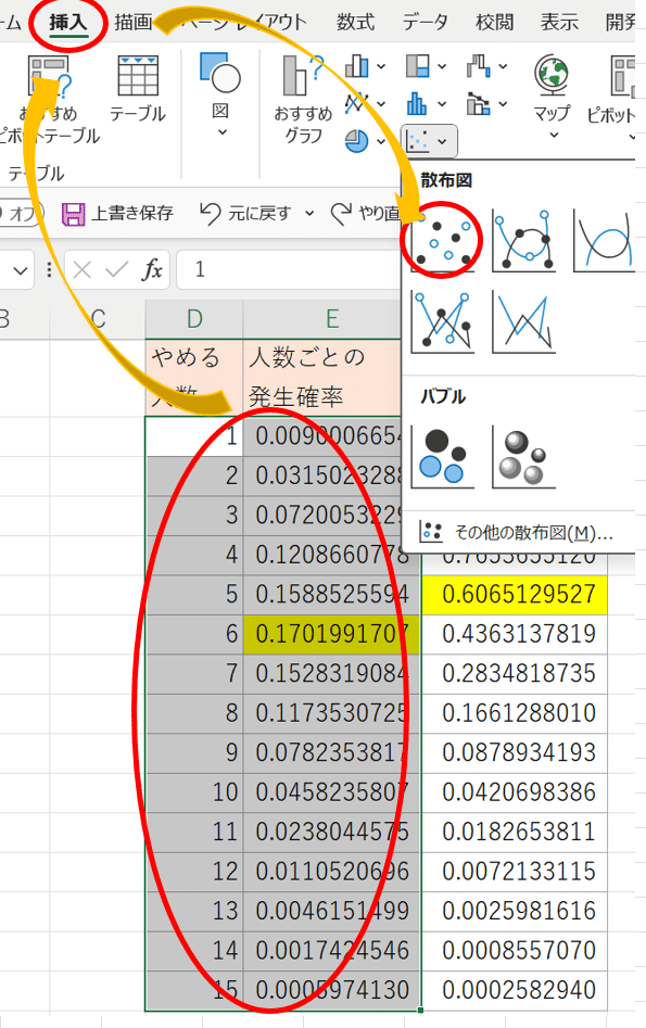
How to create a graph
Create a graph using the map above.
Select the map between columns D and E.
Press the 'insert' and 'Scatter Plot' buttons.
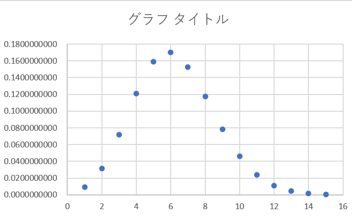
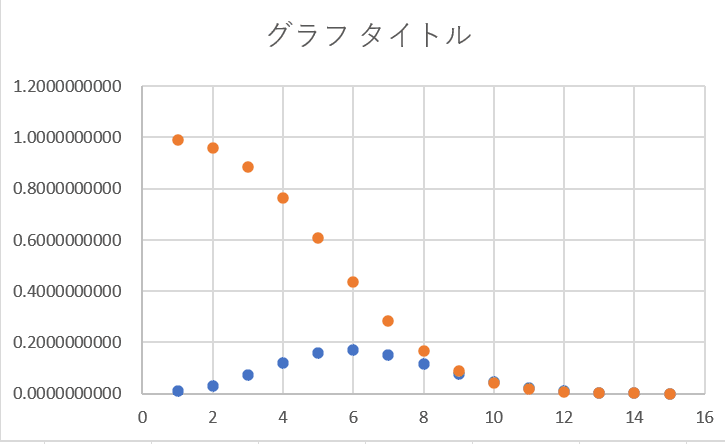
a graph like the one below will be displayed.
Edit to display the cumulative total graph.
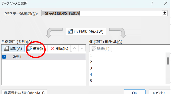
Press the filter button on the right side of the graph and press the 'Data Selection' button.
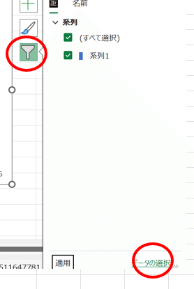
Press the '系統1(System 1)' in the window that appears and press 'Edit'
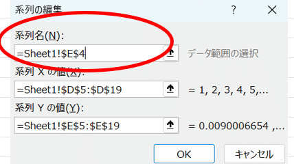
Enter the cell name where you wrote the graph name. Press '↑"to select a cell on the sheet.
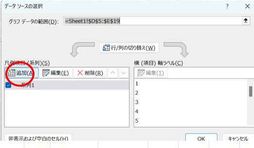
Edit to display a cumulative graph.
Press 'Add' in the window.
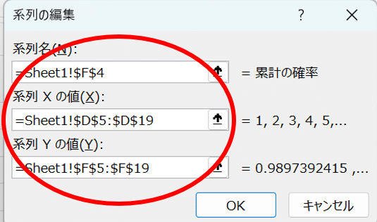
Enter the following:
'系統名(name)': Column title.
Value of X: Number of people.
Value of Y: Cumulative probability.
a graph like the one below will be displayed, so let's edit to make it easier to see.
3.Edit the graph for easy viewing.
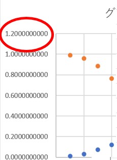
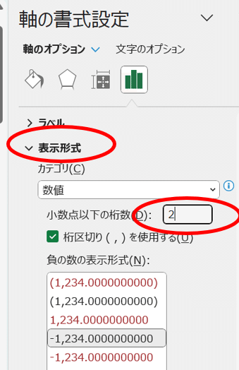
<adjust the number of decimal points>
You can edit it using '軸の書式設定'(Format Axis).
Double-click near the axis.
Change the number of decimal points on the screen that appears.
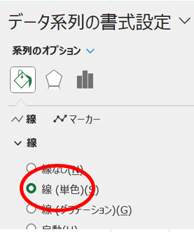
<Display a line on the graph>
Display line with dots.
Select '線'(line) on the 'データ系列の書式設定'(format axis setting) screen.
Display the meaning of each graph.
Check '凡例(example) on the 'グラフ編集(graph edit)' screen.
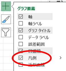
Adding a title will make the graph easier to read !
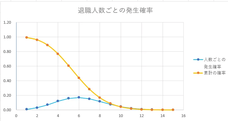
If you look at this graph, you can imagine that about 4 people will leave, and there is a high probability that 6 people will leave.
It helps share goals with team members !
Thank you for reading, please share your comments :)
この記事が気に入ったらサポートをしてみませんか?