デザトレ!(Dezatore!): Principles of Design - Part 1

Long time no write! It's been a while since I last posted (◍′◡‵◍) We've all been through quite a whirlwind of a time in the past year or two, I hope you're doing well as you're reading this~ :) ✿
Today I'll be sharing about デザトレ! (Dezatore! - pronounced as day-zah-toe-ray) that we have been doing within our design team on a weekly basis.
'What is "デザトレ! Dezatore!"?' you may ask, it is a one-hour session set out weekly to explore, experiment, share skills, knowledge and ideas among ourselves. It is a curt and catchy sounding vocabulary we created from the words デザイン・トレーニング (dezain・toreeningu : design training) ☆
Every week, we each take turns to plan what topic to focus on and facilitate the session. I'll be sharing one of the topics that I've shared in Dezatore! with the design team as part of revision and a gentle reminder for us all whenever we're designing - Principles of Design.
At one point or another, designers may have encountered this phrase. At the start of my career, it was definitely a challenge to grasp this concept. However, in recent years, close to a decade into this industry, I've learnt to appreciate this phrase and start to see its truth through observation and as a participant/user myself.
As I gathered materials and prepared to share for Dezatore!, I realized I needed the revision as well, as much as practicing Principles of Design has become instinctive to me over the years. And I also realized it varies from person to person, as to which principles and how many there are. I believe as long as we know the basics and practice them to convey the message that we ultimately aim to communicate, that's all that truly matters.
The set of Principles of Design I compiled and went with were:
・Hierarchy / Emphasis
・Balance and Alignment
・Contrast
・Repetition and Consistency
・Scale / Proportion
・Rhythm / Movement
・White Space
・Proximity
As creatives and visual creatures, I think it helps a lot to supplement with reference images when we're trying to make a point across, it makes things a lot clearer and quick to digest as well. Here are some of the materials from the slides I've shared with the team.
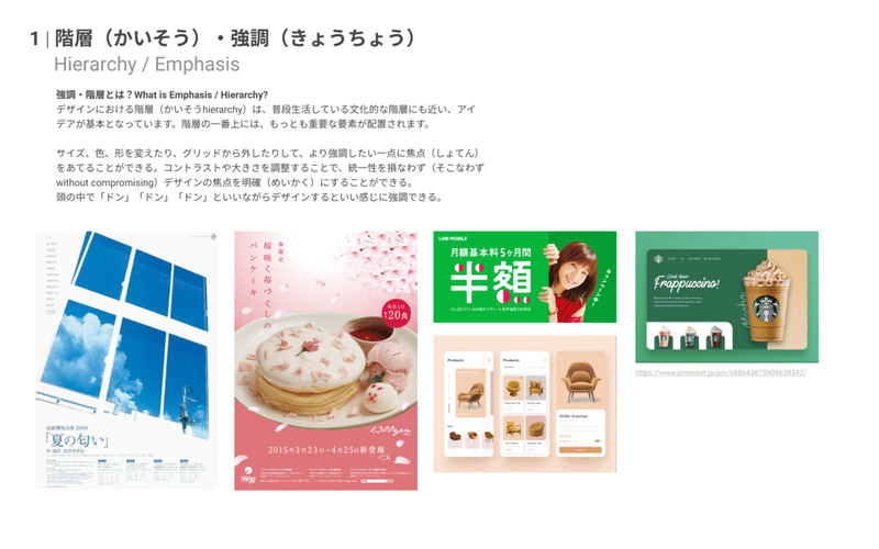
What is Hierarchy / Emphasis?
Hierarchy often relates to the order of importance of the elements/information delivered in the design. What is it that you would like the viewer to see first? And then the next, and the next. Similar to an organizational chart, you have the main focused element on top, and then slowly branch out into more details as it goes down.
Hierarchy can be expressed through various methods, such as size, shape, contrast etc. and can be very useful when trying to make an impact or to capture the viewer's attention.
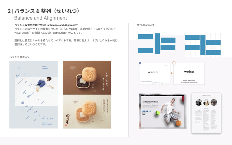
What is Balance and Alignment?
Balance is about using elements to distribute the visual weight in the design. In general, there is symmetrical balance, which is equal distribution (imagine 50-50) of visual weight. And there is asymmetrical balance, which plays with unequal distribution of visual weight in a composition. Playing with these can create interest and a sense of curiosity for the viewer.
Alignment is more about making sure things are placed in a visually pleasing manner, and keeps things in a certain organized way, so the viewer isn't distracted by information clutter or the subconscious feeling of "something's just not right..", and are able to focus on the message/information that we want to convey.
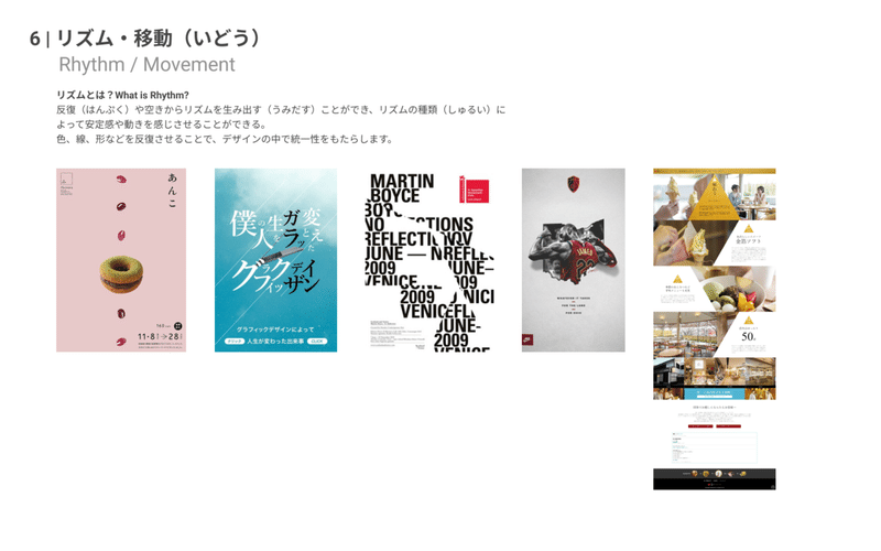
What is Rhythm / Movement?
I think this may often be an overlooked principle, because of how subtle it is. However, I've come to learn how useful & meaningful a design can turn out when we use rhythm and/or movement in our designs.
I would relate it to taking the viewer by the hand and giving them a tour around your design, just like how you would introduce your new place to a friend. Giving them cues as to what to look at and guiding them the flow as you would like them to view it, quite like a curation of an exhibition, or a storyline of a film. When done well, it creates an enjoyable experience :)
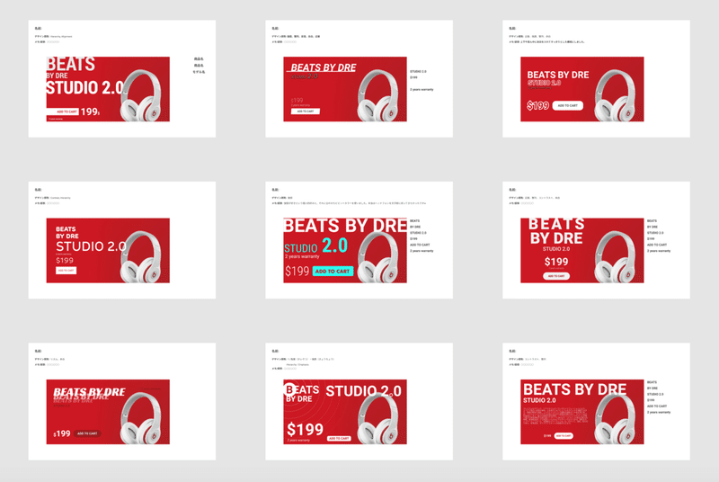
While doing research and preparation for this Dezatore!, I found tutorials by Satori Graphics, a graphic designer who posts very useful videos about basics of graphic design, before & after samples and much more. He also provides activities from time to time, so I thought it would be interesting for us to try out in the team as well!
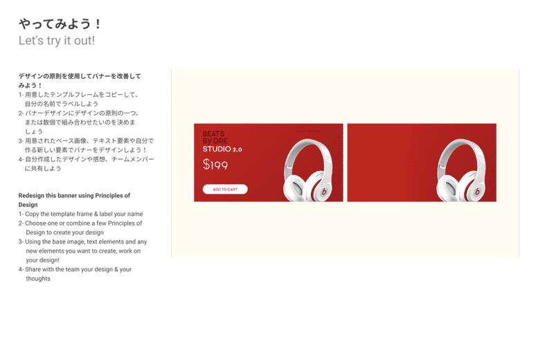
So I downloaded the template artwork from Satori Graphics and based on the given template & information, have all of us create this banner/graphic using any one or more of the Principles of Design as shared in the session.
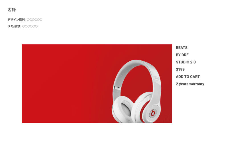
It's always very interesting to see how every one of us interpret the brief in our own ways and the wide variation of ideas that comes up in the design! These are the designs we each came up with as a short 20-30 minutes exercise!
All in all it was a good experience going through Principles of Design with the design team members, since we're all in various stages of our career and it's good to ground ourselves back with the basics from time to time :)
Huge thanks to the designers and contributors from these following sites for their wealth of information, they were very helpful references in my preparation! Do check them out if you're interested!
・Satori Graphics
・99designs : The 7 principles of design
・99designs : Design 101: The 8 graphic design basics you need to know
・iSpring : Improve learner experience with 6 simple graphic design principles
・Zeka Design
・Images from Pinterest, Dribbble
・Fare. (in Japanese)
・webnaut (in Japanese)
....and more!
I'll be sharing a Part 2 soon, so do look forward to that!
Till the next time! ☆
:::::::::::::::::::::::::::::::::::::::::::::::::::::::::::::::::::::::::::::::::::::::::::::::::::::::::::::::::::::::::::::Header credits:
Template Design by asato
この記事が気に入ったらサポートをしてみませんか?